
CASE STUDIES
Graphic Design
Poster, flyer, brochure, business card and corporate collateral case studies across education, healthcare, manufacturing and events, with print-spec FAQs.
Graphic design looks like the most basic category, but it is where brand consistency is actually tested — if a company's posters, flyers and cards each speak differently, no logo can hold it together. Watch for continuity across pieces from the same brand.
Also note information hierarchy. Collateral typically gets a few seconds of attention, so whether the key message lands at first glance matters far more than decorative elements.
14 articles

National Kaohsiung University|Campus posters, poster design, image design, advertising design
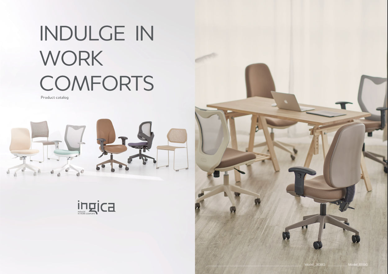
INGICA|Catalog design, exhibition design, poster design, product photography

Mitsubishi Elevator| Banner design
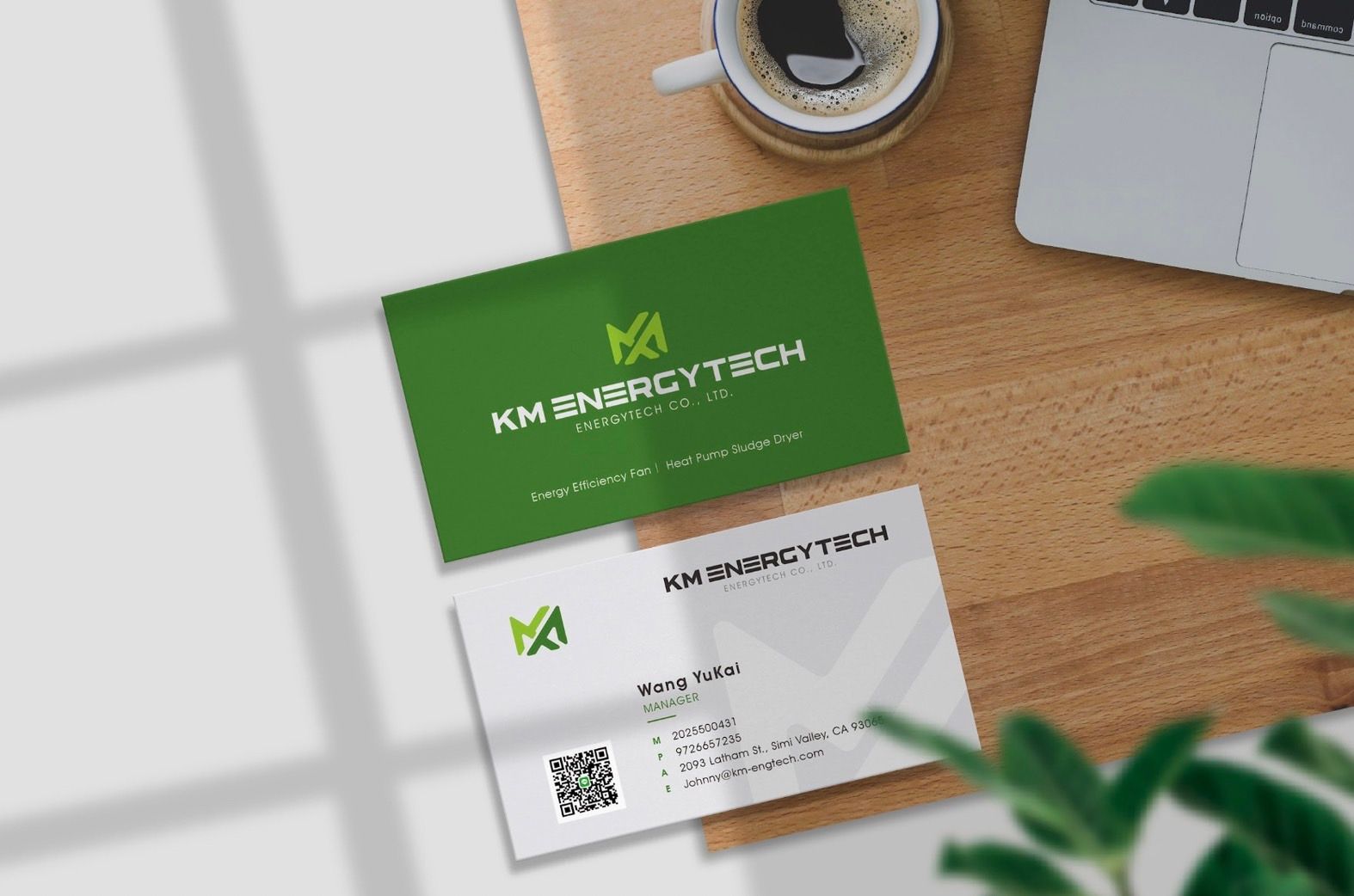
U-XIANG | LOGO design, business card design, image design
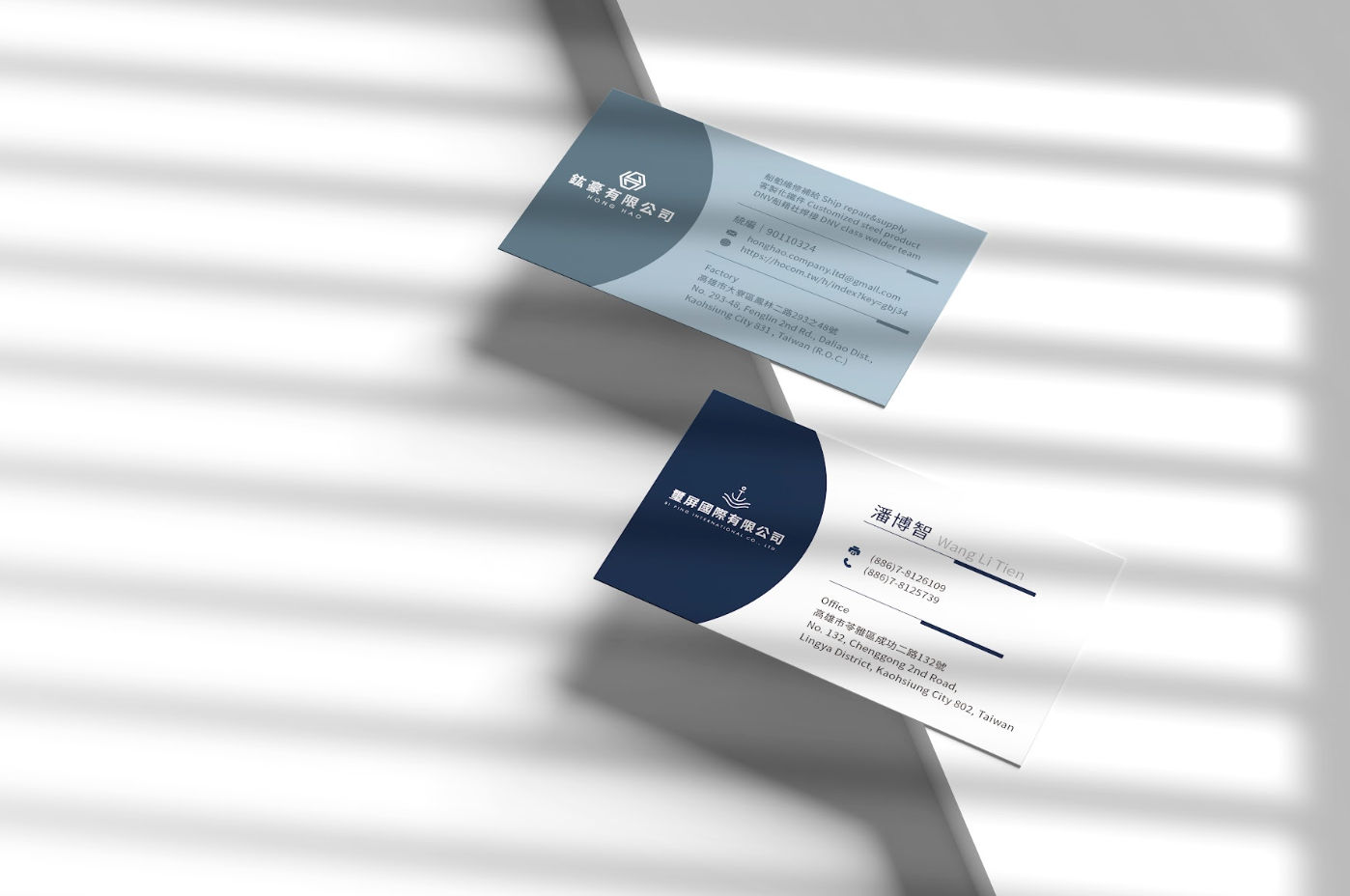
YI I ENTERPRISE|LOGO design, name design

Budweiser Gold Master Visual Series Visual Design|Poster Design|Image Vision|Advertising Design
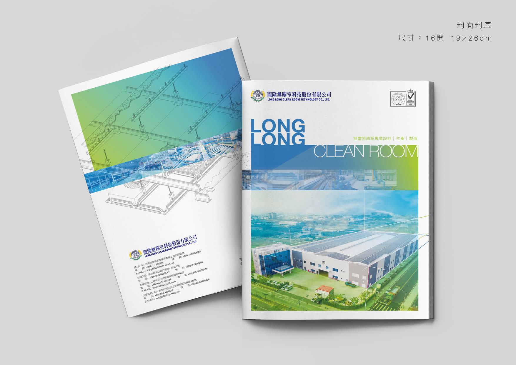
Longlong Clean Room Corporate Image Overall Planning|Catalog Design|Business Card Design

ACE EDULINK | Education Industry | Supplementary Education | Overall VI Visual Design
Yaoxin Technology Brand | Logo Design | Business Card Design | Envelope Design
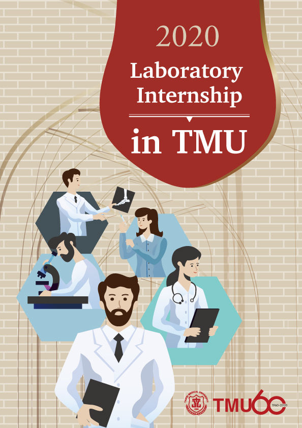
Visual Design for the 60th Anniversary of the Department of Research, Taipei Medical University

"King Kong Wisdom" Course | Banner Design Effectively Improves Ad Click Rates

National Taiwan University International College 2021 Admission Visual Design|Poster Design

Visual Design of King Kong Wisdom Event | Lecture Poster Design
Frequently Asked Questions
- What is needed to prepare print-ready artwork?
- At minimum: bleed (typically 3mm), CMYK colour mode, outlined or embedded fonts, and sufficient image resolution (usually 300 dpi at final size). Missing any one of these can produce unexpected results on press.
- Why does printed colour differ from what I see on screen?
- Screens are additive RGB; print is subtractive CMYK, with a different gamut. Vivid cyans, greens and fluorescents cannot be fully reproduced in four-colour process. For colour-critical work, specify spot colours or approve a physical proof first.
- Are posters and flyers designed the same way?
- No. A poster is read once from a distance, so the main message must land from three metres away. A flyer is held and read closely, supporting more layered information and a call to action. Reusing one layout for both rarely works.
Start Building Your Brand
Book a brand diagnosis and let our experts plan the best brand strategy for you