LogoDesignThat Becomes an Asset.
Trademark-first. Senior designers only. Font licensing documented.
Team members bringing up to 30+ years of experience, 1,000+ brands trust us. We run a trademark search before design begins, a senior designer owns the whole project in-house, and every delivery includes a font-licensing list — so your logo becomes a brand asset you can build on.
🔴 This quarter's logo design slots are limited — only a few remain

A Logo That Compounds Brand Equity Starts From Three Macro Points
A Logo Is the Start of a Brand Asset, Not Just a Graphic
Most people ask a designer to "draw a nice logo," but a logo's real value comes from the positioning behind it — who you are, who you speak to, and how you differ from competitors. Every logo we make starts with a brand diagnosis: position first, then design, so the mark carries meaning and lasts.
A Logo Has to Survive in a Real Market
A logo isn't for admiring on a desk — it goes into the market to compete. It has to clear a trademark search, avoid being pre-registered, and stand out in your industry. With team members bringing up to 30+ years, 1,000+ brands, and five industry sectors of experience, we anticipate market challenges right at the proposal stage.
A Logo Is the First Block of an Extensible System
Finishing a logo is a beginning, not an end. It extends to business cards, your website, packaging, catalogs, annual reports, trade shows, and social — each grows from it. We deliver a font-licensing list, source files, and a usage manual so it can carry years of extension.
Hire a designer and you get a graphic. Work with Joseph and you get an identity asset — designed from the brand, market, and future, built to compound with you.










Three Things Most Studios Skip — But You Should Demand
Trademark Search First
Discovering your mark is already registered after the design is done — and having to start over — is a common disaster. We search the IPO database before designing, so your logo can actually go the distance.
A Senior Designer, Start to Finish
From brand diagnosis to delivery, one senior designer works with you throughout — not a junior credited as senior. Every word you say reaches someone who truly understands brands.
Font Licensing, Documented
One of the few studios that explicitly documents commercial font licensing. Your brand won't face infringement claims or be forced to swap fonts later — every project ships with a font-licensing list.
Our Team's 30 Years of Work, Results You Can See
From manufacturing to F&B, medical, and global brands — 1,000+ companies trust our design capabilities

普利司通
日月香肉鬆
View case →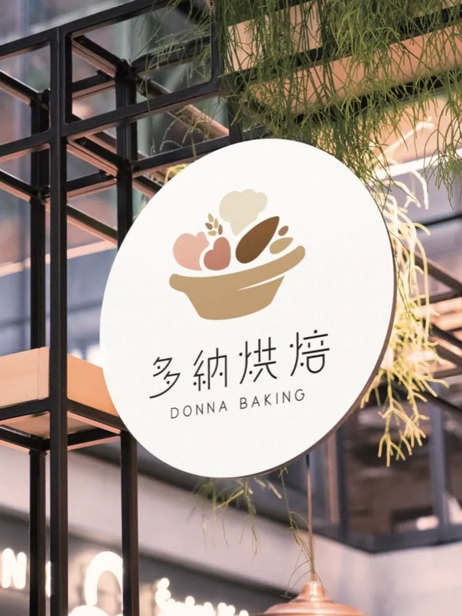
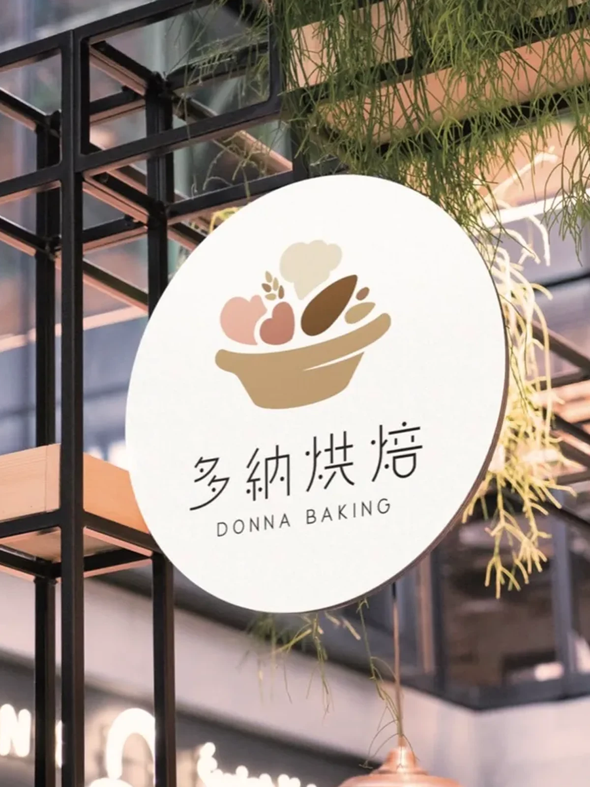
多納烘焙
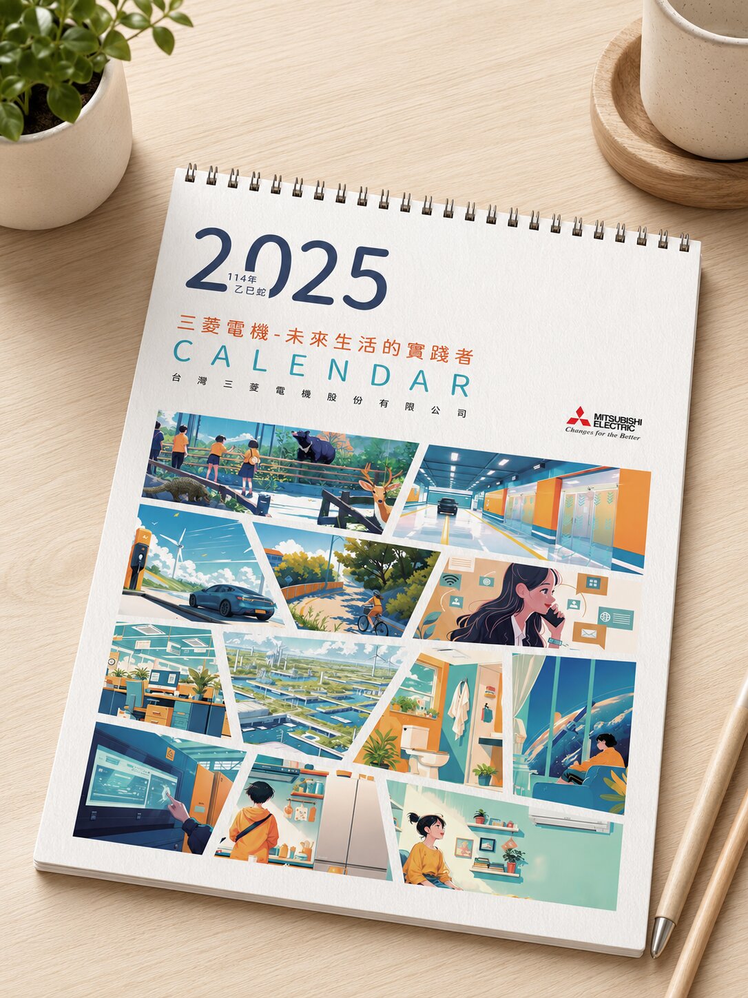
三菱電機
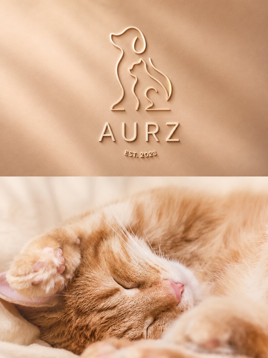
AURZ
View case →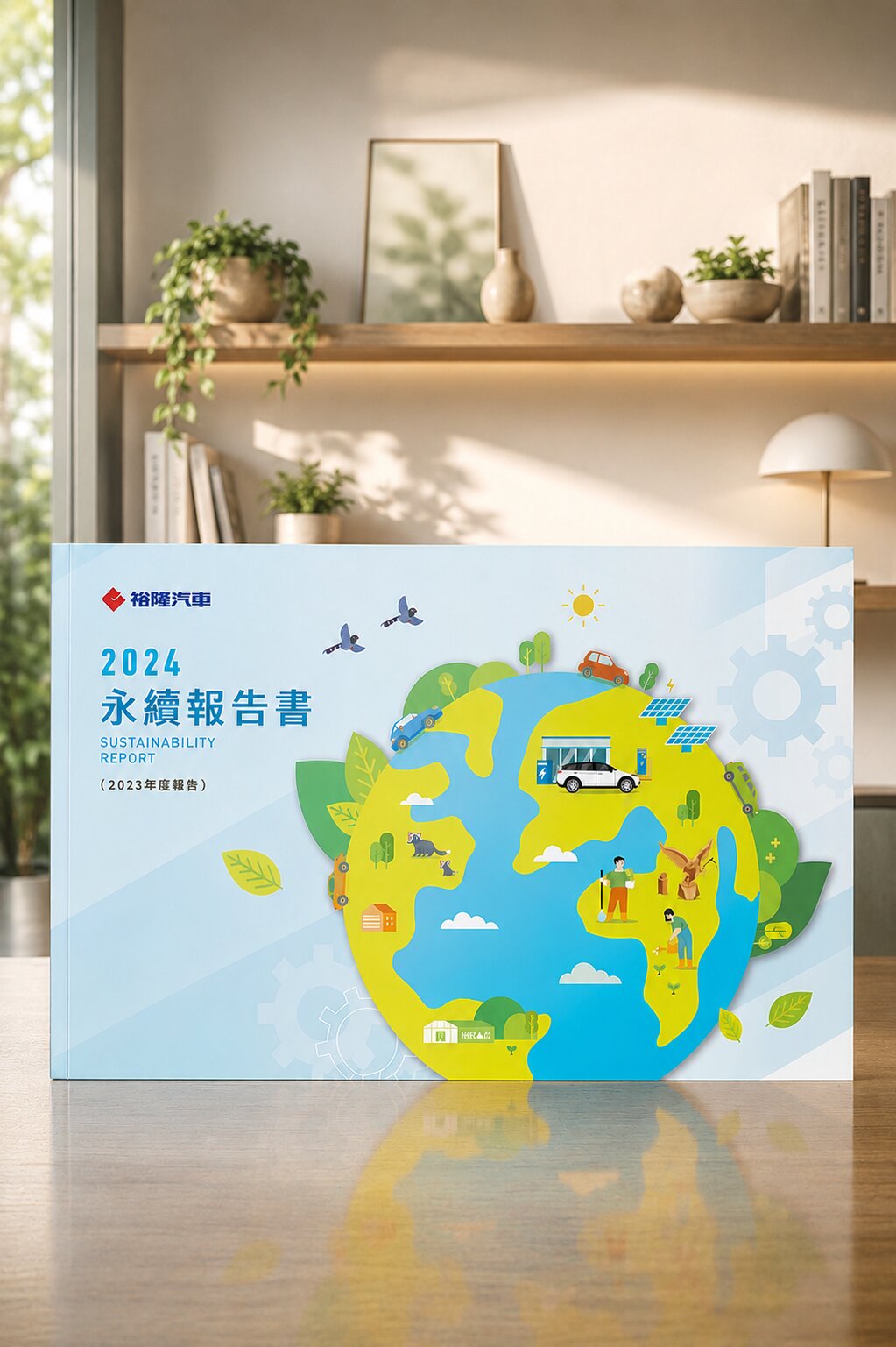
裕隆汽車
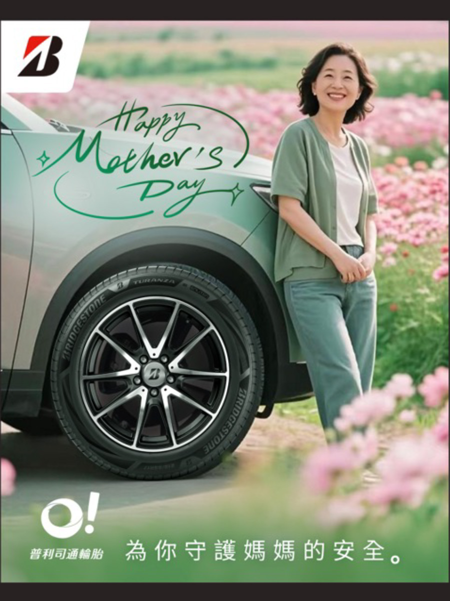
普利司通
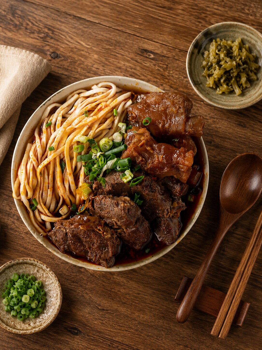
禾善堂
The Right Logo Approach for Your Stage
Different stages need different identity strategies. See which one fits, and we'll confirm the right scope together during consultation.
Scenario A: Build a New Brand Identity
- Building a brand identity from scratch — you need a logo that represents you
- For: startups, new business units, spin-off sub-brands, new market entry
- Recommended: Brand identity system (logo + brand guidelines)
Scenario B: Brand Upgrade & Transition
- Succession, brand aging, or repositioning — your image needs reinterpreting
- For: traditional-industry transformation, rebranding, new CEO succession
- Recommended: Logo redesign + full CIS update
Scenario C: Globalization / Multi-Brand Group
- Multi-language markets and sub-brand consolidation — an identity that works across cultures
- For: brands going overseas, corporate groups, franchise systems
- Recommended: CIS + multilingual VI + brand usage guidelines
From Diagnosis to Delivery — Every Step Has a Deliverable
Brand Diagnosis (90 min)
An in-depth interview to understand your positioning, target market, and competitors
Trademark Search (IPO database)
Rule out trademark conflicts before designing — no nasty surprises later
2-3 Concept Proposals
Distinct directions, each with design rationale and strategic basis
2-3 Revision Rounds
Refine round by round with the same senior designer — no handoffs
Font Licensing Confirmation
Explicit commercial licensing status for every typeface used
Source Files + Usage Guidelines
All-format source files plus a logo usage manual, delivered together
Trademark Registration Guidance
Intro to partner trademark attorneys plus filing-strategy advice
What Our Clients Say
From the logo to storefront signage and CIS, the whole identity came together at once — more industrial and professional than we'd imagined.
Tech Manufacturing Client
Logo · CISRunning a trademark search before design was something no other vendor mentioned. Filing went smoothly afterward, and we avoided the risk of redoing everything.
Brand Startup Client
Logo · TrademarkThe same senior designer stayed with us start to finish — no re-explaining. They nailed both the appetite appeal and the tone of our F&B brand.
Restaurant Chain
F&B BrandingTeam's 30+ Years · 1,000+ Brands of Real Work
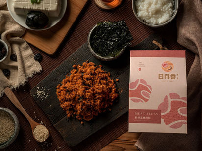
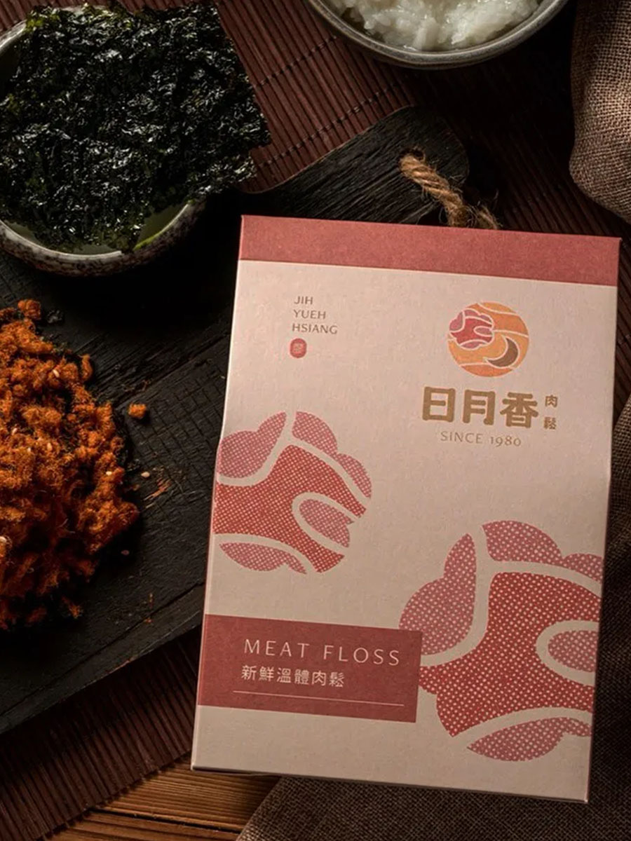
Ri Yue Xiang|Reviving a 40-Year Family Brand
From a market stall to retail gift shelves
A Taoyuan market stall for over 40 years, now run by the second generation — still using local warm pork, cooked before dawn, with no additives. We turned that honesty into a visual language: warm type and earthy tones that keep the shop's trust, extended from logo to packaging and gift boxes — taking it from stall to shelf as an asset for the third generation.
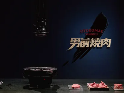
Nan Qian Yakiniku|A New Brand From a 70-Year Group
A heritage F&B group enters yakiniku
Nan Qian Yakiniku belongs to Kaohsiung's Quan Cheng F&B group, known for its Shantou hotpot for over 70 years. Entering yakiniku called for an identity that carries the group's heritage yet speaks to a younger crowd. We built its character with clean type and grounded tones, extended from logo to a full CIS — so the new brand launched with a veteran group's weight.
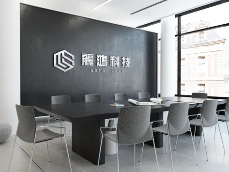
Li Hong Technology|An Industrial-Grade Identity System
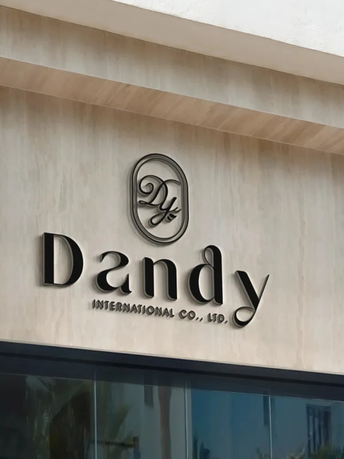
A full CIS, from logo to storefront signage
Li Hong needed more than a mark — it needed an identity system to carry a tech-industrial reputation. Thick, solid letterforms convey an industrial feel, paired with an abstract geometric figure for technical integration, then extended from logo to business cards and storefront signage as one coherent CIS — every application growing from the same set of rules.
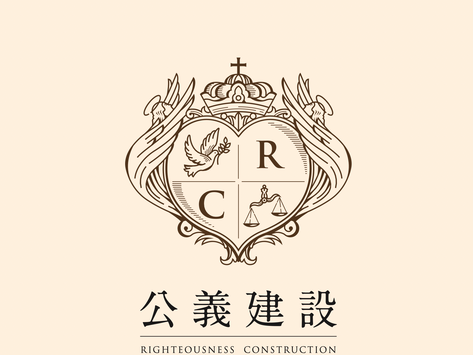
Gong Yi Construction|A Sustainable Builder Named for Justice
Building values into the identity
Gong Yi Construction was founded to be a sustainable enterprise upholding justice and fairness. We translated that into visuals: an elegant yet resilient tone conveying the steadiness, reliability, and professionalism construction demands — aligning name with image, from logo and trademark to a full CIS.
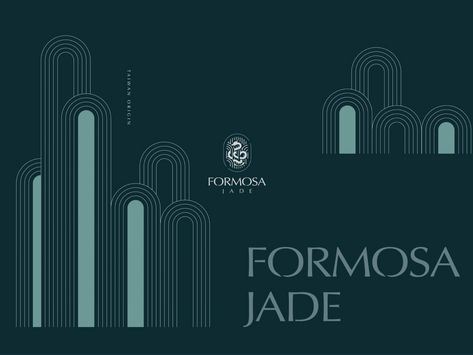
Formosa Jade|A Jewellery Brand Speaking for Real Jade
A brand born from buying fake jade
Formosa Jade's founder watched a jade-loving mother buy a fake on her very first purchase — the origin of a brand that speaks for real jade. We crafted an identity with refined Eastern texture, extended from logo to packaging and gift boxes, so expertise and trust are felt every time a box is opened.
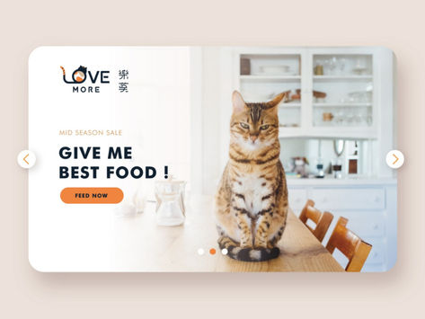
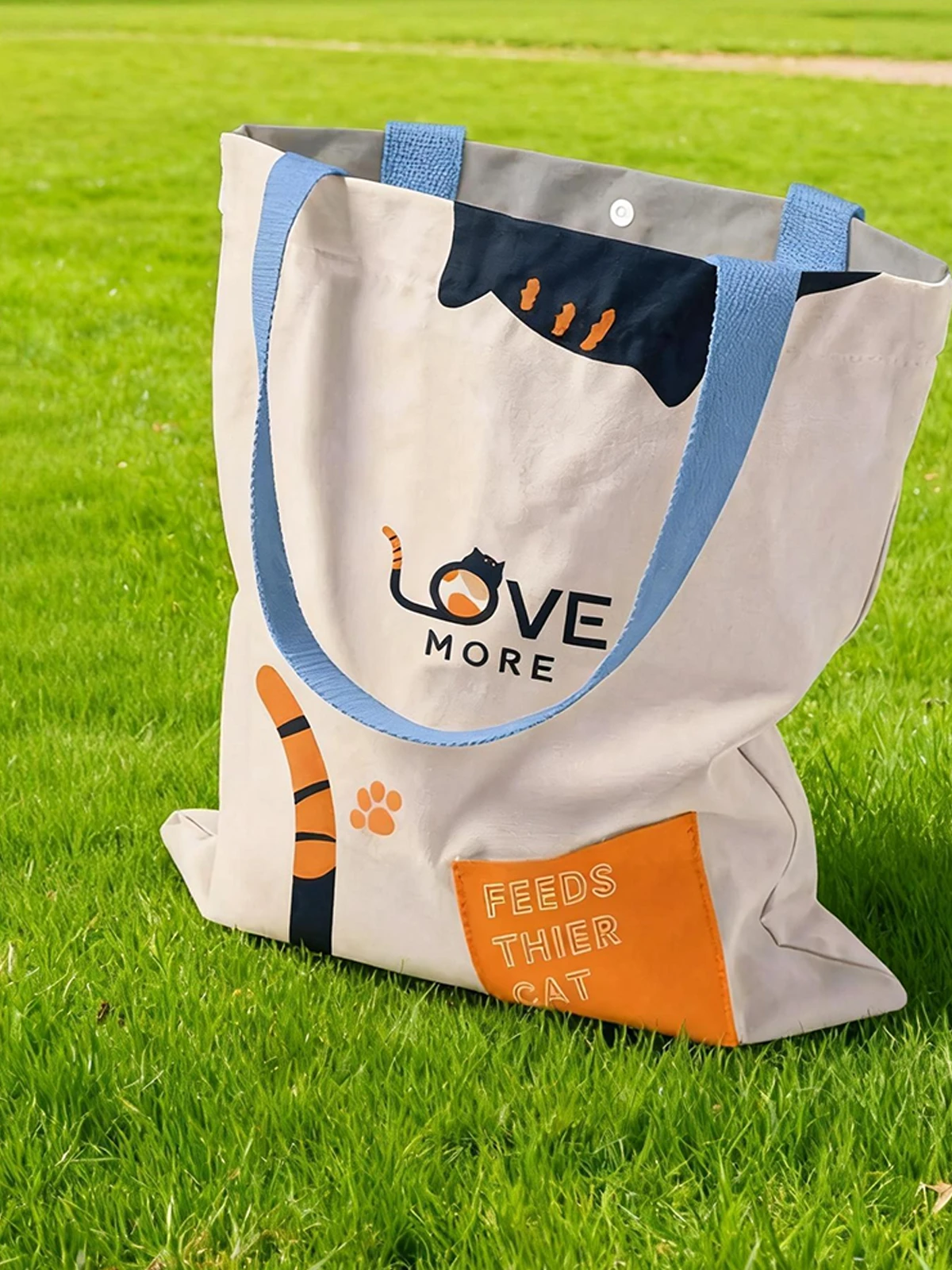
Le Mo Cat Food|Honest Cat Food by Cat Lovers
Transparent labelling to AAFCO standards
Le Mo's two founders are devoted cat owners who entered the cat-food market because of their own pets. Frustrated by unclear labels on imported brands, they committed to AAFCO-standard transparency. We designed a warm, trustworthy identity, extended from logo to packaging, so reassurance is visible at a glance.
CAT U|Bringing Taiwanese Tea to Bangkok
A startup drinks identity for Southeast Asia
CAT U is a bubble-tea startup with deep Southeast Asia know-how, aiming to share Taiwanese brown-sugar pearl milk tea and tropical fruit teas in Bangkok. We built a cross-cultural identity — warmly Taiwanese yet eye-catching in the local market — from logo to brand visuals, helping it find its footing abroad.
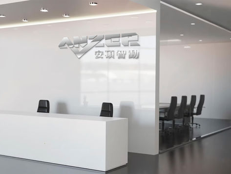
Answer Automation|An Industry 4.0 Brand
"For answers, find Answer"
Amid the global Industry 4.0 shift, Kaohsiung's industrial transformation can't wait. Answer Automation argues the point isn't just hardware but the whole solution. We built a crisp, tech-credible identity echoing its "for answers, find Answer" positioning, extended from logo to CIS for a consistent, clear automation image.
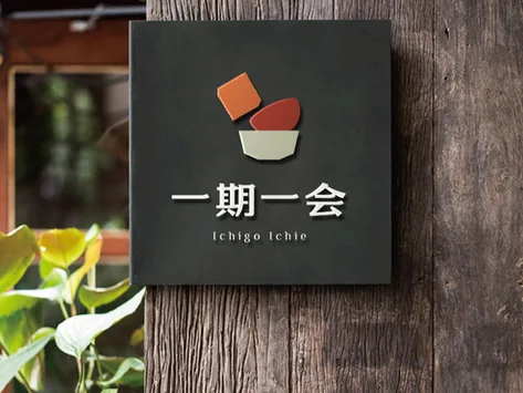
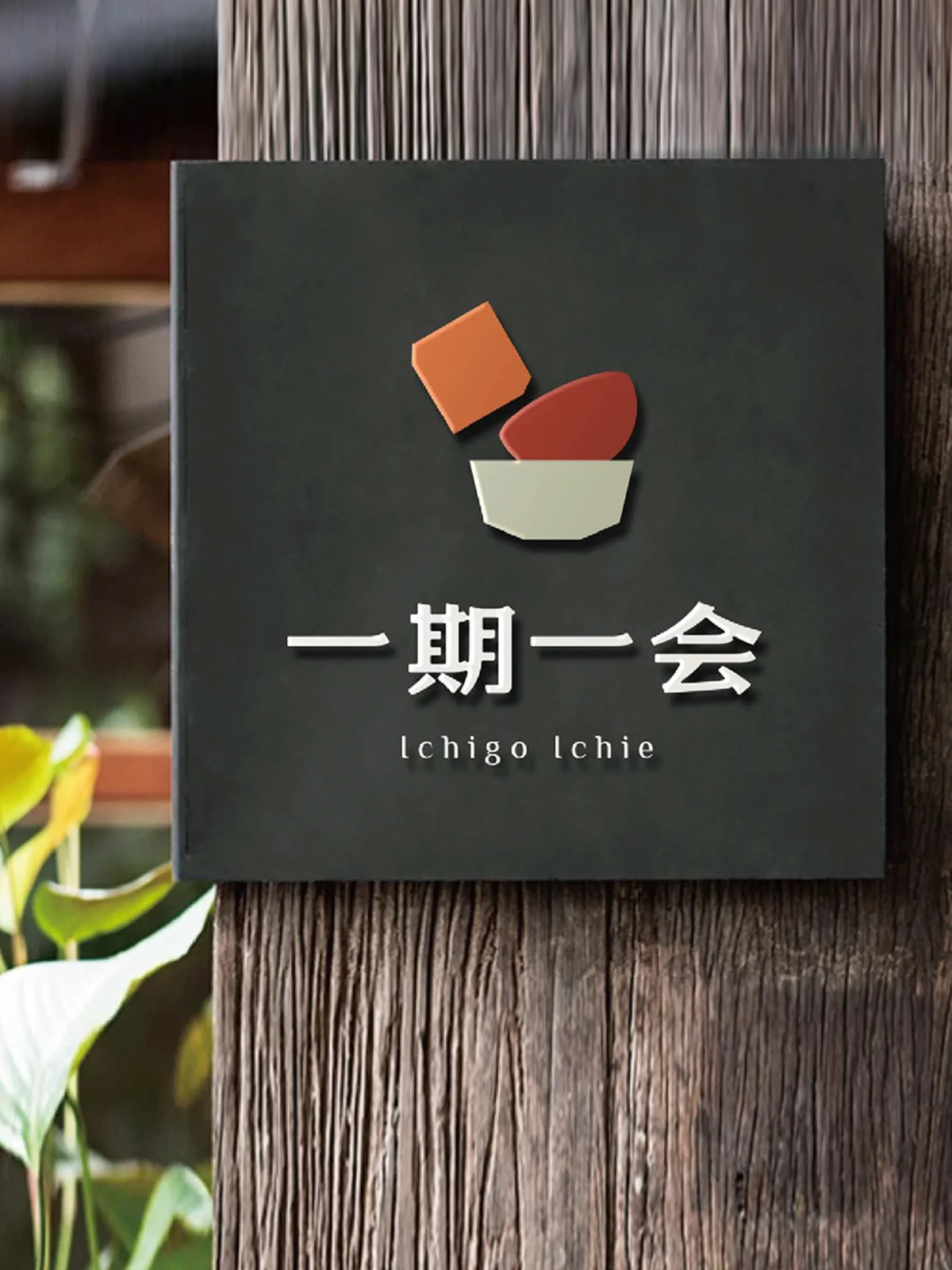
Ichigo Ichie|A Japanese Restaurant Named for a Tea-Ceremony Spirit
Cherishing a once-in-a-lifetime encounter
"Ichigo ichie" comes from the tea ceremony — a once-in-a-lifetime encounter that never repeats. This restaurant builds on seasonal ingredients and treasuring every gathering. We turned that Eastern philosophy into an identity, extended from logo and VI to menus, storefront, and light boxes, so every detail echoes the brand's spirit.
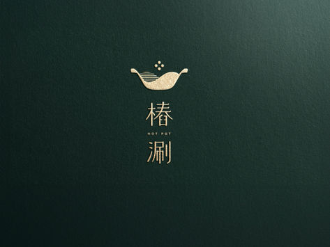
Chuang Shuan|A Hotpot Brand Reborn After a Japanese Split
A new name, the same care for ingredients
After ending a partnership with a Japanese brand, the team chose to relaunch under a new name — keeping their commitment to ingredients while broadening their direction. Drawing on the imagery of a Chinese idiom, we repositioned them with an identity both warm and contemporary, freeing Chuang Shuan from the old frame to face the market as its own brand.

Guo Rui|A Finance Advisory Brand From Hong Kong
A finance identity across Hong Kong and Shenzhen
Guo Rui Consulting began in Hong Kong and opened a Shenzhen branch, sitting in prime spots on Tsim Sha Tsui's Canton Road and Shenzhen's Futian core — focused on Hong Kong finance and banking services, agile and professional. We conveyed that positioning with a steady, international identity, extended from logo to CIS.
Team members bring up to 30+ years of experience · Trusted by 1,000+ brands · Handled by a senior designer, start to finish
Book a Logo Design Consultation
Through a brand diagnosis call, we'll understand your positioning and goals before any design begins.