Withbrandvisualintegration,align your print, social, and digital materials under one visual identity
Identity, print, and digital — one creative language across every touchpoint.
Graphic design isn't making images one by one — it's one creative language across every touchpoint: posters, DMs, packaging, social, all one brand speaking. Founded in 2014 and serving 1,000+ brands, with teams in Taipei, Kaohsiung, and Singapore, we run identity, print, and digital so your brand is consistent and stands out in every frame.
🔴 This quarter's graphic and integrated-visual slots are limited — print jobs schedule early

Graphic Design That Integrates a Brand Starts From Three Macro Points
Every Piece Must Carry the Brand Message
Design isn't just a pretty layout — it's making every piece convey the brand message precisely. We focus on the consistency of creativity and core value — posters, DMs, packaging not just individually attractive but telling one brand story. Back to brand first, then visuals.
Broad Scope, Integrated Across Touchpoints
Commercial ads, corporate brochures, product packaging, social visuals — your brand appears in many places, and each should be consistent. We cover a broad scope, integrating different touchpoints into one language — so the brand is recognized wherever it appears, not a different look per channel.
A Consistent Creative Language Compounds
A visual language running through touchpoints gains asset value the more it's used. We build a continuable creative language and templates, so later materials extend on the existing base without restarting — the brand's visual assets thicken year over year.
Hire a designer and you get a pretty image. Work with Joseph and you get a consistent visual language — designed from the brand, market, and future, running through every touchpoint.










Three Things Most Studios Skip — But You Should Demand
Creativity and Brand Consistency Together
We don't just chase a good-looking piece — we insist on consistency between design and core value. Every piece conveys the brand message precisely, so your posters, DMs, and packaging look like one brand together, not separate styles.
Broad Scope, One-Stop Integration
Whether commercial ads, corporate brochures, product packaging, or social visuals, we provide a professional design solution. One-stop integration across touchpoints means you don't piece together different designers — the brand language is consistent throughout.
Three Studios, Efficient Delivery
With studios in Taipei, Kaohsiung, and Singapore, we understand fast-moving markets, providing efficient service and quick delivery to help you seize opportunities in time. Full client support from concept to final product, with senior designers ensuring quality.
Our Team's 30 Years of Work, Results You Can See
From manufacturing to F&B, medical, and global brands — 1,000+ companies trust our design capabilities

普利司通
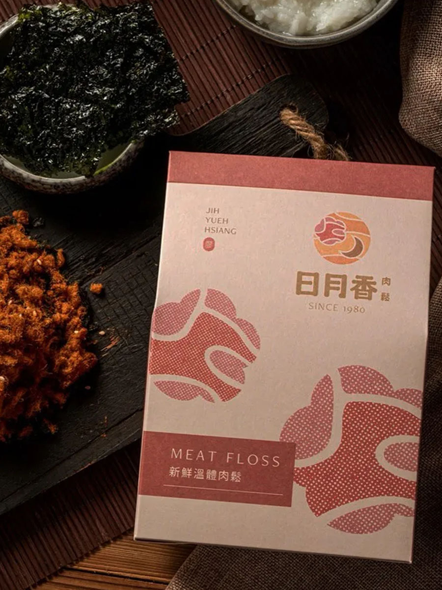
日月香肉鬆
View case →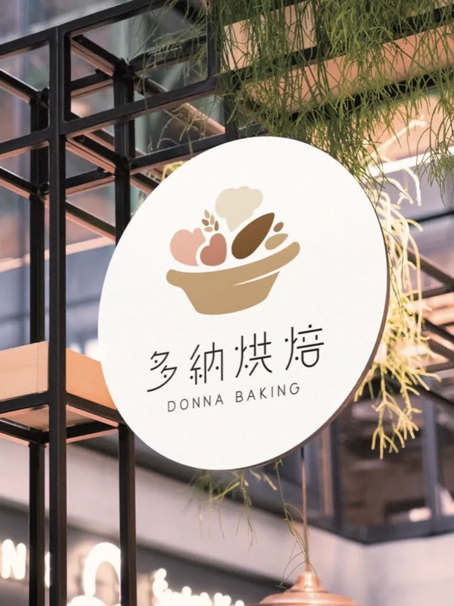
多納烘焙
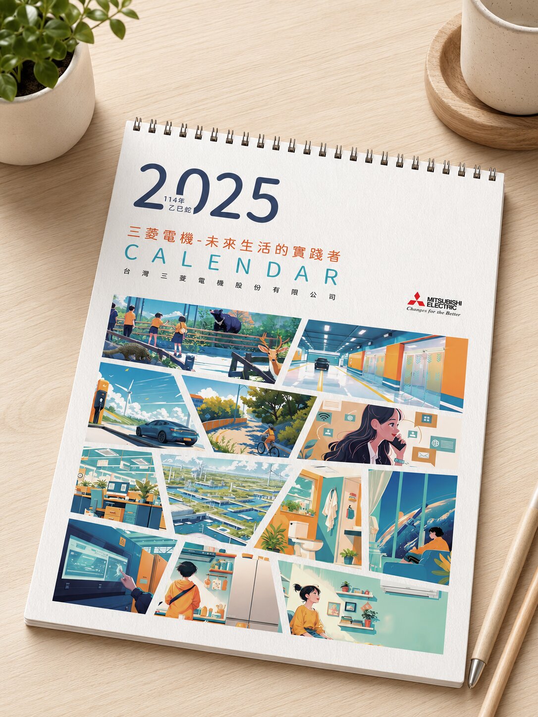
三菱電機
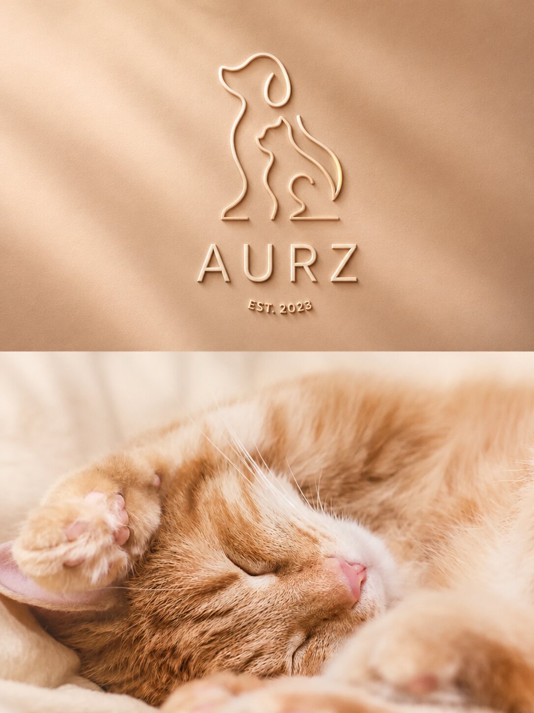
AURZ
View case →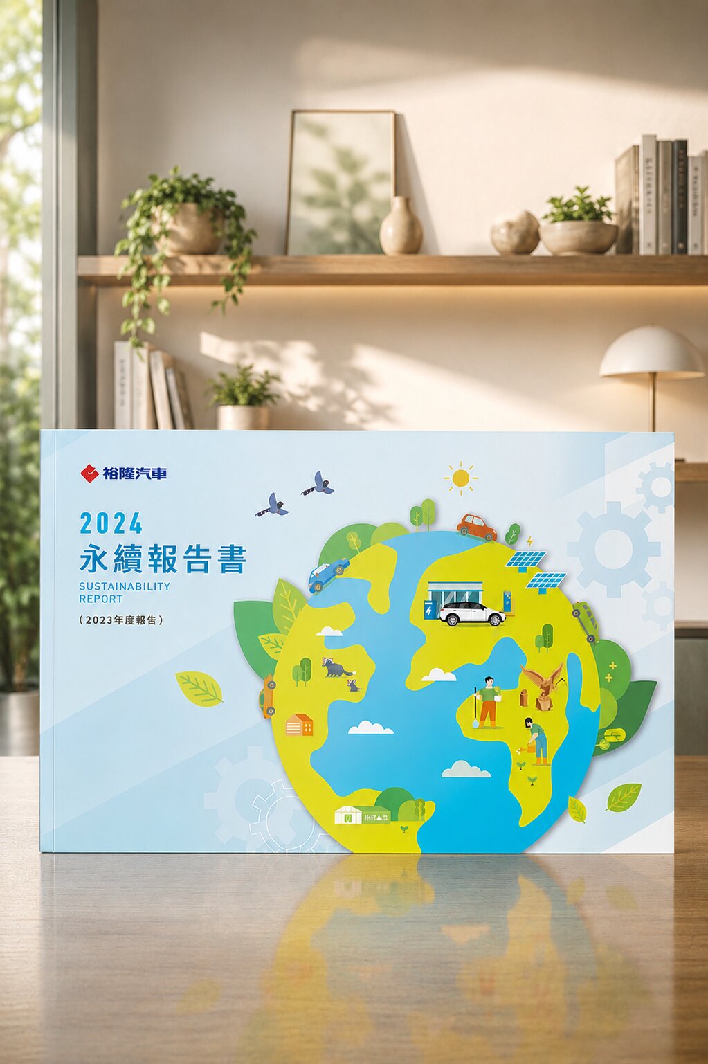
裕隆汽車
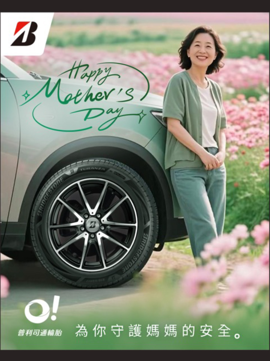
普利司通
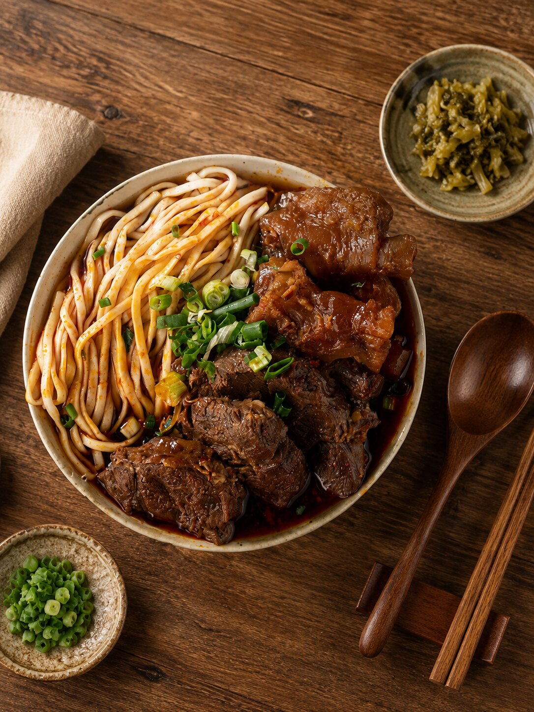
禾善堂
The Right Graphic Approach for Your Need
Different needs call for different design entry points. See which fits, and we'll confirm scope together.
Scenario A: A Single Graphic Need
- A poster, DM, event key visual, or deck — a single piece
- For: campaign windows, one-off promotion, quick delivery
- Recommended: key visual + series (poster/DM/social)
Scenario B: Whole-Brand Visual Integration
- Materials done piecemeal, needing one consistent visual language
- For: companies with scattered materials wanting unified visuals
- Recommended: visual-language integration + template system
Scenario C: E-commerce / Digital Visuals
- E-commerce and social need plentiful, consistent, converting visuals
- For: e-commerce, brand sites, social management
- Recommended: e-commerce visual system + social content
From Concept to Delivery — Every Step Has a Deliverable
Requirement Interview
Clarify use, positioning, and the message
Concept Proposal
Propose directions aligned with the brand
Design Execution
Execute visuals from positioning, balancing beauty and message
Revision & Finalization
Refine round by round to final, senior-designer reviewed
Print / Export
Supervise print or export digitally for quality
Extension Guidance
Provide series-extension and template-reuse guidance
What Our Clients Say
We used different people for different materials and the styles clashed. After Joseph integrated them, posters, DMs, and social finally look like one brand.
Consumer Brand Client
Visual IntegrationThey deliver fast — we made the campaign window without quality dropping — and the key visual was memorable right away.
Event Organizer Client
Key Visual · Fast DeliveryThe design isn't just good-looking — it actually states our brand message clearly, and our sales team gets good responses using it.
B2B Corporate Client
Brand ConsistencyOur Team's 30 Years · 1,000+ Brands of Graphic Work
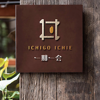
Ichigo Ichie|Full Visuals for a Japanese Restaurant
One language from menu to light box
Ichigo Ichie builds on seasonal ingredients and treasuring gatherings. A restaurant's visuals must run from logo through menu, storefront, and light box to avoid disjointed looks. With one Japanese-toned visual language, we designed identity, cards, menu, and light boxes — the brand speaking one way at every touchpoint.
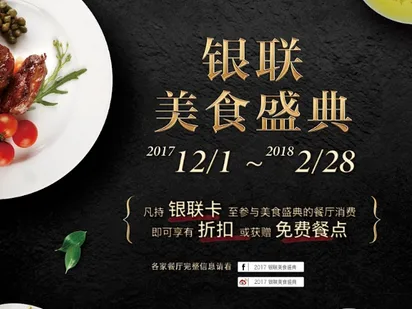
UnionPay|Clear, Strong Financial Posters
Hierarchy and visuals that state the message
A financial brand's poster must state the message clearly within a limited layout, with quality. For UnionPay we designed a clear information hierarchy with eye-catching visuals — complex financial messages readable at a glance while keeping a professional image, a showcase of pure graphic craft.
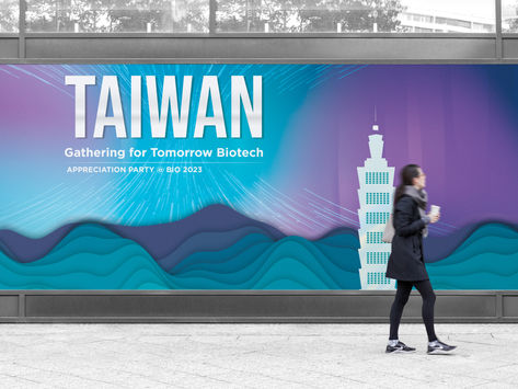
ITRI|Full CIS and Graphic Applications
Mark, color, and type as one
Institution-grade visuals must be consistent across mark, color, and type. For ITRI we designed a full CIS covering mark, color, and type, extending to backdrops and posters — keeping the institution's visuals consistent and professional across occasions.
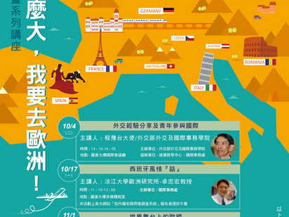
NUK|Campus Event Key Visuals
School colors highlighting the theme
A campus event poster must highlight the theme amid many messages while fitting the school's image. For NUK we used the school colors to design posters — the theme clearly highlighted while keeping campus image consistent, communicating effectively to staff and students.
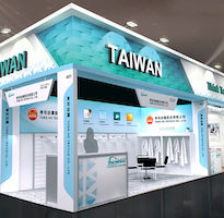
Dong He Textile|Exhibition Visuals for a Shanghai Show
Booth planned on the CIS, aiding overseas entry
A trade-show booth is the brand's first on-site impression overseas. We planned Dong He Textile's Shanghai exhibition booth on its CIS — extending the brand's visuals consistently into three-dimensional space, effectively supporting its overseas market goal.

Shi Tian Cookies|Graphic Visuals for a New Year Box
Vivid, eye-catching seasonal box graphics
A New Year gift box must catch the eye in-store first. For Shi Tian we designed the box with vivid color and fresh graphics, considering ease of opening — higher visual pull among seasonal stacks, turning graphic design into shelf competitiveness.
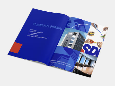
Shun De|A Semiconductor Firm's Profile Catalog
Getting the cover's first impression right
For a semiconductor firm's catalog, the cover is the first hook for target clients. For Shun De's ESG report catalog we designed cover and inner pages — presenting professionalism and technical strength through graphic design, making the catalog a weighty tool for outward communication.
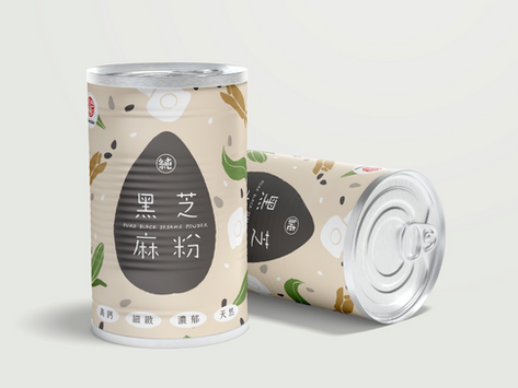
Kai Yi (Zhen Lao Sesame)|Food Packaging Visuals
Material and visuals conveying food reassurance
Traditional food must convey reassurance and quality on the shelf. For Kai Yi's sesame-powder cans we ensured safe transport and storage through material choice, conveying tradition and care through graphic visuals — safe and brand-forward on the shelf.
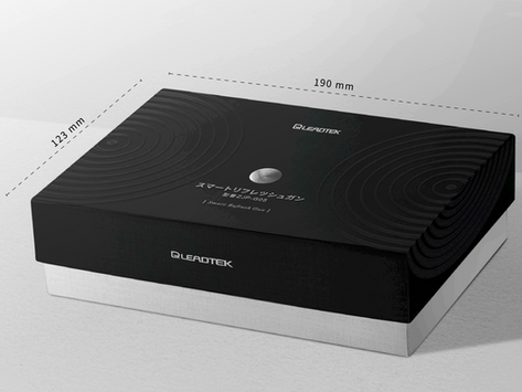
Leadtek|Image Visuals for Tech Products
Streamlined visuals for a high-tech feel
Tech-product visuals must convey professionalism at a glance. For Leadtek's massage gun we designed packaging and image visuals with a streamlined form and a refined feel — a high-tech sense from the frame, supporting its channel position.
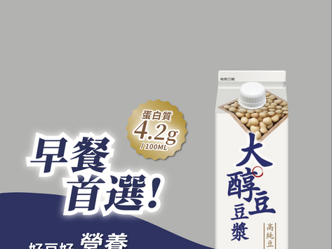
Wei Chuan Soy|Graphic Design for Soy-Milk Packaging
Turning a quality standard into a shelf claim
Food packaging must state its quality claim on the shelf. For Wei Chuan's soy milk we highlighted its high-quality beans and care — turning the quality standard into a claim consumers see at a glance through clear graphic visuals, lifting shelf persuasion.
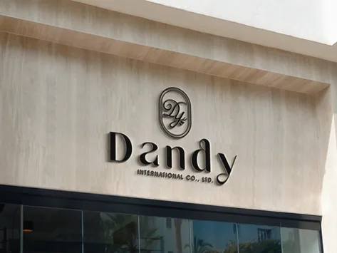
Dandy|Elegant Brand Graphics
An elegant tone through graphic applications
The Dandy brand blends elegance, expressing its core value and image. We designed the brand's graphics and identity on that elegant tone, extending from logo to signage and applications — its character shown consistently across graphic materials.
Our team brings 30 years of industry experience · Trusted by 1,000+ brands · Handled by a senior designer, start to finish
Book a Graphic Design Consultation
Through a consultation, we'll understand your use, brand, and needs before design.