Withstrategicpackagingdesign,establish a clear reason to choose at the point of shelf consideration
Structure, visuals, sampling, and print — one stop, straight to the shelf.
Packaging doesn't wrap a product — it's your brand's salesperson on the shelf, with three seconds to be seen, understood, and picked up. With team members bringing up to 30+ years of experience, and 1,000+ brands trusting Joseph, we run structure, visuals, material sampling, and print in one place — so your package holds up and sells across e-commerce, mass retail, and premium channels.
🔴 This quarter's packaging slots are limited — sampling and print scheduling fill early
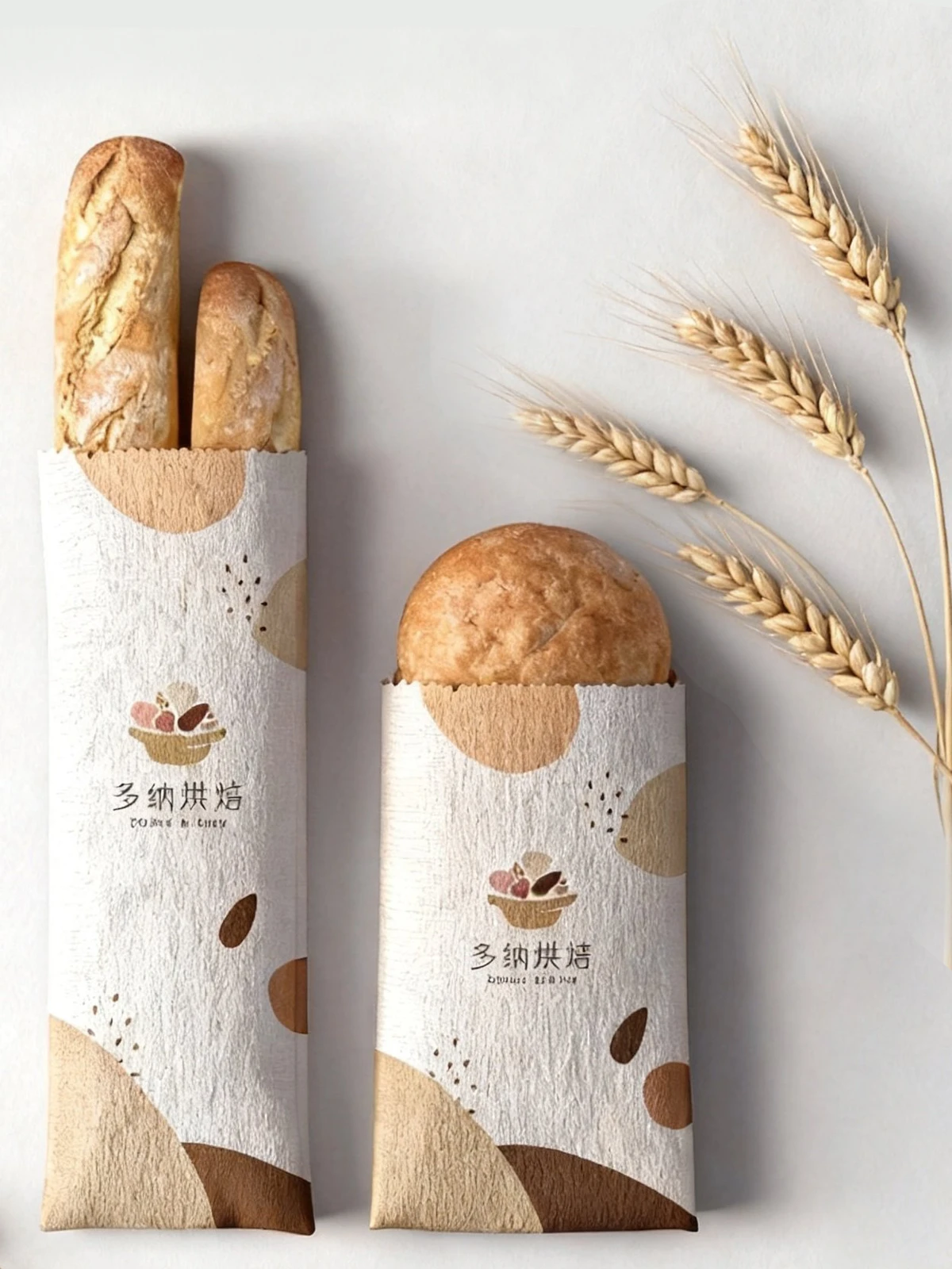
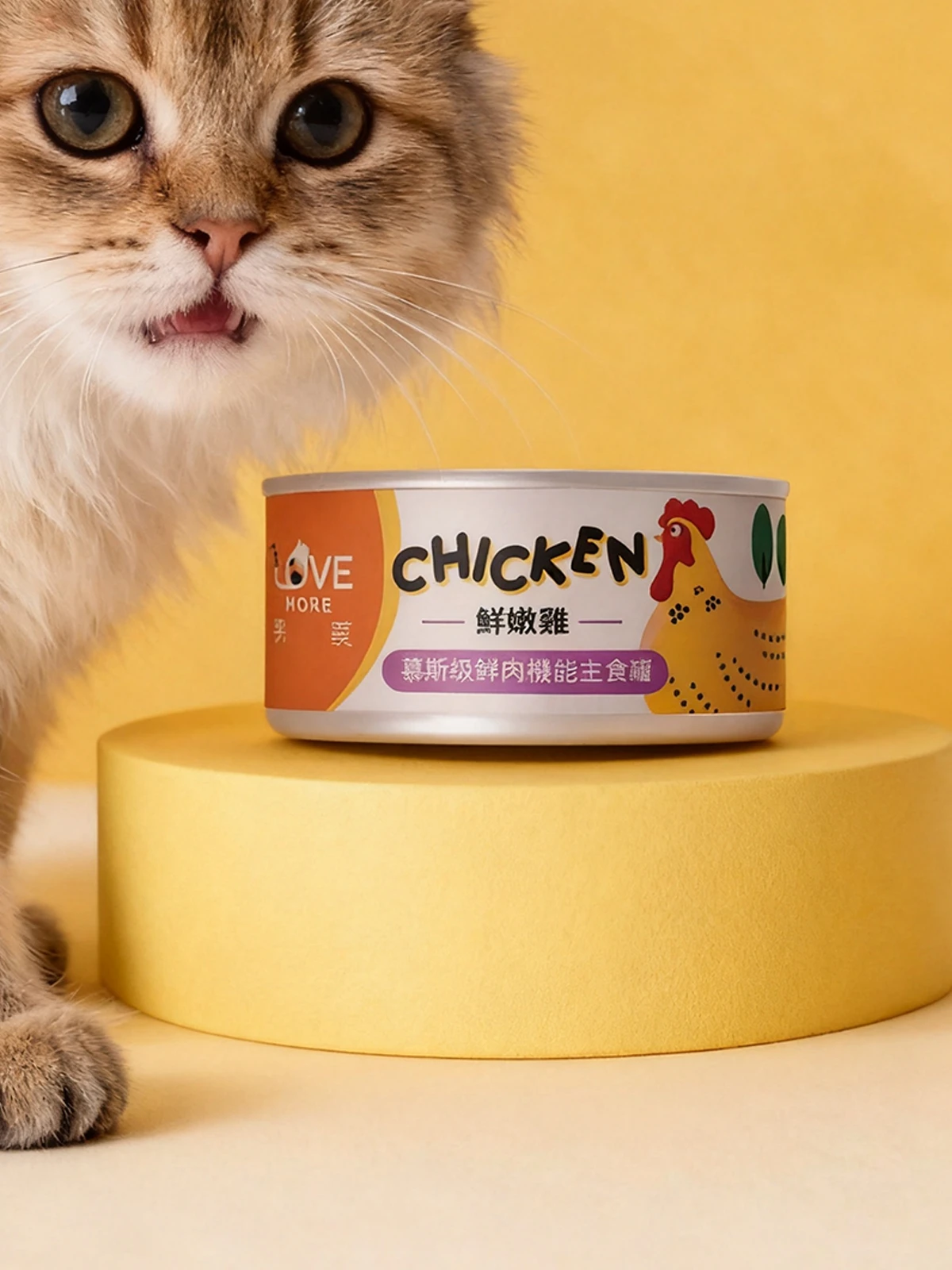
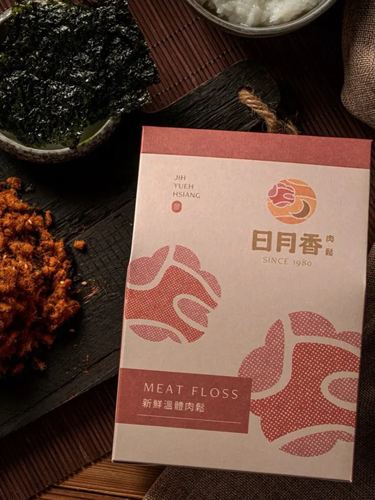
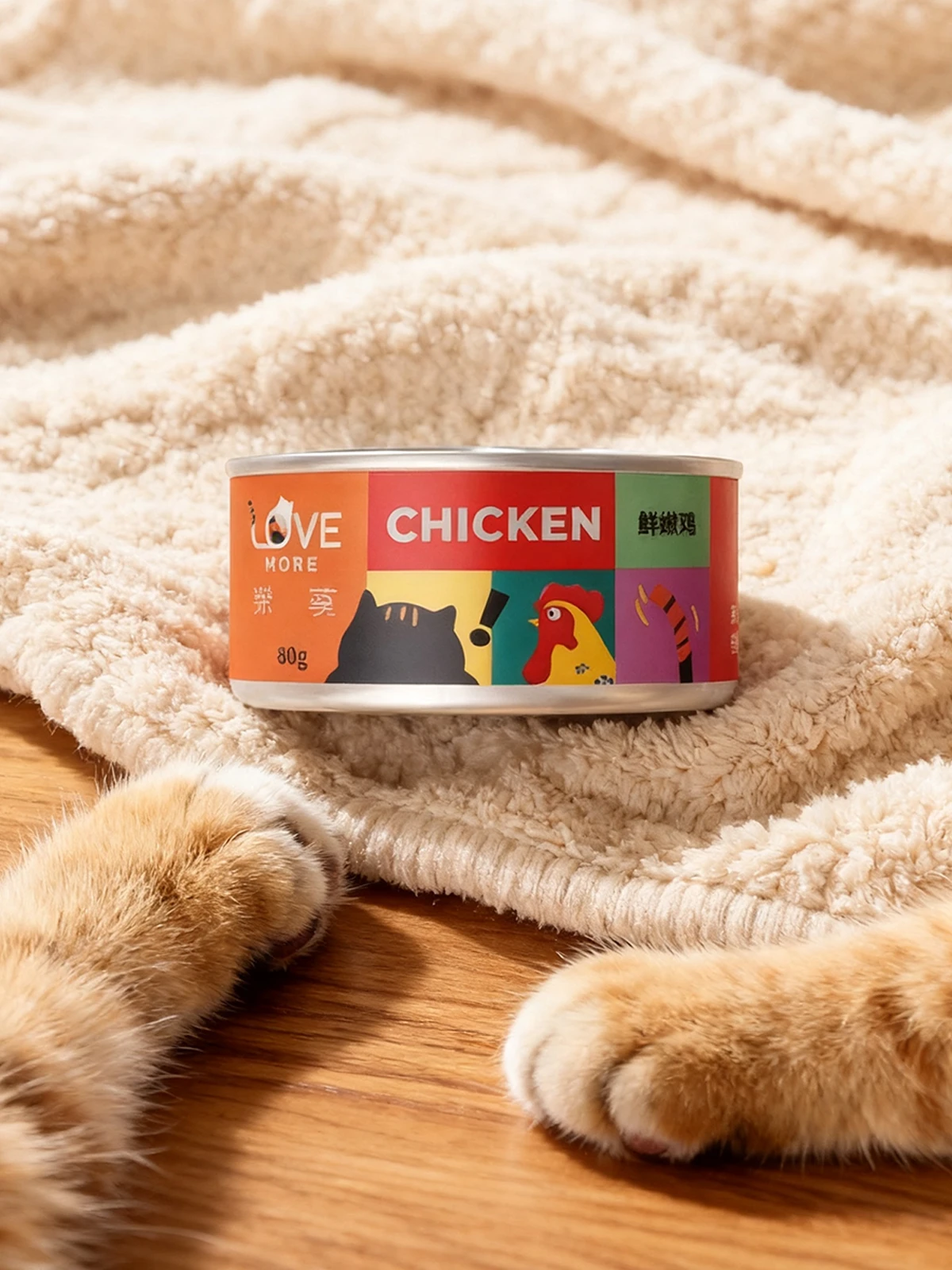
Packaging That Actually Sells Starts From Three Macro Points
Packaging Is the Brand's Voice on the Shelf
At the shelf, customers don't read your website — they glance at the package. So it must carry the brand's position: who you are, who it's for, how it differs from the jar beside it, all condensed onto one box. We return to positioning first, then decide structure and visuals — so every package speaks for the brand.
Packaging Has to Sell in Real Channels
An e-commerce thumbnail, a mass-retail shelf, a premium unboxing — each channel has its own deciding moment. With team members bringing up to 30+ years, 1,000+ brands, and five sectors of experience, we anticipate the channel challenge while designing: will the thumbnail blur, will it drown on the shelf, does the material justify the price tier.
Packaging Should Extend Into a Whole Line
When one package sells, the next is a second flavor, a gift edition, a seasonal version, an e-commerce bundle. We plan from a structural and visual system so extensions don't restart each time — materials, die-lines, and templates carry over, and the brand grows tidier on the shelf.
Hire a vendor and you get a pretty box. Work with Joseph and you get a packaging system — designed from the brand, market, and future to sell for you on the shelf.










Three Things Most Studios Skip — But You Should Demand
Structure, Visuals, Print — One Stop
Many studios hand you a flat artwork and leave die-lines, materials, sampling, and print for you to chase. We run structure, visuals, sampling, and production in one place — no translating back and forth between design and printer, saving time and closing the gaps where errors hide.
Channel Experience, Not Just Looks
A good-looking package doesn't always make it to the shelf. With team members bringing up to 30+ years of experience across five sectors, we know the rules of e-commerce thumbnails, mass-retail shelves, and premium displays — anticipating size, material, and merchandising so the package actually ships and sells.
A Senior Designer, Start to Finish
From brand diagnosis to print sampling, one senior designer works with you throughout — not a junior credited as senior. Every requirement on material, color, and structure reaches someone who truly understands production.
Our Team's 30 Years of Work, Results You Can See
From manufacturing to F&B, medical, and global brands — 1,000+ companies trust our design capabilities

普利司通
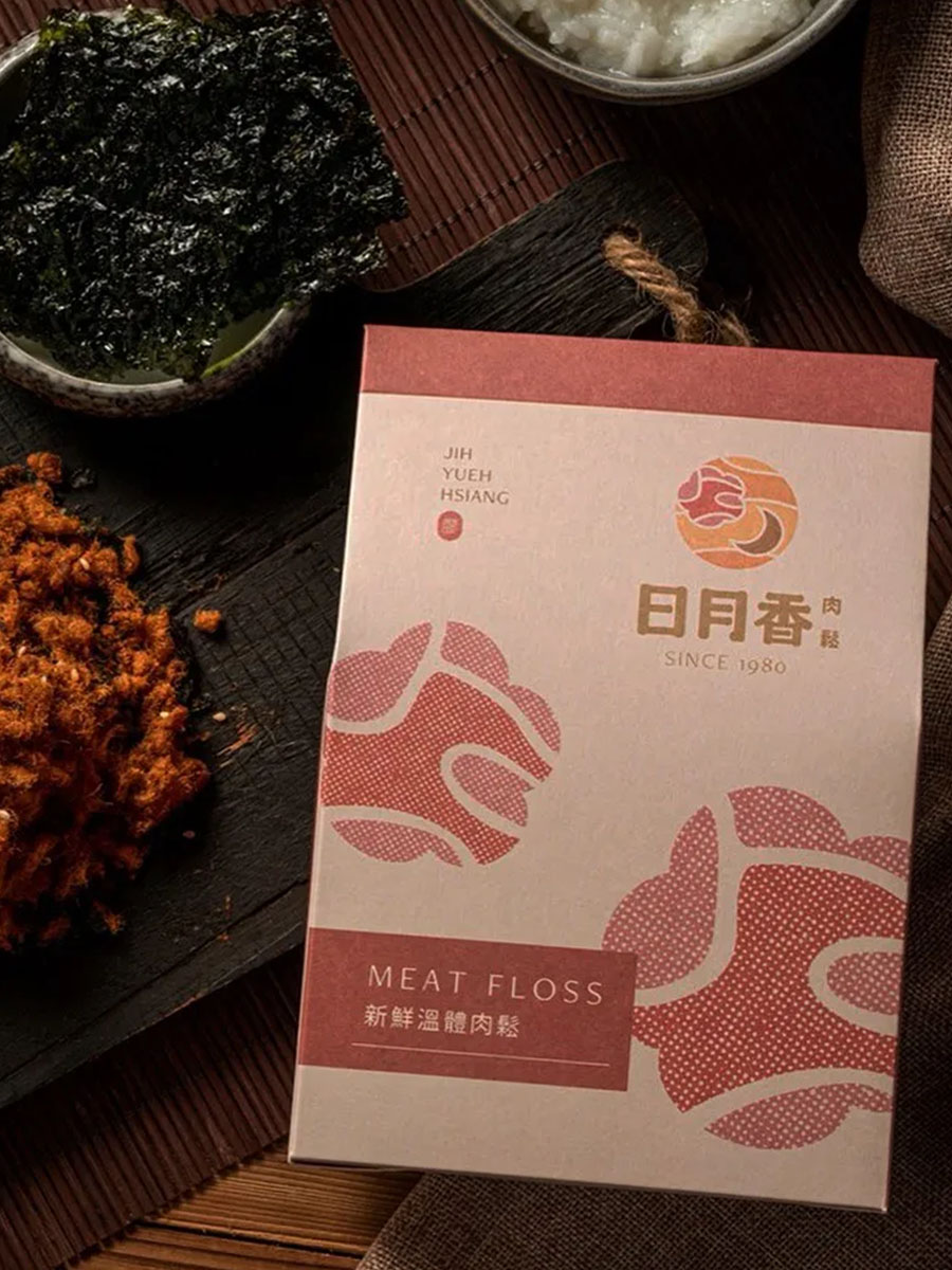
日月香肉鬆
View case →
多納烘焙
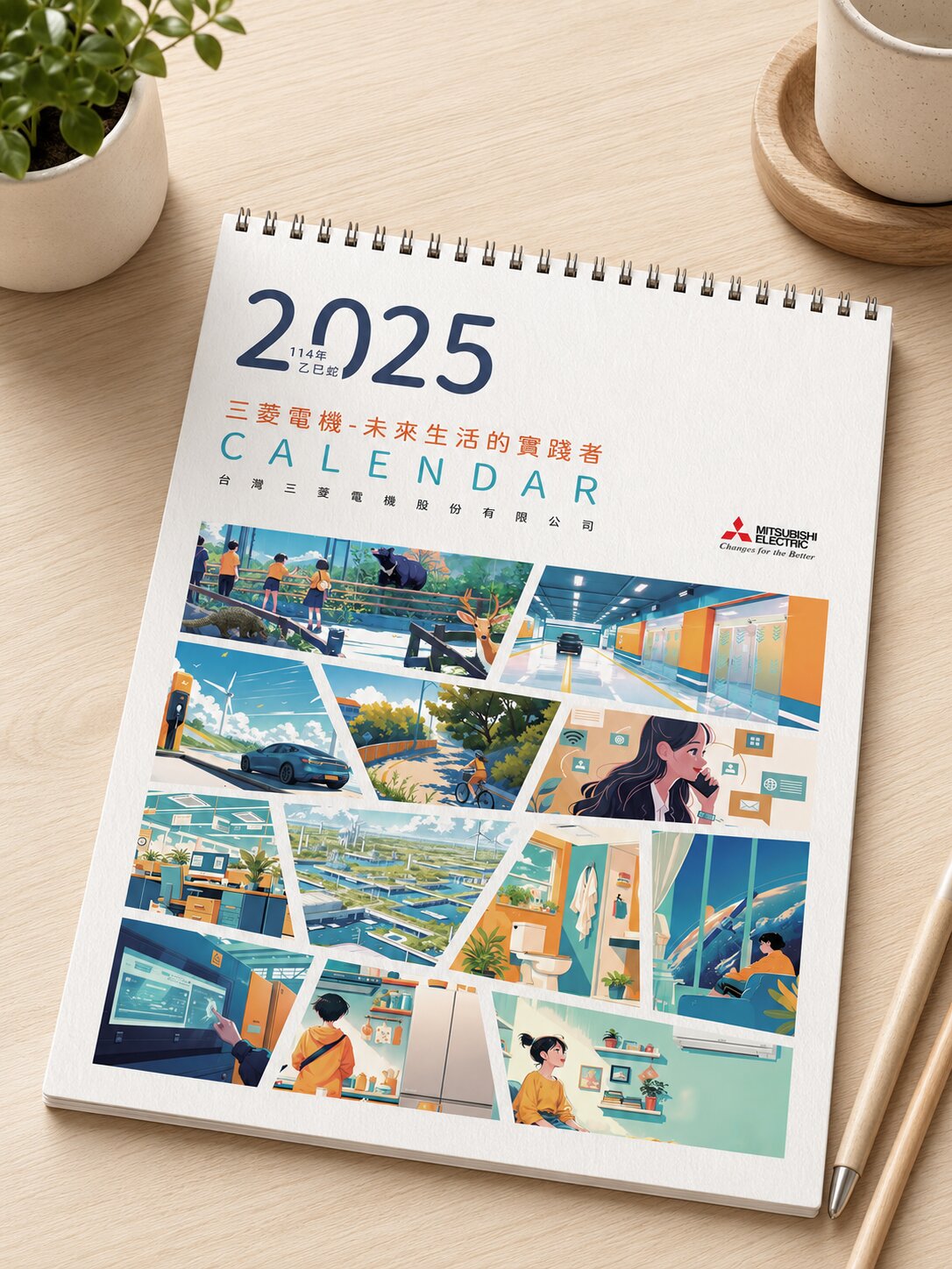
三菱電機
AURZ
View case →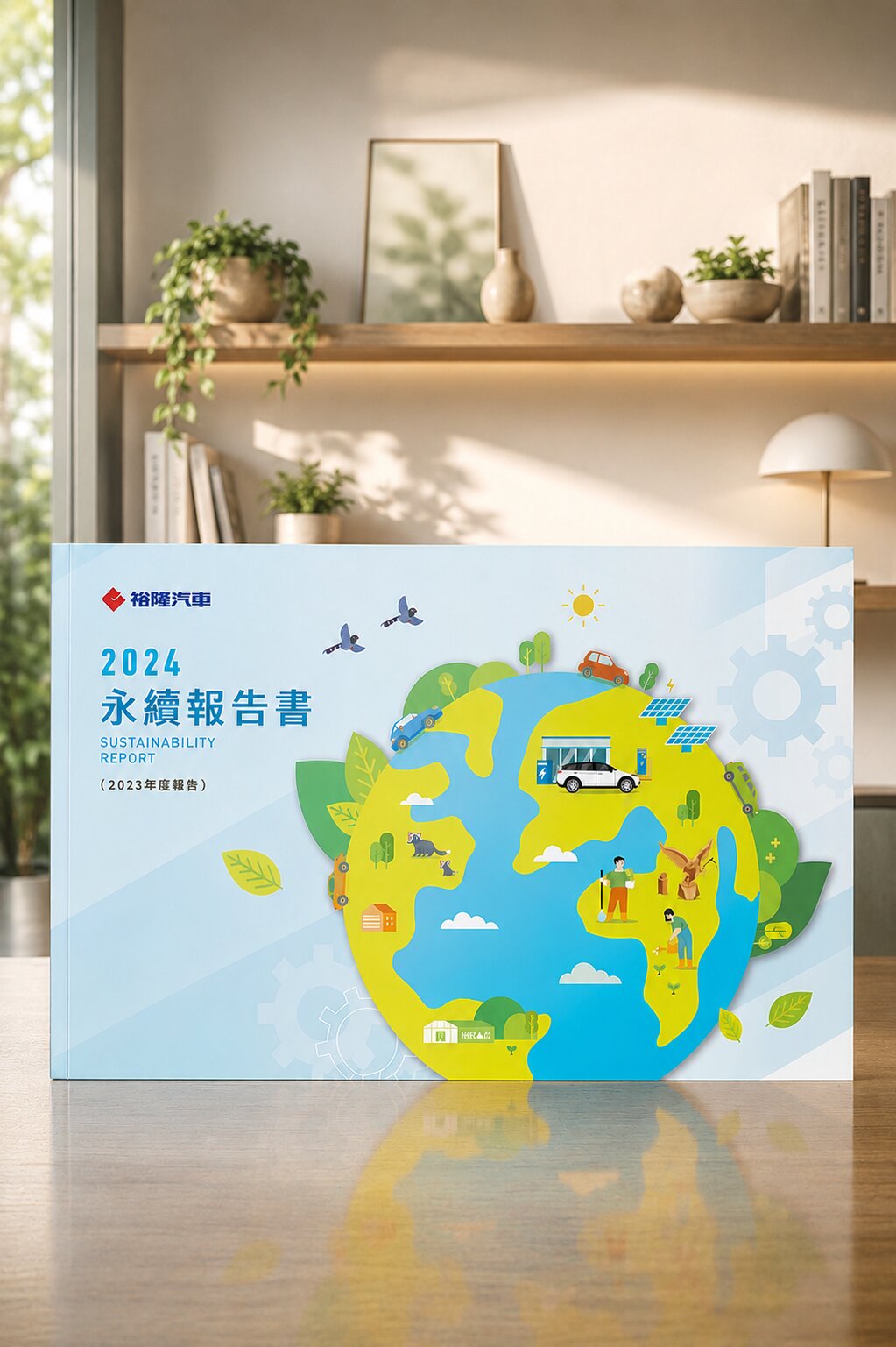
裕隆汽車
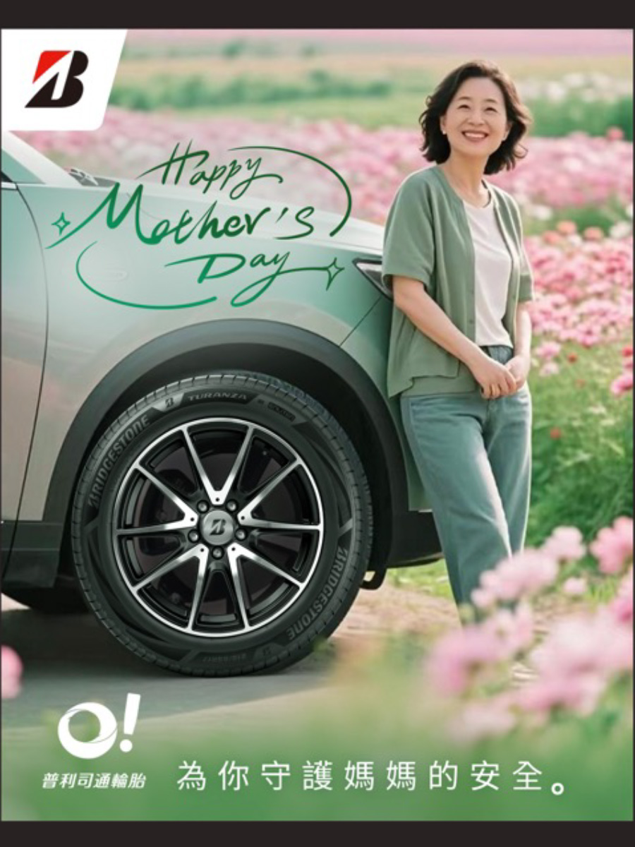
普利司通
禾善堂
The Right Packaging Approach for Your Stage
Different stages need different packaging focus. See which one fits, and we'll confirm the right scope together.
Scenario A: A New Product Needs to Stand Out
- A new product entering e-commerce or retail — packaging that gets seen and picked up
- For: F&B, skincare/health, first launches from new brands
- Recommended: structure + visual design + material sampling
Scenario B: Gift & Seasonal Need Premium Feel
- Seasonal or gifting moments — unboxing and premium feel that justify the price
- For: tea, bakery, gift items, anniversary boxes
- Recommended: gift-box structure + visuals + print finishing
Scenario C: A Whole Line Needs Consistency
- Multiple flavors, SKUs, or channels — an extensible yet consistent packaging system
- For: product lines, multi-brand groups, multi-channel distribution
- Recommended: packaging visual system + die-line & template guidelines
From Consultation to Production — Every Step Has a Deliverable
Brand & Product Consultation
Understand positioning, target channel, and price tier to set the packaging task
Structure & Die-line Planning
Plan box structure for protection, display, and cost
Creative Visual Design
Develop visuals from positioning for three-second shelf recognition
Material & Sampling
Select materials and sample to verify feel and print before mass production
Print Production
Supervise printing and finishing so production matches the design
Channel & Shelf Guidance
Provide merchandising and e-commerce thumbnail guidance
What Our Clients Say
Structure to print, one team — no relaying between designer and printer. The sample was right the first time and our launch timeline was cut in half.
F&B Brand Client
Structure · Visual · PrintOnce the unboxing experience was right, repeat and gifting customers clearly grew — the feel genuinely justifies our price.
Tea Gift Brand
Gift BoxThey know the shelf — flagged thumbnail and material issues we'd missed. On the shelf, it stood out against similar brands right away.
Health Brand Client
Retail ChannelTeam's 30+ Years · 1,000+ Brands of Packaging Work
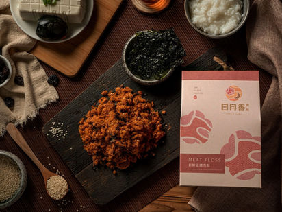
Ri Yue Xiang|A 40-Year Shop Reaches the Gift Shelf
Packing "honesty" into a giftable brand
A Taoyuan market stall for over 40 years, still using local warm pork, made before dawn, no additives. We turned that honesty into packaging — warm texture keeping the shop's trust, plus a gift-box structure ready for shelves and gifting — from market stall to retail and gift occasions.
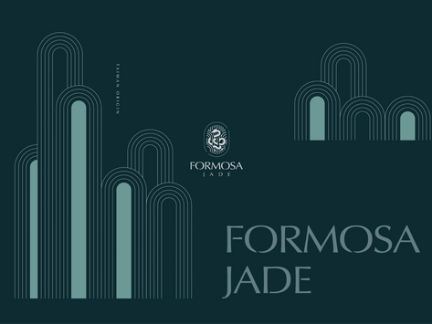
Formosa Jade|Premium Packaging That Speaks for Real Jade
A brand and packaging born from a fake jade
Formosa Jade's founder watched a jade-loving mother buy a fake on her first purchase — the origin of a brand speaking for real jade. We brought that trust into the packaging: refined Eastern texture and a premium structure crafting an unboxing where authenticity is felt each time.
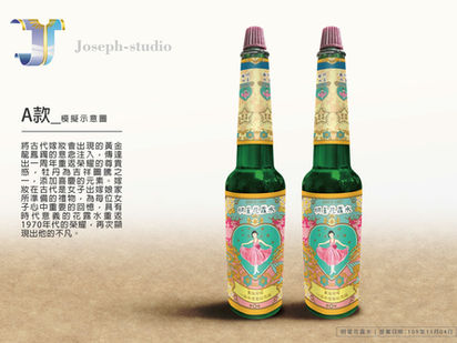
Astar Florida Water|An Anniversary Box for a Century-Old Brand
A century of heritage in one commemorative box
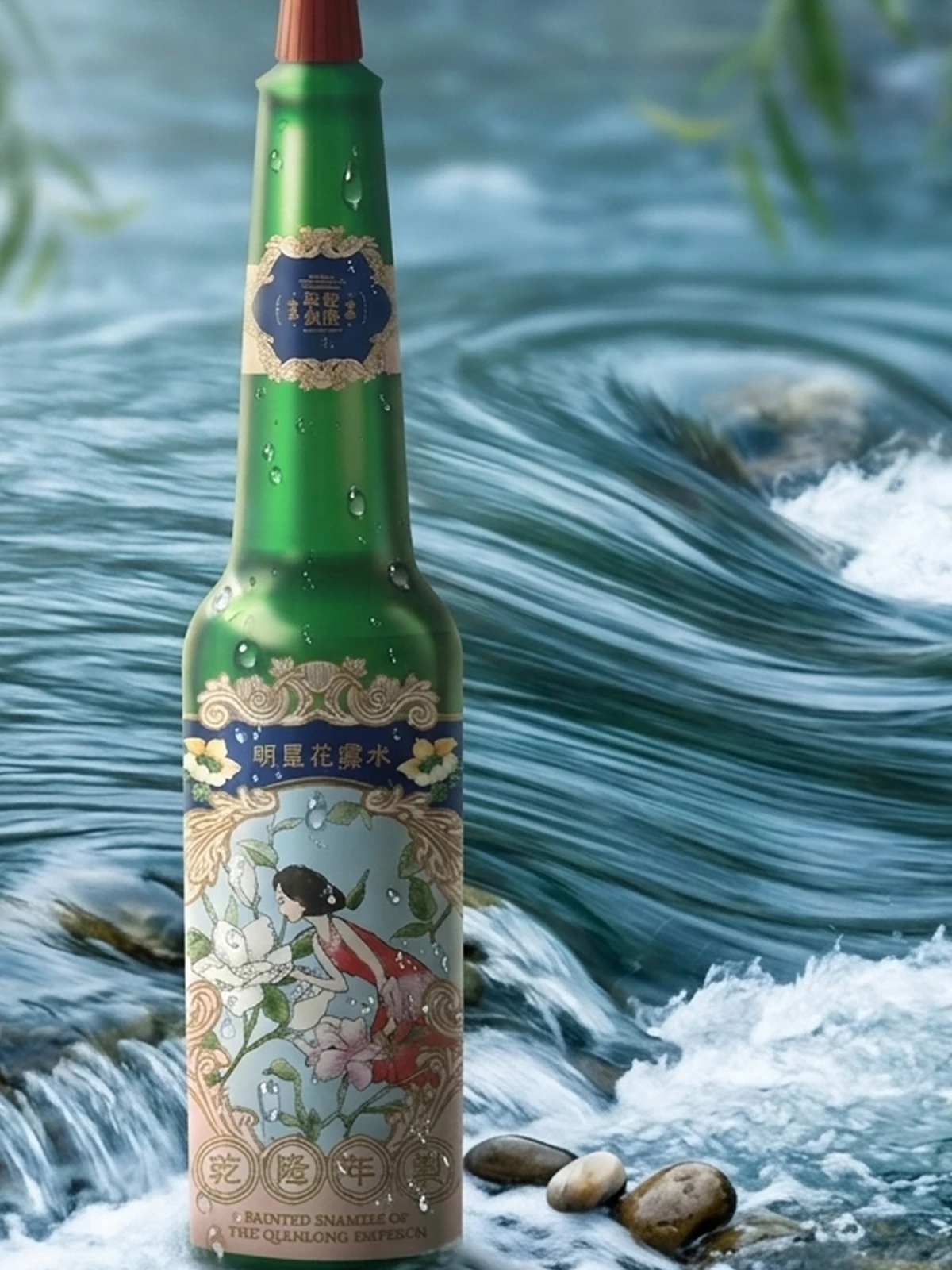
Astar Florida Water has been made for over a century since 1907, with 6,000 bottles a day still in short supply. The anniversary box had to turn that heritage into something worth keeping today. We honored the classic without aging it — visuals and a box structure that make a century-old brand's commemorative value collectible.
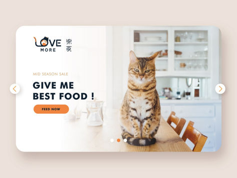
Le Mo Cat Food|Winning the Shelf on Transparency
Clear labelling to AAFCO standards
Le Mo's two cat-owner founders entered the market because of their own pets. Seeing unclear labels on imports, they made "transparency, to AAFCO standards" their differentiator. We turned that into packaging that makes reassurance visible at a glance, consistent from identity to pack.
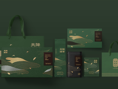
Tian Jiang Zhen Xiang|Packaging for Local Tea Farmers
Making "locally grown" a claim on the pack
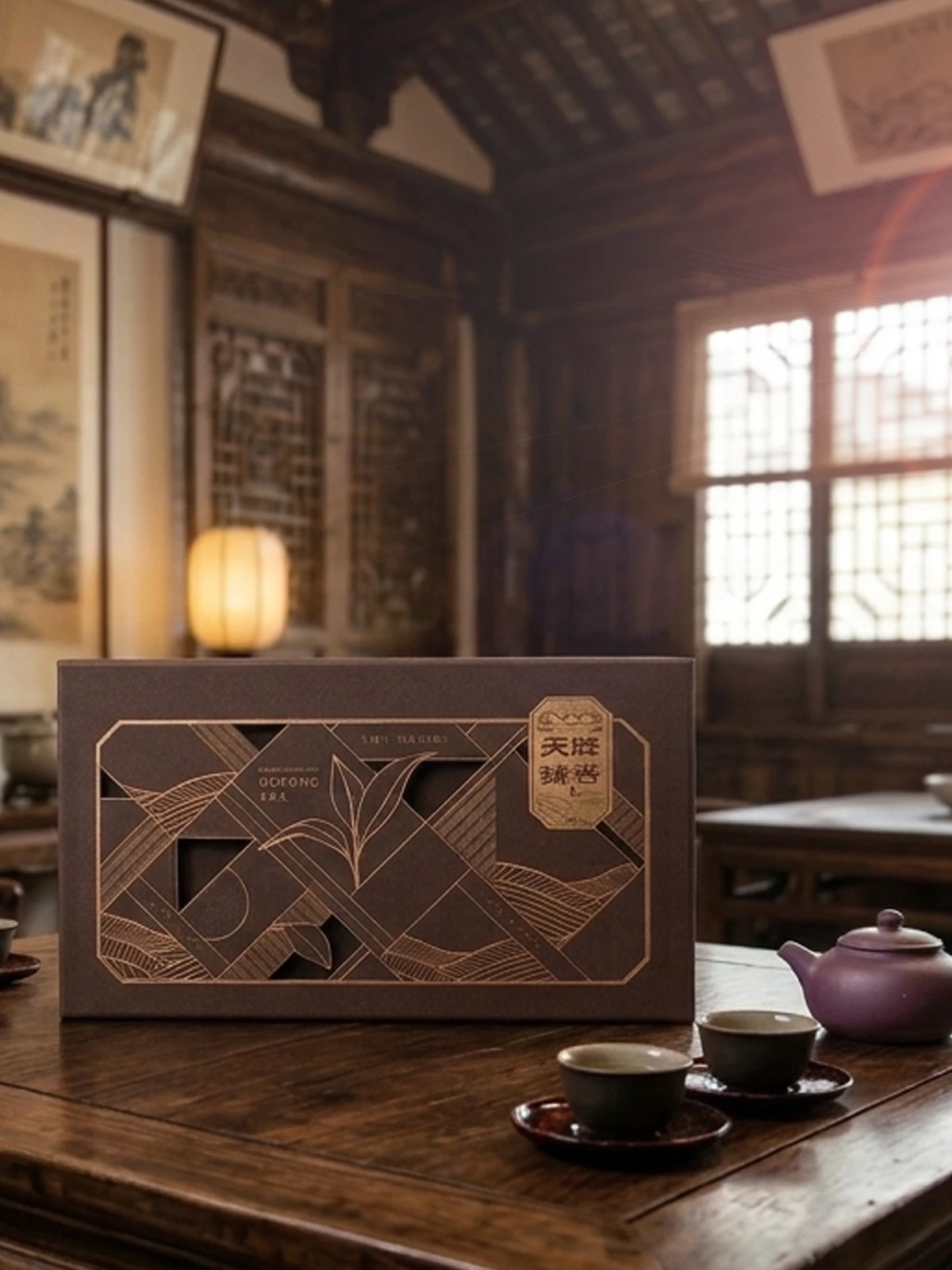
Most bubble-tea leaves in Taiwan come from Vietnam; Tian Jiang Zhen Xiang is among the few local farmers. Believing the farmer's only resource is the leaf itself, the packaging had to state that local commitment. We built an earthy yet refined pack, gift-box, and tea-bag system that makes local value the shelf differentiator.
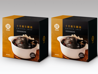
Sheng Chang Old-Food|Packaging for a 74-Year Pharma
A rare old pharma with brand thinking
Sheng Chang is a pharma of over 74 years, rare for its brand thinking. To move herbal chicken soup out of the medicine cabinet and into everyday food, packaging is the turning point. We designed packs that balance trust and everyday warmth — translating an old pharma's expertise into a daily choice you'll pick up.
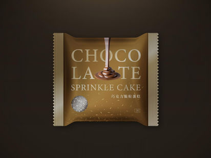
Hi-Life|Convenience-Store Bakery Packaging
Image packaging amid store transformation
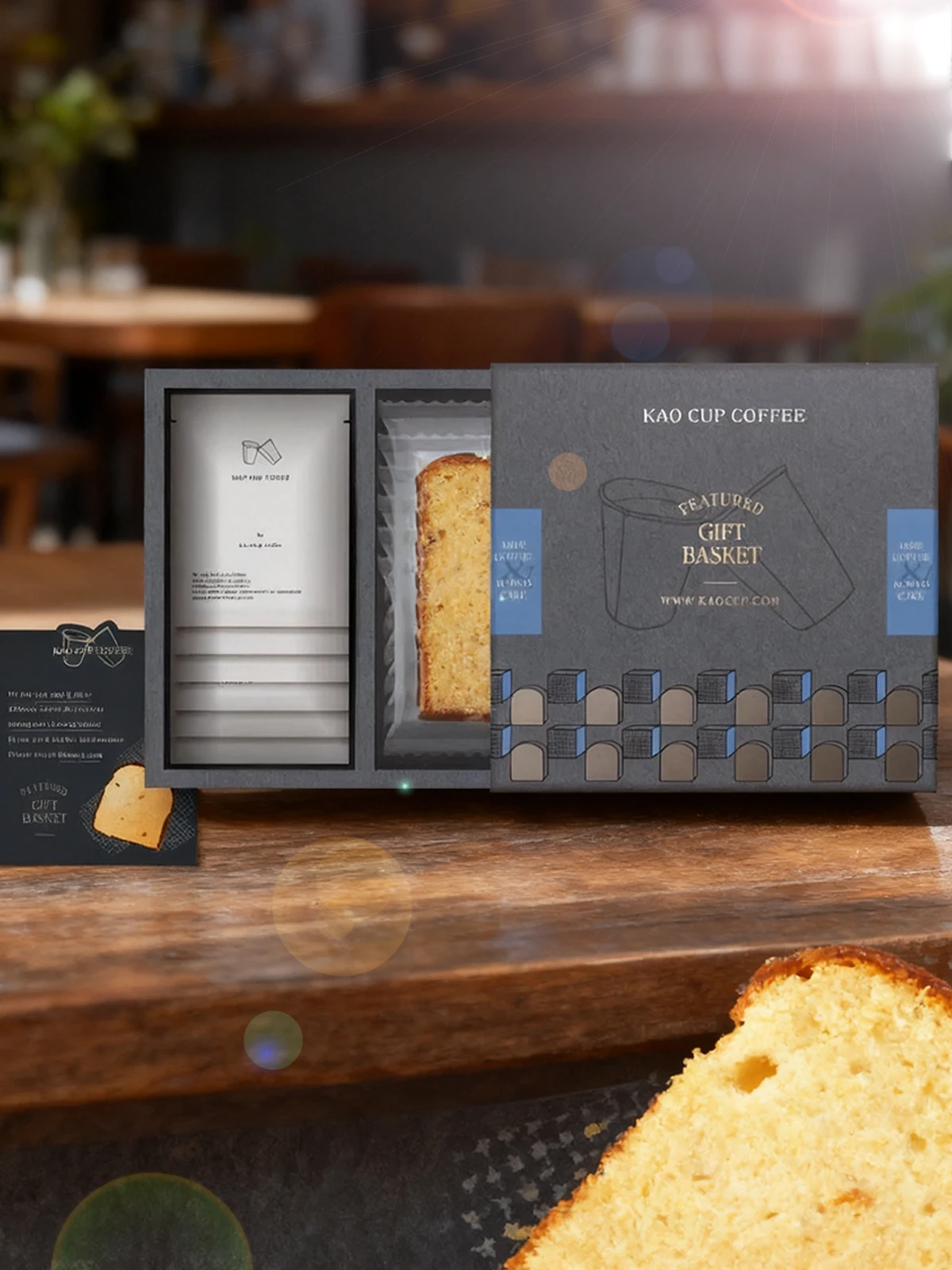
As convenience stores transform and delivery rises, customers have more choices and private-label image matters more. We designed Hi-Life's bakery packaging to balance shelf recognition with brand consistency — giving private-label products a clear brand face in the store channel.
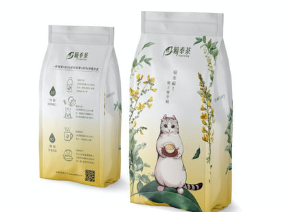
Mao Feng Cha|A Local Tea Brand Born Amid a Pesticide Scare
Building trust as the differentiator on the pack
Loosened pesticide-residue standards on imports hit tea farmers hard in an uneven market. Mao Feng Cha was born in that context, with trust as its core message. We built identity through a warm pack, sticker, and coaster system — making trustworthiness its market differentiator.
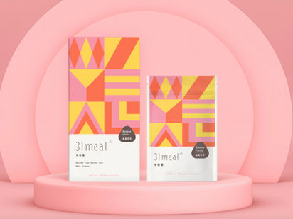
31MEAL|A Packaging System for a Meal-Replacement Brand
Simple health, replacing one of three meals
31MEAL, a JPAST brand, replaces one of three meals with simple health. A functional meal replacement earns shelf credibility through clean, trustworthy packaging. From positioning we built a lite CIS and meal-pack system so the convenient-and-healthy promise lands consistently across SKUs.
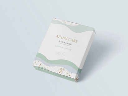
AzureCare|Packaging Grown From the Name
Azure × Care — a positioning in the name
The mask brand's English name is AzureCare — Azure for an open, expansive blue, Care for nurture. With a clear naming position in place, we extended that imagery into the packaging visuals, so the sense of azure and care reads at a glance on the shelf.
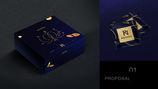
ROZNEL|Packaging for Beauty-From-Within Drinks
"True beauty comes from within"
ROZNEL believes true beauty comes from within, developing beauty drinks for lasting youthfulness. We turned that claim into packaging that conveys the beauty-from-within promise on the shelf, consistent from logo and pack through to the website.
Our team brings 30 years of industry experience · Trusted by 1,000+ brands · Handled by a senior designer, start to finish
Book a Packaging Consultation
Through a packaging diagnosis, we'll understand your product, channel, and price tier before design.