Technology
Nationwide Remote|Digital Projects, Standardized
Any city — digital upgrades done right
#Remote#Nationwide
Brand design and marketing work from our team's 30+ years and 1,000+ clients — browse by industry to see how we solve different brand challenges.
140+
Case Studies
1,000+
Clients Served
30+
Years Experience (Team)
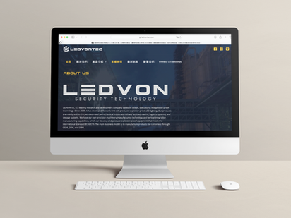
Establishing professional presence online first
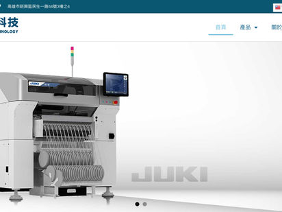
Clear content is the prerequisite to being found
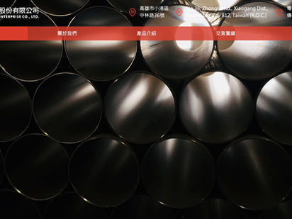
Structuring the product line so buyers find it
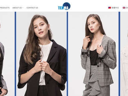
Letting international clients assess you online
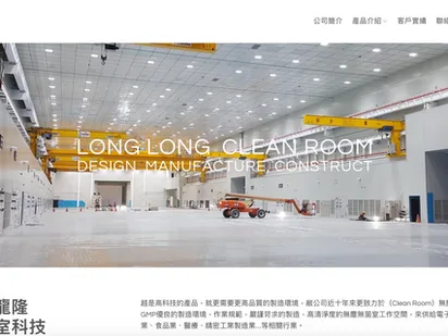
Building digital authority with complete content
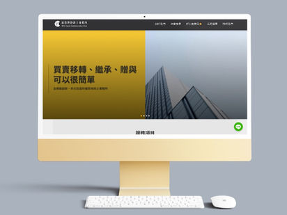
Clear professional content AI is readier to cite
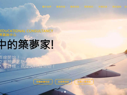
Structuring courses and expertise
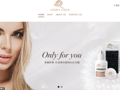
Brand story is content AI can read too
Any city — digital upgrades done right

Two tracks — no sacrificing rankings for AI

We did it on ourselves before teaching you
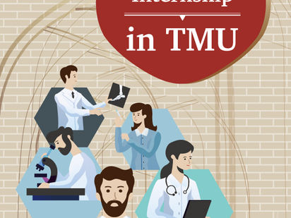
One key visual extended to poster and banner

Banners that route prospects into enrollment
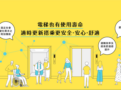
A clean slogan with clear type

Bold type and high contrast for the message

Bringing traditional craft online
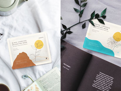
Consistent visuals from packaging to banner
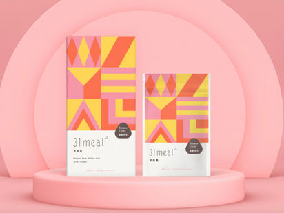
A consistent ad language of simple health
Consistent extension from brand to banner
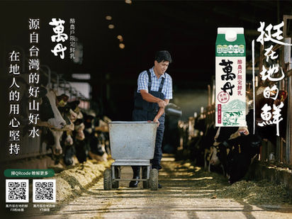
Making health and freshness the ad focus
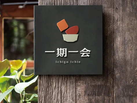
Extending the brand spirit across visuals
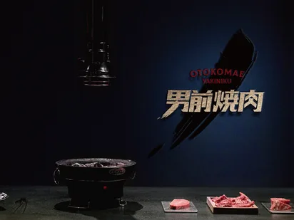
From CIS to ads and promotion

Starting from one belief — justice — to find differentiation for a construction firm
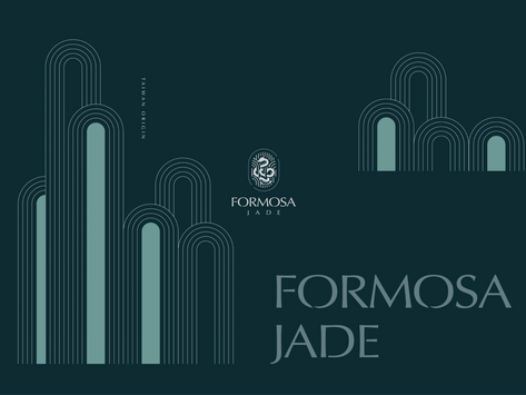
"Speaking for real jade" became the brand's most powerful differentiator

Standing firm in a crowded finance market on "agile, close, professional"

Not a mark — a full identity system that conveys industrial trust
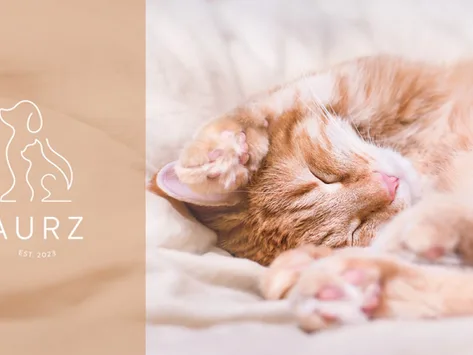
Differentiation lives in emotion — the bond between people and their pets

Not lodging — a destination for experiences
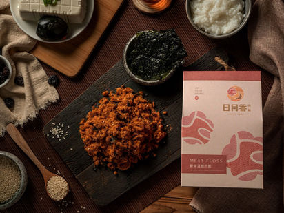
Turning "honesty" into a brand asset the next generation recognises
One core image — every touchpoint speaking with one voice
Core values and image fully aligned — making the identity persuasive
A colour language that builds health trust — the right message at first glance
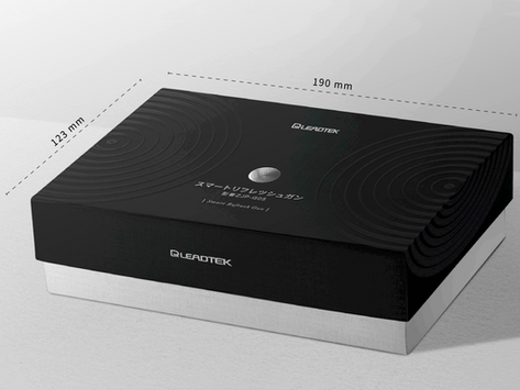
Tech brand recall is built on a consistent image system
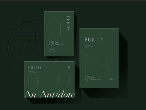
Clear positioning plus consistent visuals — how a skincare brand gets remembered
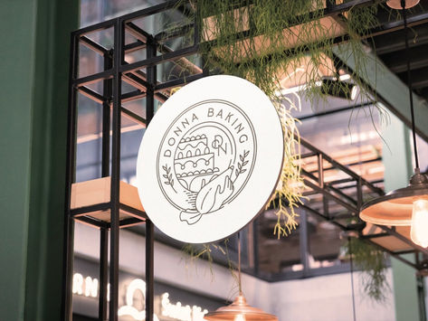
A bakery's atmosphere planned end-to-end — from identity to gift box
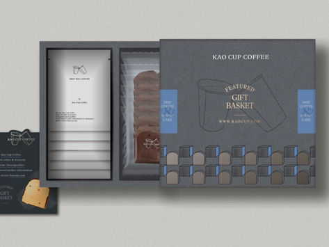
From positioning to gift box — an image system people remember

Consistent from mark to office stationery
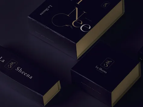
A distinctly recognizable fashion identity
Sword and speed symbolizing the sport's spirit

An identity conveying international professionalism

Clean, clear, and memorable
A new name grown from a Chinese idiom — the spirit of the rebuilt brand
"For answers, find Answer" — the name is the positioning claim
Three letters unifying the naming logic of a vast service
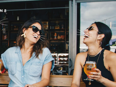
Short, charming, and pronounceable across languages
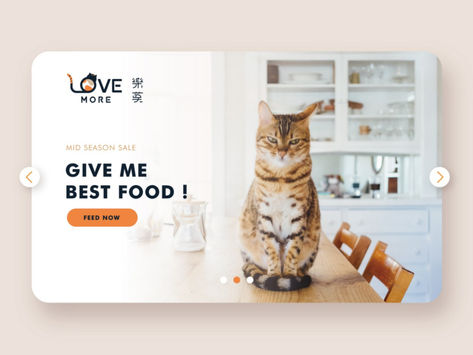
A clear-labelling strategy to AAFCO standards

Turning faculty and heritage into a readable journal
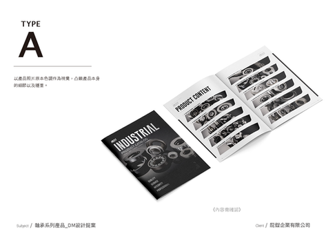
Turning bearing expertise into a credible catalog
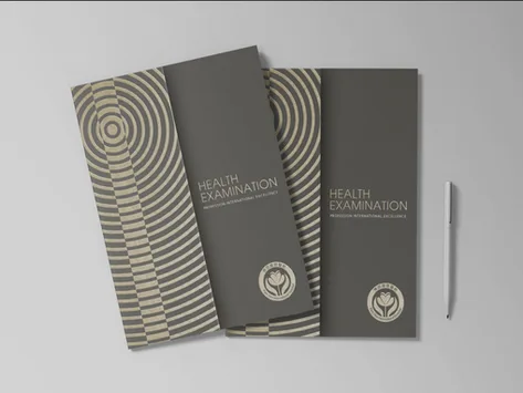
Six centers of excellence into one trust
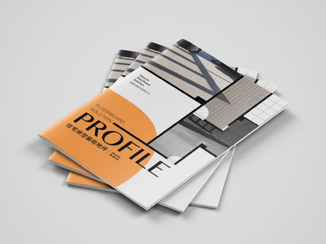
Born from a generation gap in flooring
Pioneering patents that must be made clear
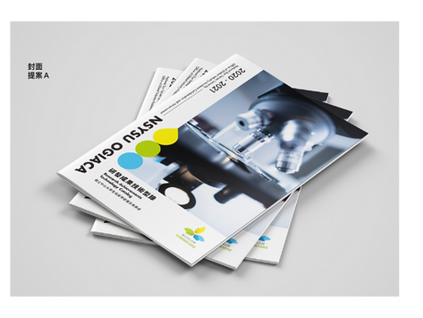
A mission of leading industry-academia, on paper
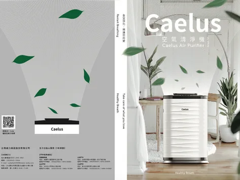
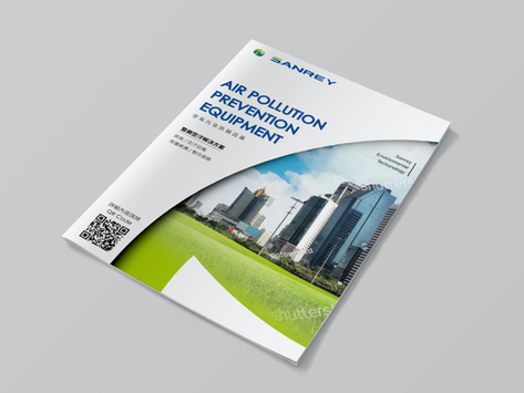
Making "energy-saving" a clear selling point
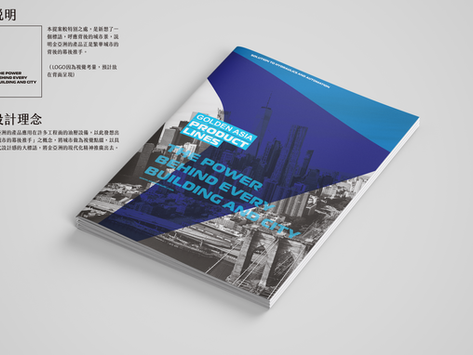
A visual language of seamless tube and chrome shaft
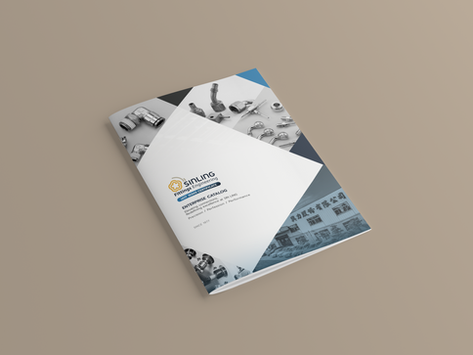
Product content in print and digital together
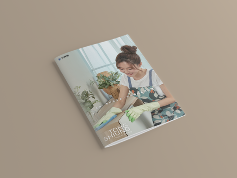
Highlighting versatility across scenarios
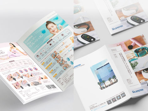
A layout that reflects industry standing
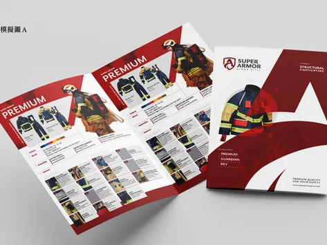
Clear layout makes pro gear understandable
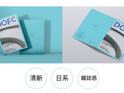
A clean layout that signals technology
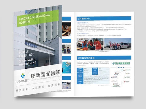
Trust in a medical brand starts with the brochure
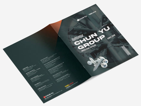
From catalog to magazine and exhibition
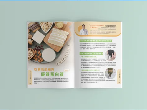
Keeping the brand's freshness through cover and layout
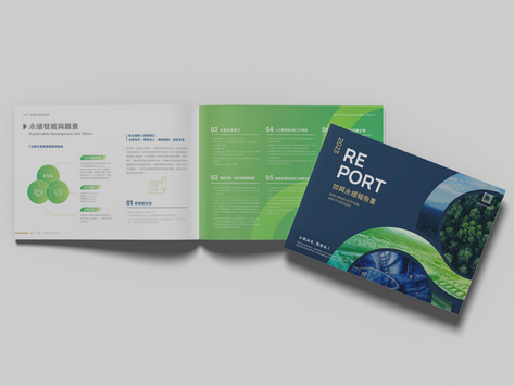
Organizing a listed firm's scale clearly

Stationery that continues the firm's gravity
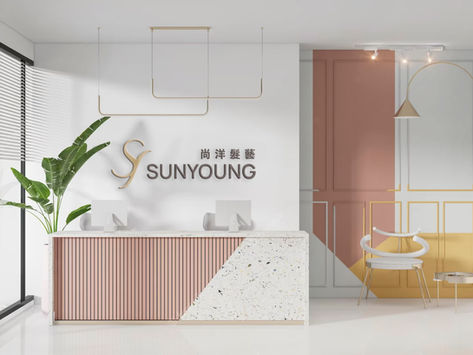
Refreshing the card alongside a new identity
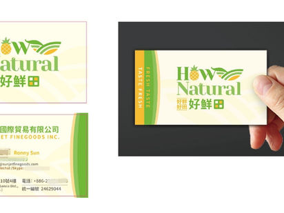
The card as one piece of the whole visual
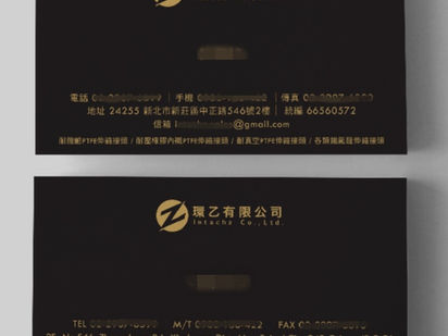
Extending a corporate brand to the card
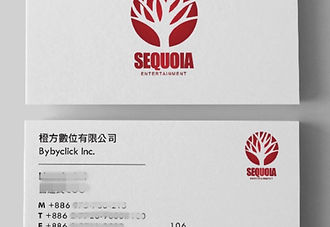
A group-scale identity, landed through the card
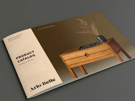
Wood-texture cover conveying natural materials and a premium feel
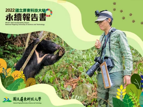
Design language carrying the university's sustainability commitment
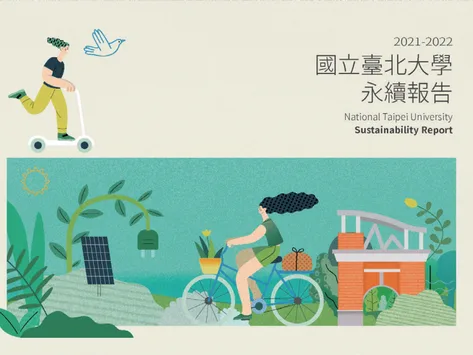
A design standard for academic institution ESG publications
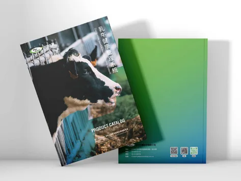
Consistent brand colour and trustworthy feel throughout the catalog

A biotech brand's sustainability commitment expressed through design
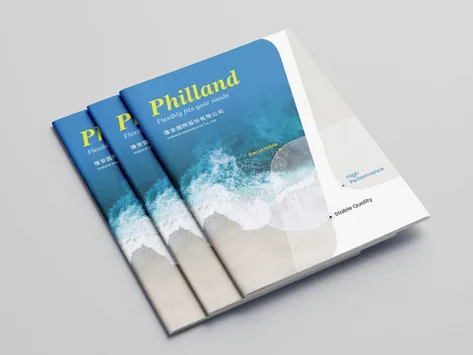
Full brand extension from cover to table of contents
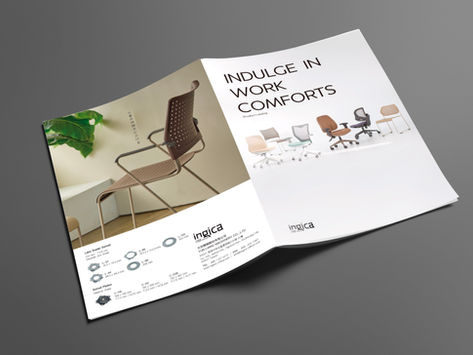
Scene imagery making the chair's versatility across spaces immediately clear

Consistent trust conveyed across different markets
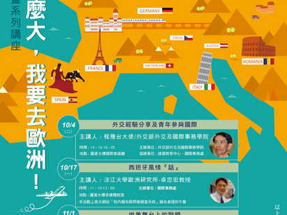
Campus promotion: messaging to visuals in one plan

A mermaid image connecting with Asian female consumers across markets
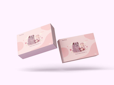
A packaging strategy balancing professional trust and Chinese regulatory requirements

A compound strategy where KOL word-of-mouth and ad placements reinforce each other
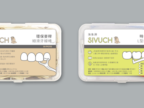
Transitioning from Taiwan manufacturing to cross-border brand packaging

Integrating baseball elements into food packaging sticker design
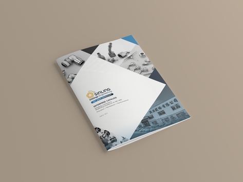
Converting industrial spec data into a readable digital catalog
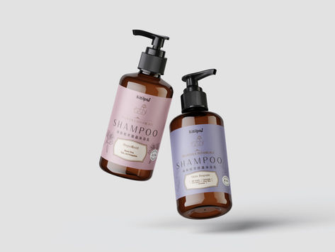
Differentiating a biotech brand on shelf through colour and label design
Build the compliance foundation before Baidu can see you

What Chinese users search is fundamentally different from translated Taiwan terms
Zhihu and Baidu Baike give the brand more entry points in the search results page
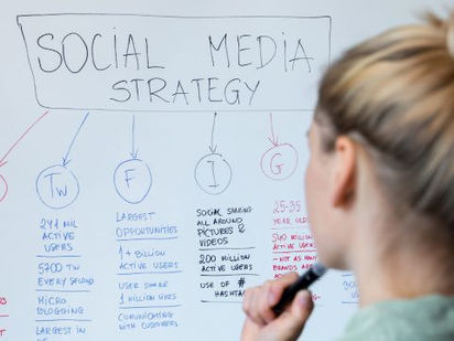
Clarifying strategy before entry is more efficient than fixing it after launch
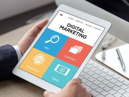
Without data, you don't know which keywords actually drive enquiries
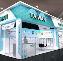
Booth planned from the CIS to clearly communicate brand positioning to overseas buyers
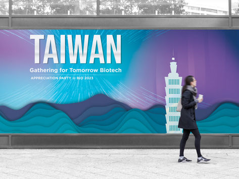
Consistency from corporate identity to all exhibition materials
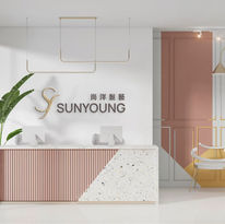
Starting from brand objectives, making the space a sales partner

Conveying premium through a malt-extract image
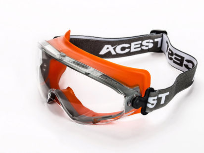
Capturing protection and sporty style in one frame
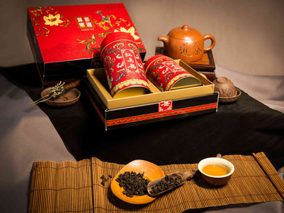
Making humble produce look appetizing with a local feel
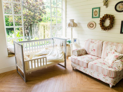
Light that communicates safety and quality
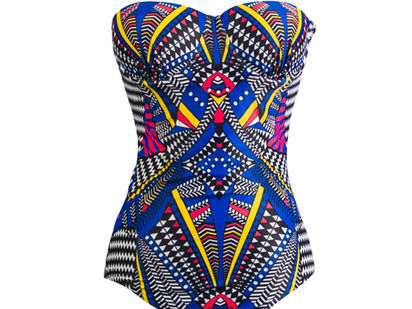
Worn shots composited into a 3D display — no live model
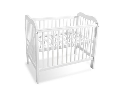
Background removed, product form and shadow preserved
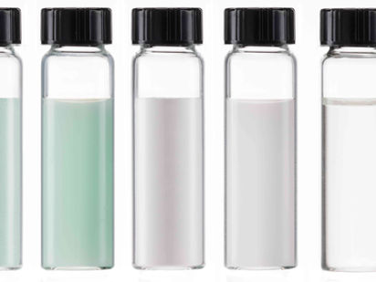
Captured assets feeding directly into design and print
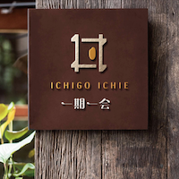
A complete identity system from brand name to every touchpoint
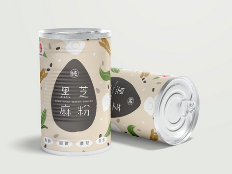
Packaging that conveys trust in traditional craftsmanship
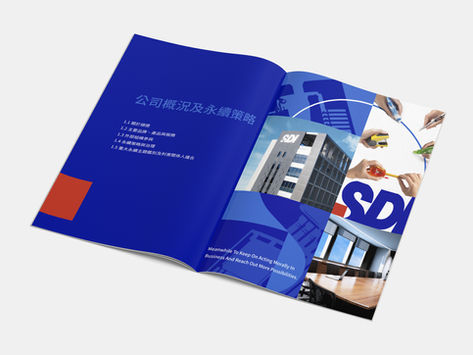
Complex ESG data designed into a clear, readable annual report

Packaging visuals that communicate high-purity soybean quality

A gift box design that balances visual appeal with ease of use
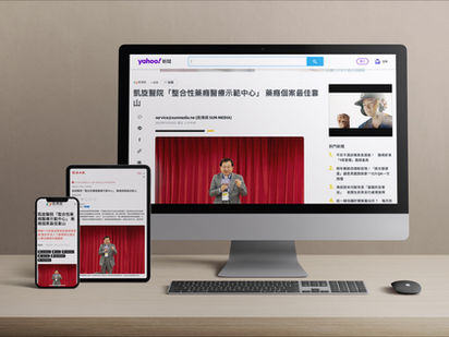
Medical advertising that balances professional trust with reach efficiency
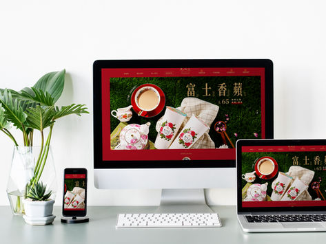
Turning brand atmosphere into reachable digital ad creative

Turning ingredient benefits into an EDM pet owners open and read

Creating a clear reading experience for technical products
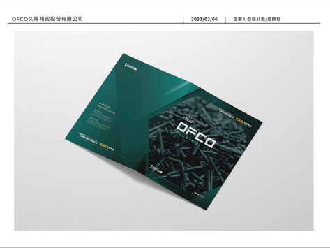
Making precision manufacturing visible in exhibitions and catalogues
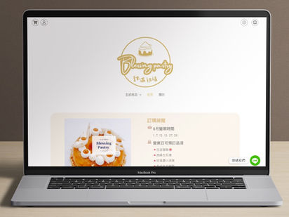
Letting the story behind every pastry speak on the page
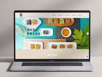
The texture of traditional craft transmitted accurately through digital visuals
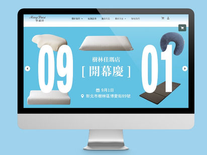
Bringing the "restful sleep experience" into the homepage through visual language
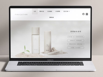
Cedar green and apricot orange conveying the trust of natural ingredients
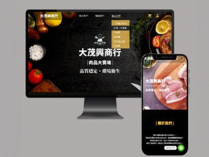
High-resolution product imagery transmitting freshness and quality
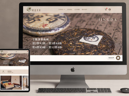
Visual style reflecting the elegance and depth of tea culture

Recruitment visuals that state a program's value
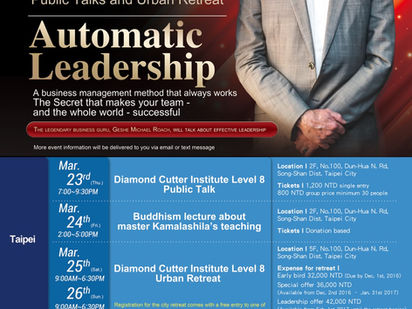
Making a lecture's message read on the poster
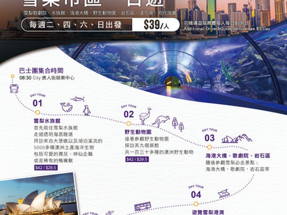
Imagery that sparks the urge to travel

Graphics conveying corporate image and values
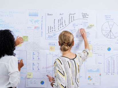
Clarity in planning — execution with rationale, results with context
Launch campaigns not just for reach — every channel pointing at conversion

Turning event documentation into a brand visual asset library
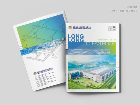
A full set of publications for the corporate image
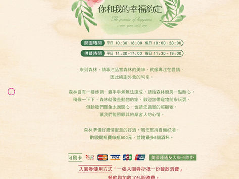
Bringing a forest kitchen's atmosphere into the menu through illustration
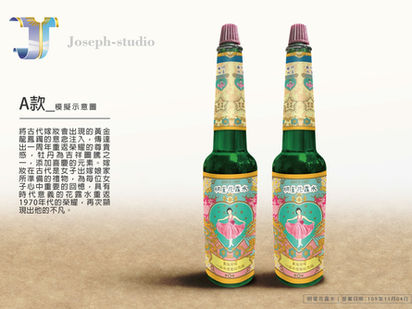
Reboxing a century of scent and memory
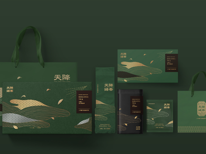
Giving local tea a gift-worthy form
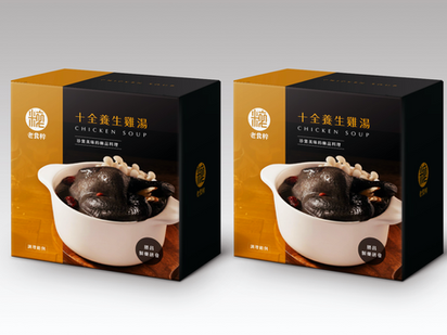
Putting 74 years of trust into the box
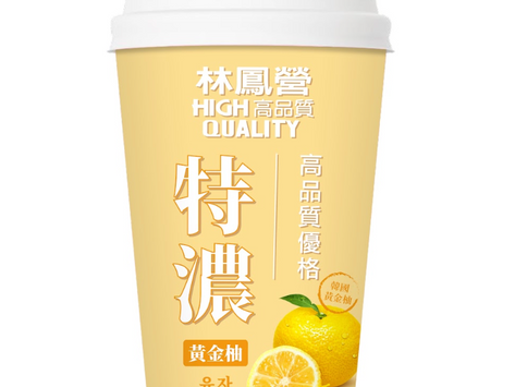
Putting rich texture into the first glance
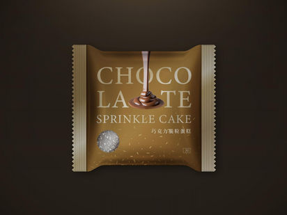
Fast-recognition packaging for the c-store shelf
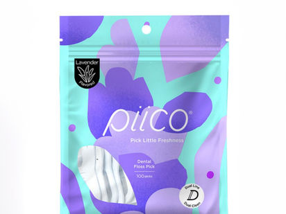
Eco material balancing pro feel and sustainability
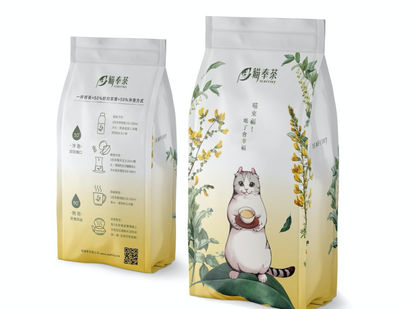
Building trust as the differentiator on the pack
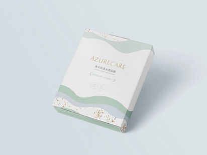
Azure × Care — a positioning in the name

Quality backed by awards and long trust

Commercial photography to international catalog standards
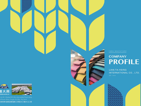
Making traditional textile strength clearly seen

Make SEO the infrastructure under the entire marketing investment
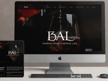
A site that makes people want to visit
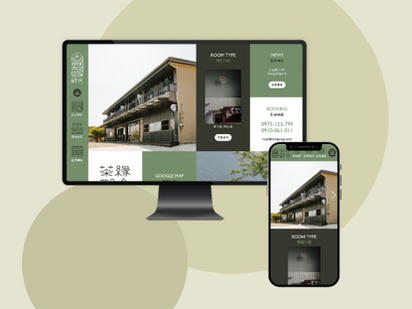
A site that sells the longing to stay
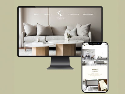
Persuading with big visuals and story together
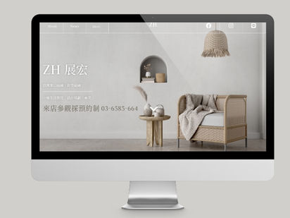
Giving building materials an aesthetic voice
Tell us about your situation — see how we've solved similar brand challenges.