Joseph Studio designed catalogs and print materials for Herbalife Quarterly, using clear information architecture and refined layouts to effectively communicate product information and brand value.
Herbalife design elements
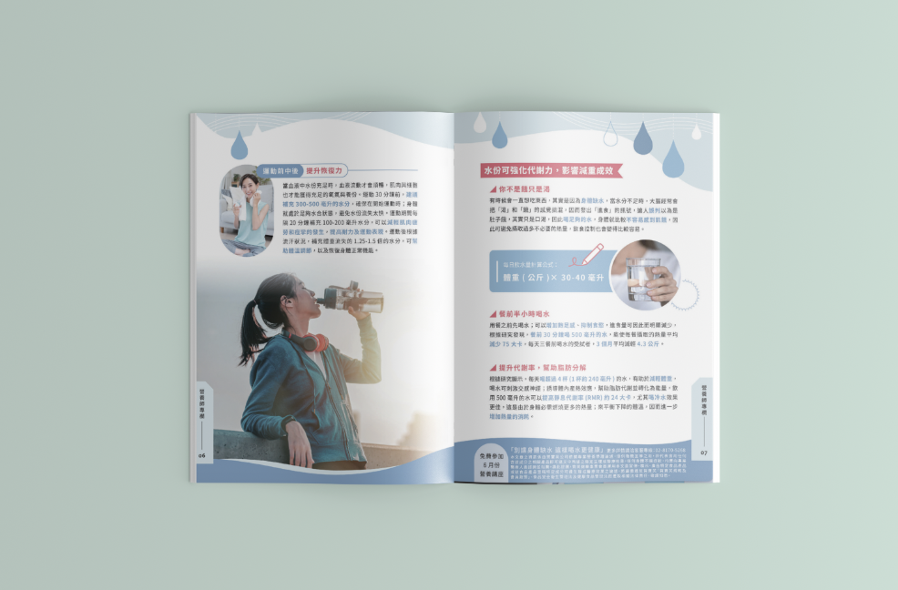
Color and background
Use soft teal tones to create a fresh and relaxing atmosphere.
The water drop pattern in the background adds a sense of cleanliness associated with healthy drinking water.
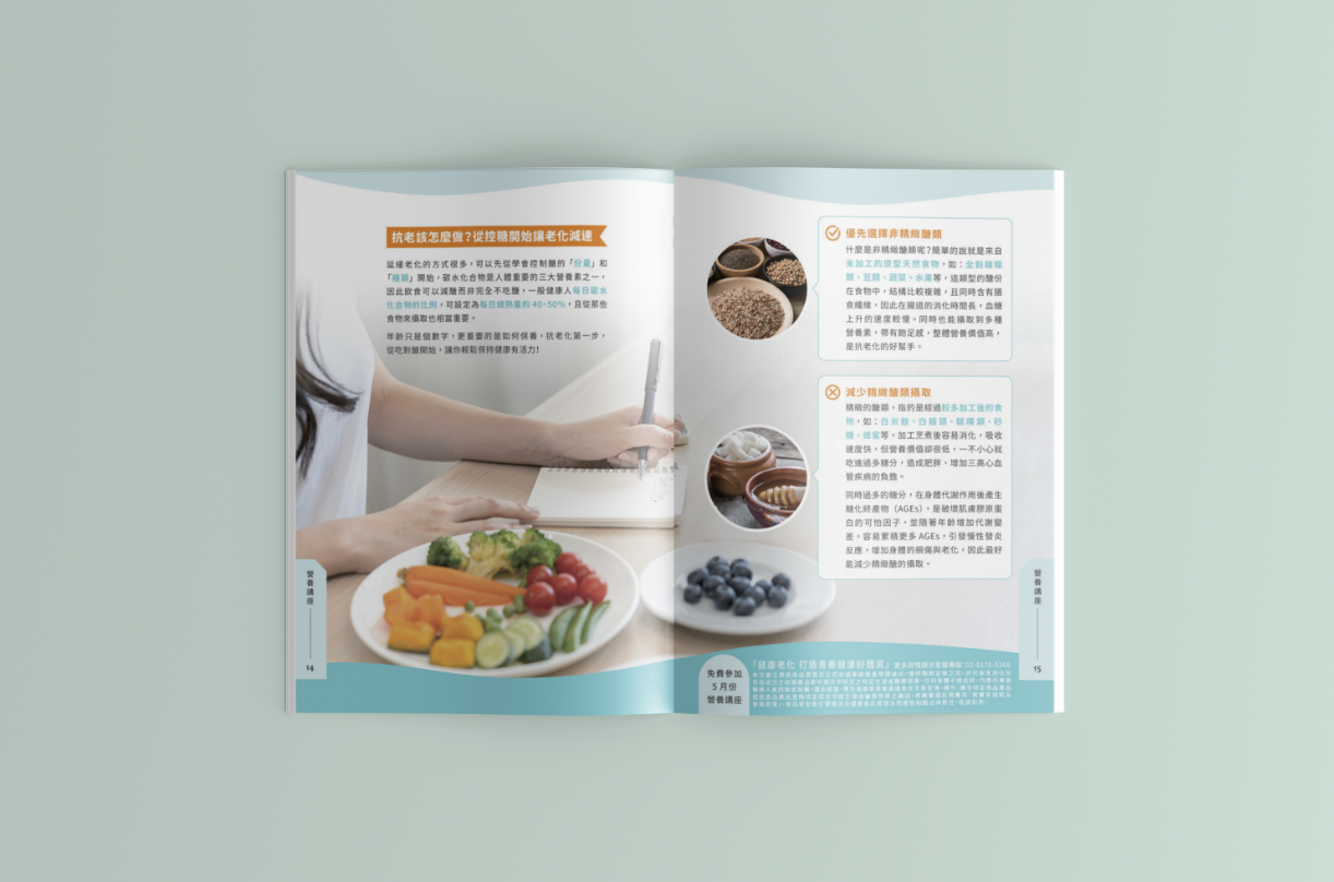
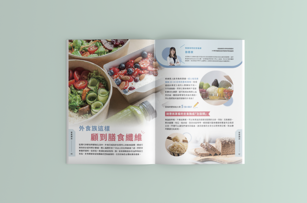
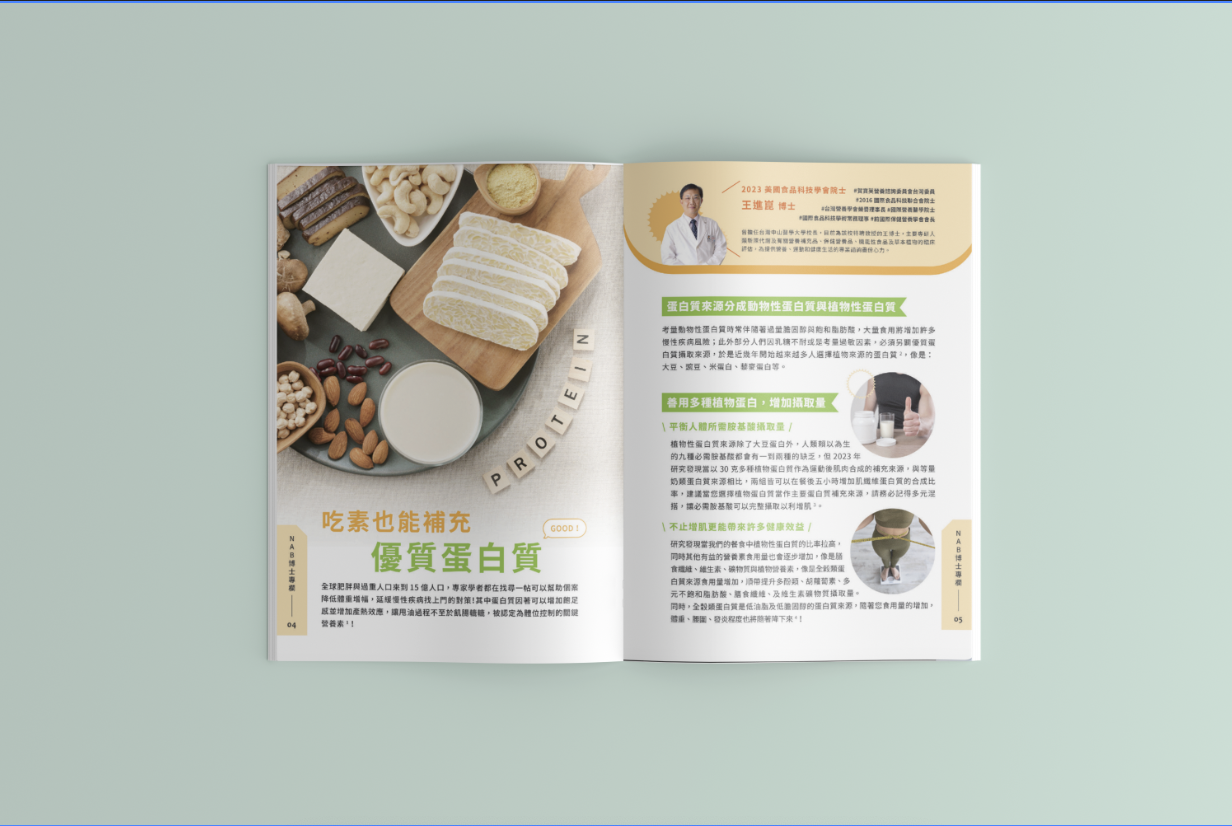
Layout design
The columns are clearly divided and the left and right pages are designed symmetrically, making the information easy to read and understand.
Use round and oval illustration frames to soften the design and add visual interest.
Pictures and Graphics
The main image shows a woman drinking water, emphasizing a healthy lifestyle.
Elements such as a handheld cup and a timetable in the illustration are used to emphasize the importance of drinking water and the recommended amount.
Text and content
Use clear and readable fonts for titles and content.
Small icons (such as schedules and cups) next to text help emphasize key information.
[Introduction to Hebaofu]
Herbalife Company, an American company, is a global MLM nutritional products company. Its business content is engaged in the development and sales of many kinds of nutritional products. The company was founded in 1980 by Mark Hughes. Incorporated in the Cayman Islands and headquartered in Los Angeles, California, the company operates in 90 countries through a network of independent distributors and health affiliates
[Joseph Design Concept]
Promotion of healthy living:
By showing an image of a woman drinking water, the design emphasizes the importance of maintaining a hydration balance. This is not only about promoting healthy eating habits, but also about comprehensive lifestyle management.
Education and Guidance
The design includes educational information, such as the recommended amount and timing of drinking water, which helps readers understand how much water they should consume daily and its health benefits.
Fresh and visually pleasing:
The use of teal tones not only evokes the cleanliness and freshness of water, but also makes the overall design feel more comfortable and relaxing. This color choice helps create an image of health and vitality.
The combination of functionality and beauty:
Through clear layout division and symmetrical design, the transmission of information is both intuitive and effective. The use of graphs and charts adds interactivity and education, making it easier for readers to absorb important information.
Design Gallery
