
31MEAL Participate in one meal logo overall design|Simple version of CIS design|Brand design|Busines
- naomi43960
- Nov 3, 2022
- 2 min read
Updated: Dec 12, 2022
【31MEAL One Meal】The most convenient meal replacement!
31Meal, a brand of JPAST's parent company, is based on the concept of pure health. For 1/3 meals, Joseph replaces one of the three meals with an effective and healthy formula to meet the needs of office workers for diet control and fitness and weight loss, and hopes to help consumers develop healthy eating habits through high-quality products. The brand concept of eating habits, Create a new brand of women's minimalist visual packaging overall design.
DESIGN A
concept of design
Transform 31MEAL into geometric shapes for a functional feel. The color is mainly yellow, which corresponds to the taste impression of "banana cocoa", and the contrasting colors of orange and pink present a distinct brand image.
LOGO standard word
The 31meal is outlined with arc strokes, and space is deliberately left at the connection of the strokes, showing a simple, light and natural feeling as a whole, echoing the core of the brand. On the upper right is a three-pointed flower embellishment, presenting the concept of one-third, adding to the fun of overall and fantasy weight loss and fitness!


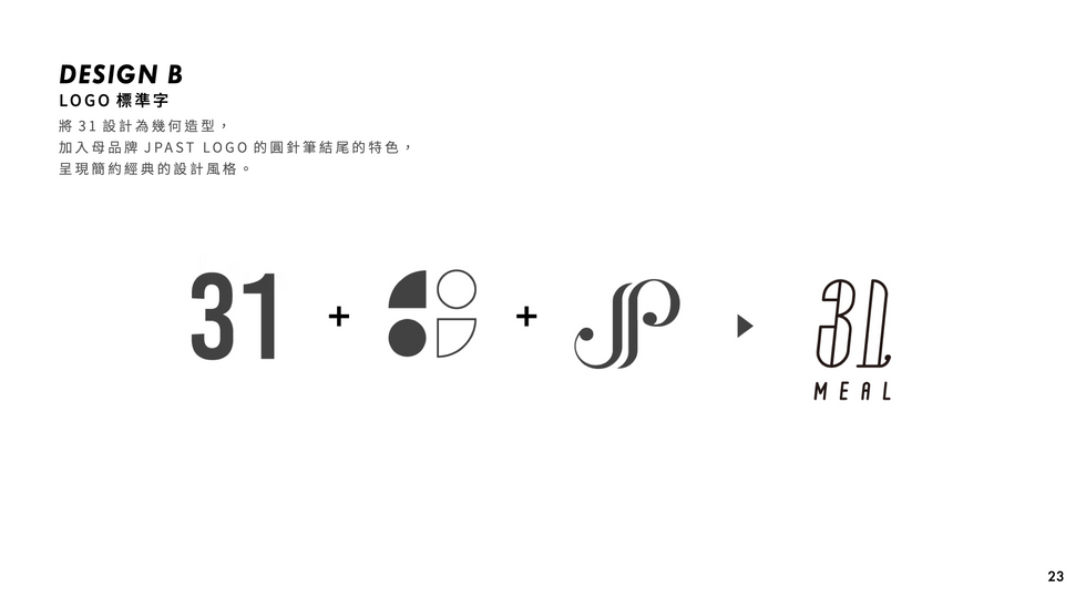
DESIGN B
concept of design
Conceived from the sky for breakfast, lunch, dinner and supper, the sun and starlight are combined as the main visual image, and the pink gradient color symbolizes the change of the sky. Expresses the concept of dietary control that 31MEAL replaces one meal with three meals.
LOGO standard word
The 31 is designed as a geometric shape, and the characteristics of the end of the round needle pen of the parent brand JPAST LOGO are added, presenting a simple and classic design style.


DESIGN C
concept of design
The ingredients in the banana cocoa milkshake are presented in different geometric shapes, such as banana, cocoa fruit, garcinia cambogia and other patterns, with a 1/3 concept LOGO, to express the intuitive and clear impression of replacing a meal.
LOGO standard word
Combined with the concept of 1/3, the 3 is designed as a European classical writing shape, echoing the LOGO features of the parent brand JPAST, and the oblique cuts suggest that one of three meals will replace the meaning of fitness diet control.


#brand design
#corporate brand design
#Business Card Design
#Banner Design
#Image Design
#Package Design
#meal replacement packaging design


Comments