Witheventwebsitedesign,build audience registration intent before launch day
One-page to multi-page · Visual design and front-end development fully in-house.
Your event website is the first touchpoint — it decides how many people see it, stay, and take action. A loose registration page, buried information, or a layout that breaks on mobile usually isn't a design problem; it's the event position and audience path that weren't thought through. With our team's 30+ years of experience and 1,000+ companies served, Joseph handles everything from a one-page quick launch to a full multi-page event platform — visual planning, web design, and front-end development all in-house.
🔴 Events are time-sensitive — quarterly event website slots fill fast; book early
An Event Website That Converts Starts From Three Overlooked Points
The Event Website Is an Instant Brand Test
Most people treat an event website as "just a page of info," but what visitors see first is an instant test of your brand's recognition and professionalism. A loose design and inconsistent style lose trust before the event even opens. Every event website we build starts from brand tone — confirming the visual language, information hierarchy, and audience path so the site reinforces your brand while it informs.
Audience Path Determines Sign-Up Rate — Not Aesthetics
"We ran the event but sign-ups were fewer than expected" is the most common feedback. The cause is usually not ad spend — it's an audience path that wasn't designed: information buried, a vague CTA, a layout that struggles on mobile. With our team's 30+ years, 1,000+ companies, and 27+ event websites of experience, we plan at proposal time exactly how your audience will browse, where the decision moment is, and where the CTA needs to be.
A Solid Event Website Can Become a Long-Term Brand Asset
The event ending doesn't mean the website's value disappears. A well-designed site comes with an SEO foundation that builds search traffic over time; it leaves a complete brand asset for fast extension to the next event; it can even become a permanent gateway for an annual flagship event. Get the architecture and design right once, and the long-term savings and accumulated traffic far exceed a one-off setup fee.
Hire a vendor and you get a page that counts down. Work with Joseph and you get a site planned from the brand, market, and future — so every event converts.
Related ESG & Sustainability Services










Three Things Most Vendors Skip — But You Should Demand
Audience Path First, Not Wireframes First
Most vendors start designing straight away, skipping the question of who visits this event, what they want, and how they'll navigate. We plan the audience path and information architecture first, then go to visual design. With the path right, design converts — not just looks good.
Visual Planning + Front-End Development Together, Not Split
Most vendors split design and development between different people, so messages don't match, timelines slip, and quality suffers. Joseph's visual planning and front-end development are handled by the same team — the design intent lands precisely in code, and the schedule stays tight.
Mobile-First, With Our Team's 30+-Year Cross-Industry Design Standard
Most event registrations happen on mobile. We use mobile-first as our design baseline — smooth touch interaction, a clear registration button, and a layout that holds on every screen size. This is the design floor distilled from our team's 30+ years and 1,000+ companies of experience, not an optional add-on.
Our Team's 30 Years of Work, Results You Can See
From manufacturing to F&B, medical, and global brands — 1,000+ companies trust our design capabilities

普利司通
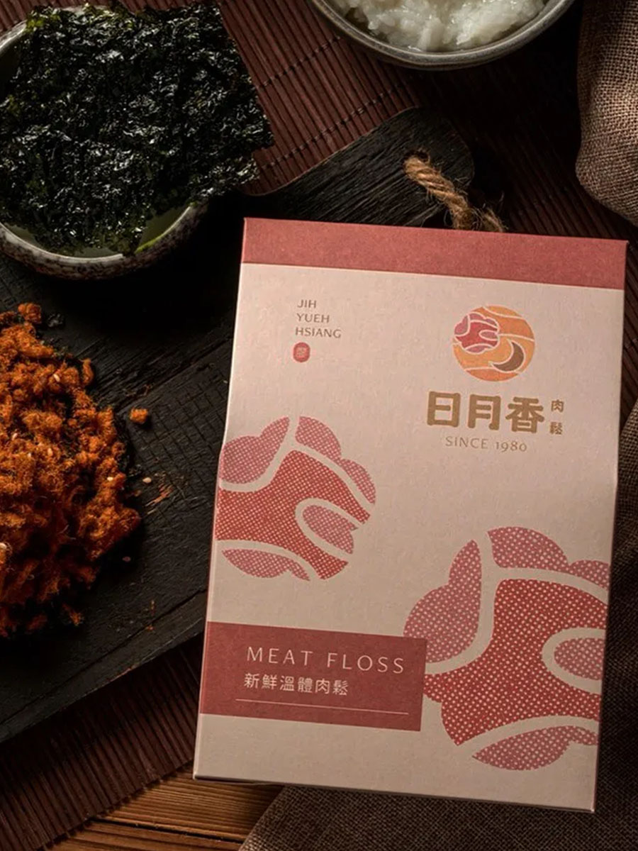
日月香肉鬆
View case →
多納烘焙
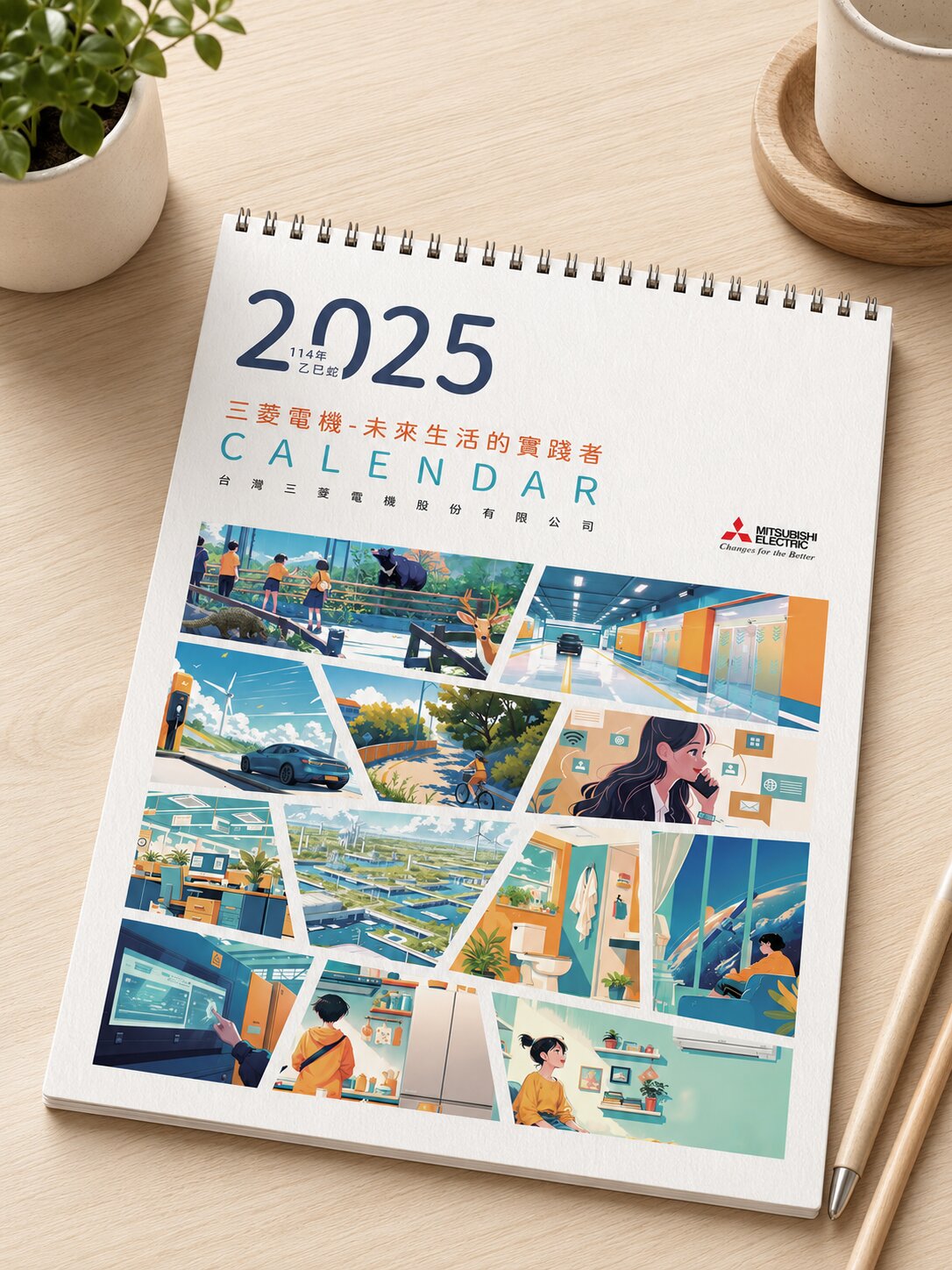
三菱電機
AURZ
View case →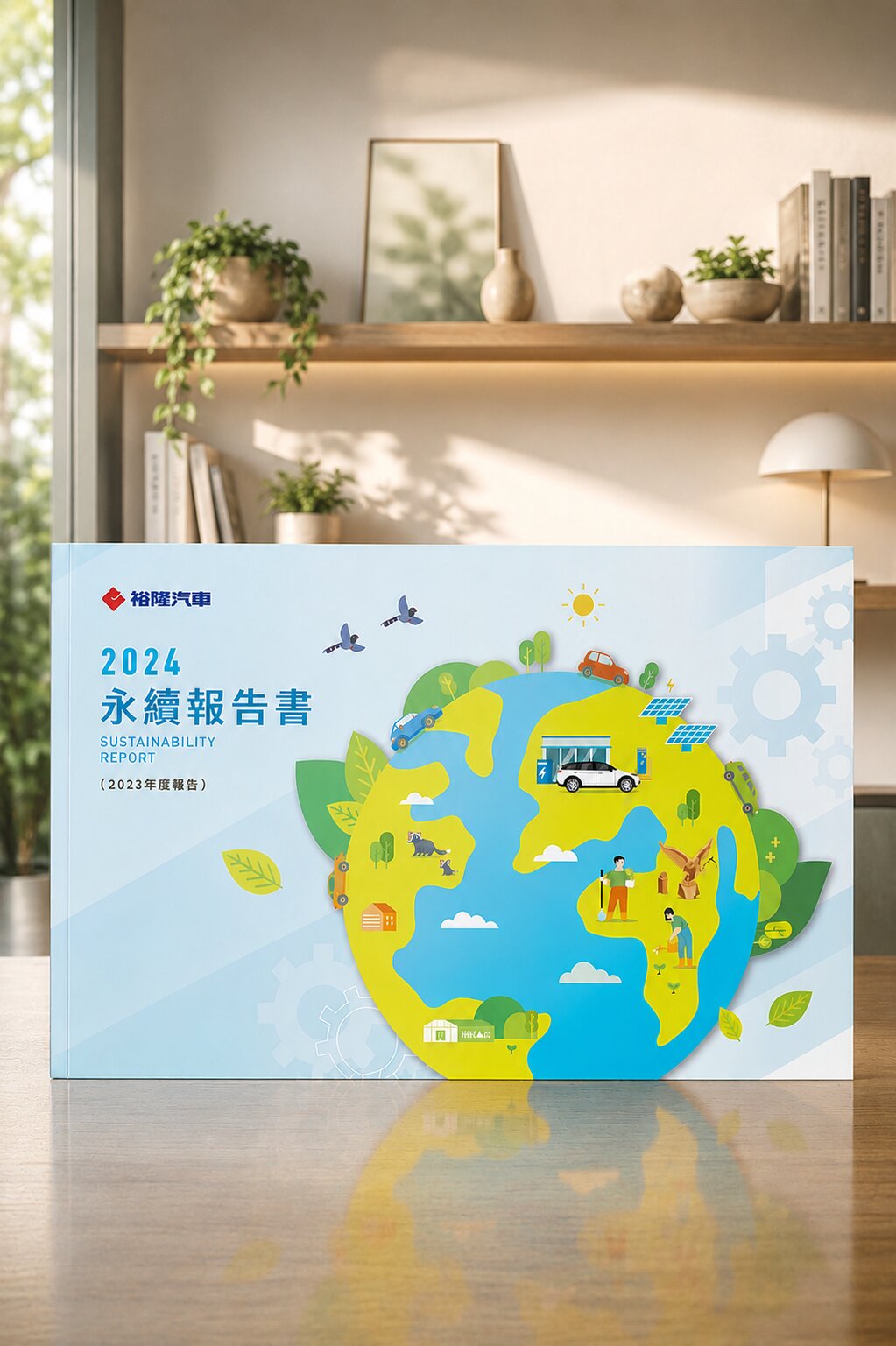
裕隆汽車

普利司通
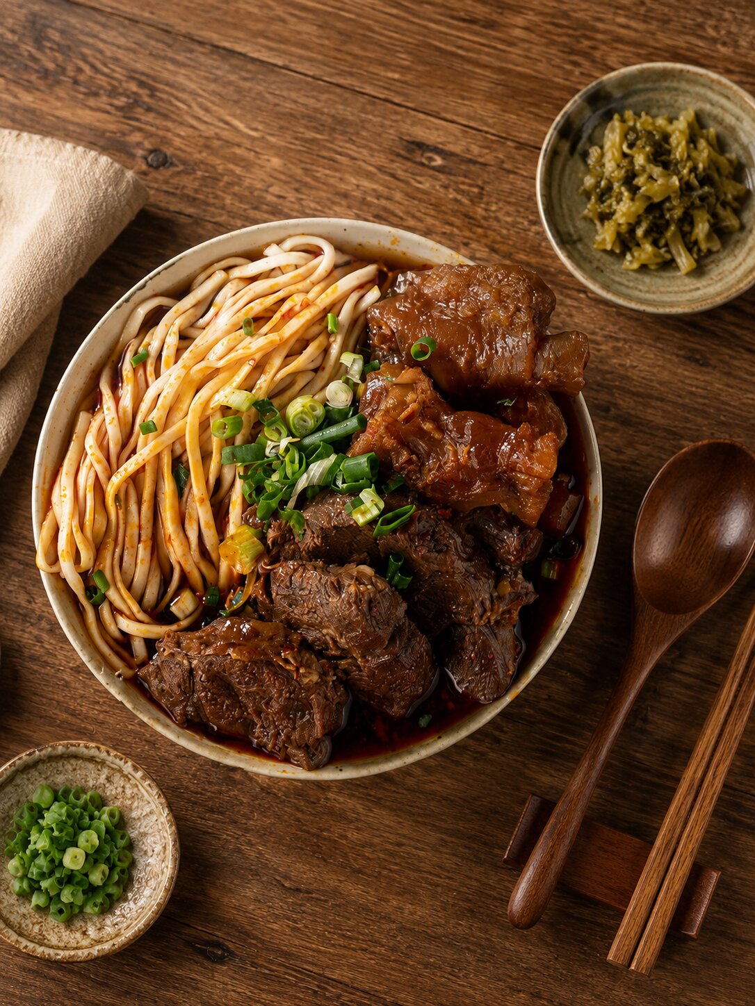
禾善堂
The Right Website Strategy for Your Event Type
Different event types need different website planning priorities. See which fits, and we'll confirm the right scope together during consultation.
Scenario A: Corporate Events / Product Launches
- Need to launch fast, project a professional brand image, and collect registrations or RSVPs
- For: product launches, annual conferences, forums, investor briefings
- Recommended: one-page event site + brand visual planning + registration form integration
Scenario B: Exhibitions / Markets / Live Events
- Need to present vendors, schedules, and participating brands clearly, guiding visitors to buy tickets or register
- For: design expos, art exhibitions, markets, concerts, live events
- Recommended: multi-page event platform + schedule module + ticketing or registration integration
Scenario C: Annual Flagship Events / Ongoing Event Brands
- Need an extensible event website architecture reusable year over year, with SEO and brand equity in mind
- For: annual summits, corporate anniversary events, standing event brands
- Recommended: extensible site architecture + SEO fundamentals + brand visual guidelines
From Brief to Live — Every Step Has a Deliverable
Event Brief Clarification (60 min)
An in-depth interview to clarify the event goal, audience, timeline pressure, and functional needs (registration, ticketing, traffic)
Audience Path & Information Architecture
Map visitor navigation flow, information hierarchy, and CTA placement to ensure a clear conversion path
Visual Style Proposal
Propose a visual direction based on brand tone and event theme — confirming colour, type, and layout language
Web Design Mockups
Design all pages (desktop + mobile) per the architecture, confirming brand consistency and content accuracy
Front-End Development + Form Integration
Code the design precisely, integrating registration forms, ticketing, or third-party tools, with smooth mobile performance
Launch Testing & Sign-Off
Cross-browser and cross-device testing to confirm all functions before official launch and handover
What Our Clients Say
We finalised the key visual three days before the event, and they still delivered on time — the design was much better than I imagined.
Corporate Event Organiser Client
Event Website · Fast LaunchWe used a DIY platform before — the mobile layout kept breaking. After asking Joseph to redo it, mobile sign-up rates went up noticeably.
Exhibition Organiser Client
Mobile Optimisation · Registration ConversionWe've used the same architecture for the third year running — just update the content and key visual each time. It's saved a lot of cost.
Annual Summit Organiser Client
Extensible Architecture · Annual FlagshipOur Team's 30+ Years · 1,000+ Companies of Website Design Work
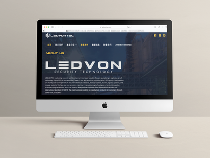
Lihong Technology|Corporate Image Website for Industrial Tech
Grounding a steady tech feel and corporate professionalism in visuals
Lihong Technology integrates industrial automation equipment and needed a website that carried both technical depth and corporate credibility. The design extended from the brand identity system — a blue-silver palette for tech trustworthiness, clear product category navigation, and a concise company background so potential buyers and partners build a professional impression on first visit, with a smooth RWD mobile experience.
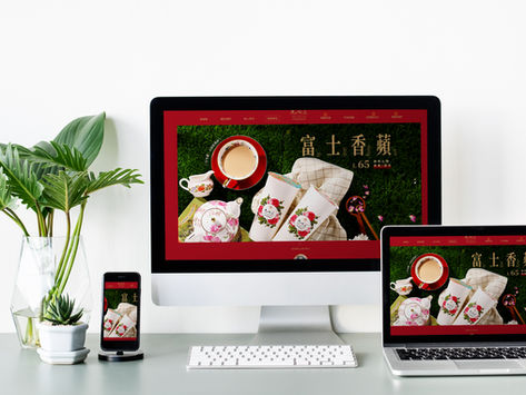
Classical Rose Garden Xianhedao|Elegant Brand Website for Beverage
A classical, elegant atmosphere transmitted precisely through web visuals
Classical Rose Garden's "Xianhedao" beverage brand centres on a classical, elegant image — the website needed to transmit that tone precisely to its audience. The design started from the brand's colour system and visual language: natural tones, refined layout, and selected product imagery that mirror the brand character, so visitors feel the intended quality in the first second and follow a smooth purchase path.
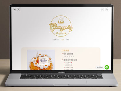
Blessing Pastry|Warm Brand Website for Artisan Pastry
Letting the story behind every pastry speak on the page
An artisan pastry brand's appeal lies in warmth and craft — the website needed to recreate that experience visually. Starting from brand tone, soft natural colours, refined product photography presentation, and a brand story narrative structure let visitors feel the pastry maker's sincerity while clearly guiding them to purchase or order.
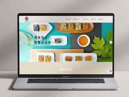
Wu Fu Qi Ma Pu|Brand Website for Traditional Taiwanese Handcraft
The texture of traditional craft transmitted accurately through digital visuals
A traditional handcraft brand must hold old customers' trust while building a new audience online. The website design started from the brand image — traditional craft colour imagery and curated display structure — making the craft's detail visible on screen while keeping a smooth mobile experience, so the handmade spirit isn't diminished by the digital interface.
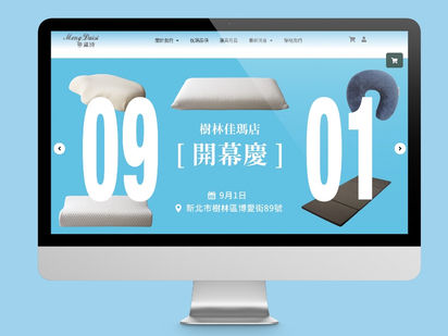
Mengdaishi Bedding|Restful Atmosphere Brand Website for Bedding
Bringing the "restful sleep experience" into the homepage through visual language
A bedding brand needs to transmit comfort and trust visually, letting visitors imagine the relaxation the product brings while browsing. Visual style, colour tone, and product display structure work together in an organised layout that reflects the brand position — adapting to every screen size so visitors on any device have a smooth shopping experience.
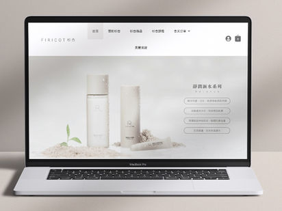
FIRICOT Shanxing|Natural-Style Brand Website for Skincare
Cedar green and apricot orange conveying the trust of natural ingredients
FIRICOT Shanxing's brand centres on cedar and apricot as core ingredients — the website needed to make the "natural, pure" claim visible at a glance. Plant-inspired colours (cedar green, apricot orange) and high-quality product imagery form the visual base, with clear ingredient introductions and purchase paths so the skincare brand's natural claim is visually convincing — and RWD keeps the mobile shopping experience smooth.
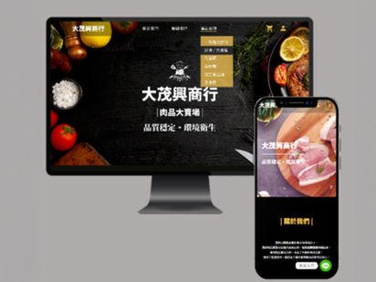
Da Mao Xing|Intuitive Shopping Website for Meat Products
High-resolution product imagery transmitting freshness and quality
A meat e-commerce site needs to build visitor confidence in freshness and quality before pushing an online purchase. High-resolution product photography is at the design core, paired with intuitive category navigation and a live chat feature so consumers find and choose easily — and a smooth experience across devices keeps bounce rates low.
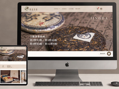
Jingda Tea|Tea Culture Brand Website with Depth
Visual style reflecting the elegance and depth of tea culture
A tea brand needs to transmit the cultural depth and quality of its products visually, letting visitors feel the brand's warmth as they browse. Starting from visual style, a colour and image language that echoes tea culture (natural, elegant, refined) builds the brand atmosphere, paired with clear product introduction structure and purchase path — so the story from origin to table flows smoothly on the page.
Our team brings 30 years of industry experience · Trusted by 1,000+ brands · Handled by a senior designer, start to finish
Book an Event Website Design Consultation
Tell us your event type, launch timeline, and functional needs — we'll provide a clear quote and design recommendations.