Menudesign—reinforcing ordering decisions through visual hierarchy and brand tone
Brand tone, reading flow, print-ready — every menu designed to serve image and conversion.
Restaurants invest heavily in logo and space but let menus slide into afterthought printing. Yet the menu is the brand touchpoint a guest holds longest — layout logic shapes ordering efficiency, visual tone carries brand character, and materials determine the overall impression. With our team's 30+ years of experience and 1,000+ clients served, we design from brand tone outward, lead layout with reading flow, and deliver print-ready files — turning menus from necessary evil into a brand asset worth showing off.
🔴 Menu design slots are limited — new openings and seasonal refreshes require advance booking
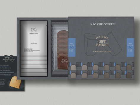
A Menu That Serves Both Brand and Conversion Starts From Three Design Principles
The Menu Is Your Brand's Most Direct Touchpoint on the Table
No matter how beautiful the space, the menu is what guests engage with longest after sitting down. Typeface, layout density, colour language, paper texture — each detail carries brand character. We design menus from brand tone, ensuring the menu speaks the same language as your logo, packaging, and interior — not a layout task, but an extension of your brand identity.
Reading Flow Determines Ordering Efficiency and Spend
A menu is not a catalogue — it's a tool guiding decisions. Where the eye falls first, how items are categorised, how hero dishes are emphasised — layout directly influences what and how much guests order. We lead menu layout with reading flow, making signature dishes naturally visible, ordering pace smooth, and add-ons easy to find, so menu design works for your average spend.
Print Production and Maintainability for Future Updates
Great menu design isn't just beautiful on day one — it needs layout guidelines that hold up when you update for seasons or new items. We deliver print-ready complete files (AI / PDF) and document the layout logic, so when you make small updates or return for a refresh, you're not starting from scratch and maintenance is manageable.
Go to a print shop and you get a layout file. Work with Joseph and you get a menu design system — brand-driven, reading-flow-led, print-ready and extensible.










Three Things Most Print Designers Skip — But You Should Demand
Brand Tone First, Not Template First
Most menu design starts with a template — pick a style, fill in items, send to print. We start from your brand identity and tone, ensuring the menu speaks the same language as your logo, packaging, and space. This is the starting point the industry often skips but your brand deserves.
Consumer Reading Flow Leads Layout Logic
Looking good doesn't mean working well. We lead layout with how consumers look, choose, and decide — making signature dishes visible, add-ons easy to find, so design serves both brand image and ordering efficiency, not just visual arrangement.
Print-Ready Delivery with Layout Documentation
We deliver complete print files (AI, EPS, PDF, PNG) with layout documentation, so you have a reference for seasonal updates and item changes without starting over each time. Good design needs to be reliably extended, not a one-off output.
Our Team's 30 Years of Work, Results You Can See
From manufacturing to F&B, medical, and global brands — 1,000+ companies trust our design capabilities

普利司通
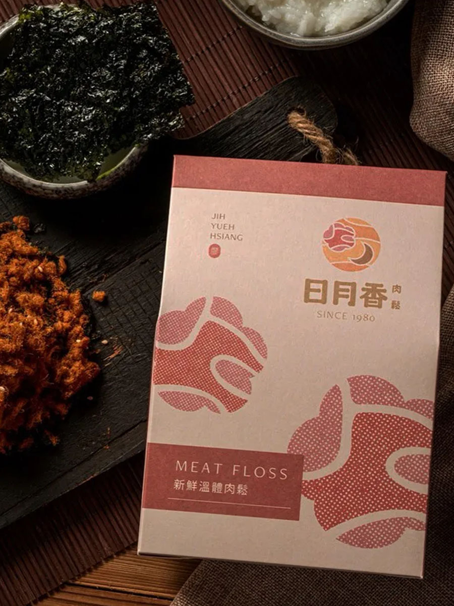
日月香肉鬆
View case →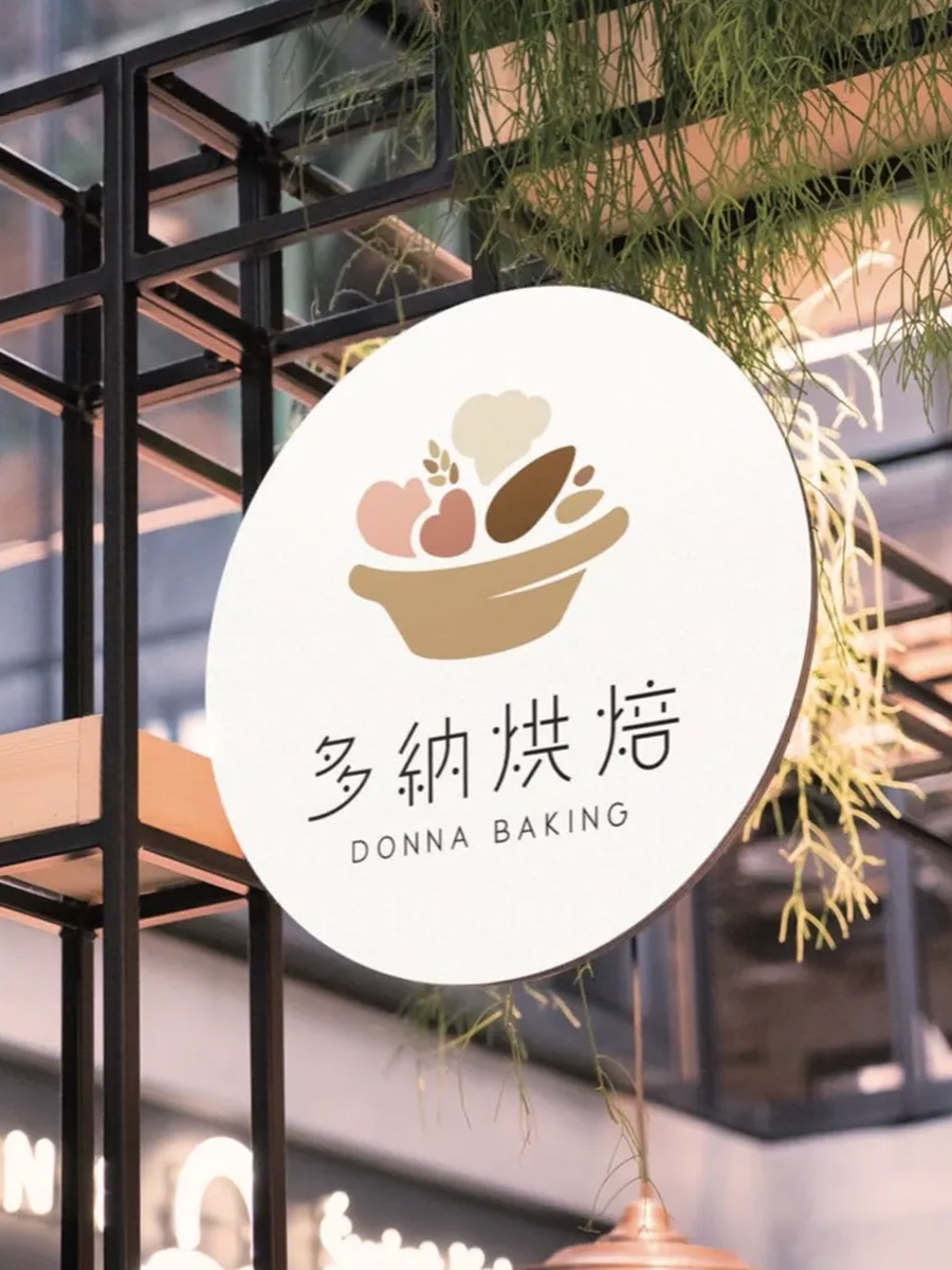
多納烘焙
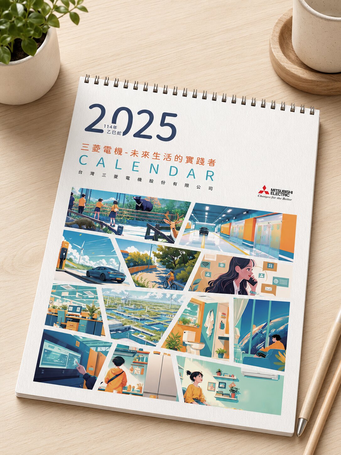
三菱電機
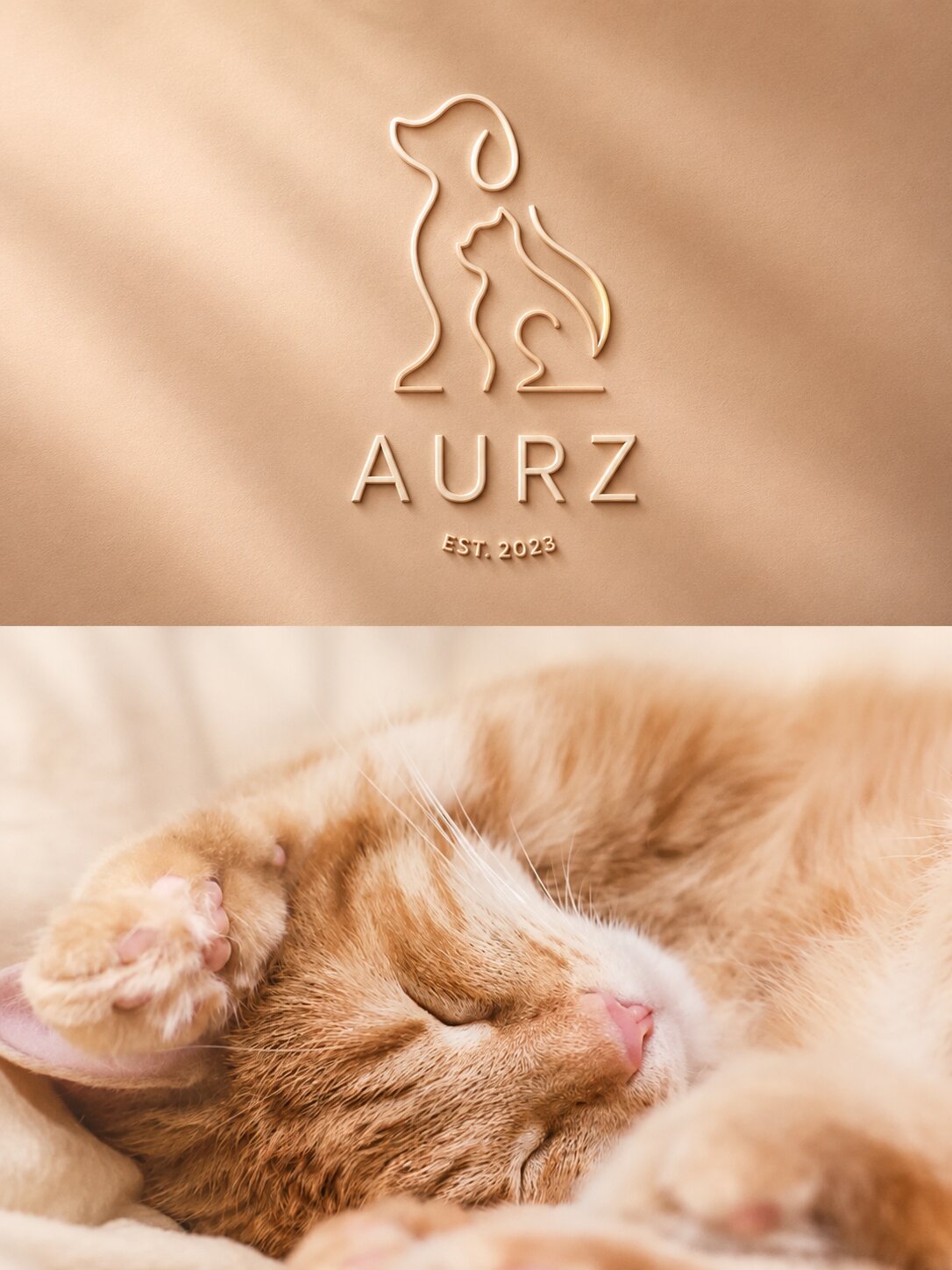
AURZ
View case →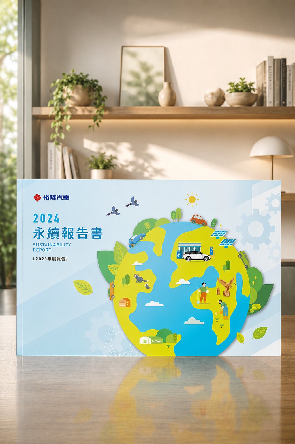
裕隆汽車
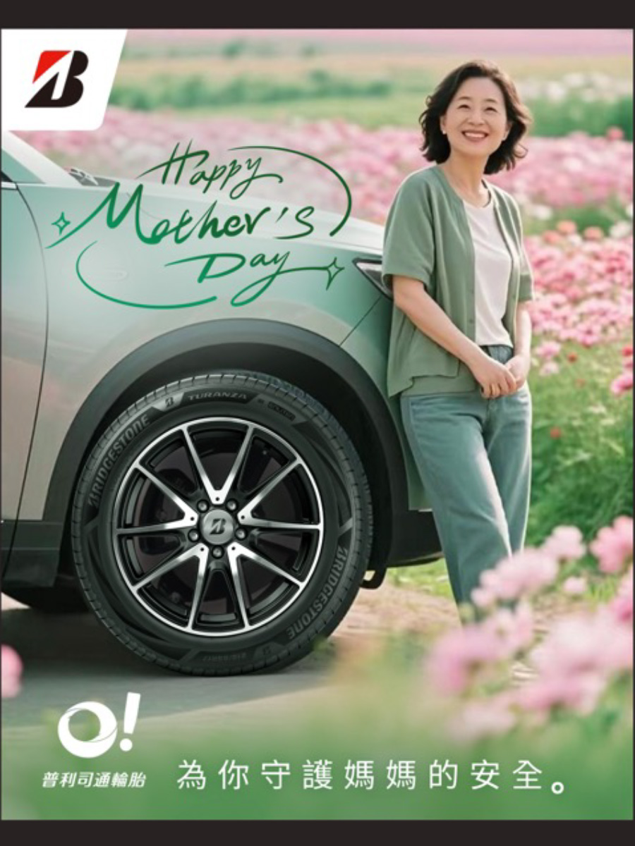
普利司通
禾善堂
The Right Menu Design for Your Situation
Different restaurant types and stages call for different design priorities. See which fits, and we'll confirm the right scope together during consultation.
Scenario A: New Opening Brand Build
- A new opening that needs a menu visual system built from your brand identity
- For: new restaurants, beverage shops, cafes
- Recommended: brand identity + menu design + full stationery set
Scenario B: Existing Brand Menu Refresh
- You have an identity, but the menu is outdated or needs a seasonal update
- For: chain seasonal menus, single-store refreshes, brand upgrade menu sync
- Recommended: menu redesign extended from your existing identity
Scenario C: Specialty or Hand-Drawn Menu
- You need a distinctive menu — hand-illustrated, themed, gift-box style, or takeaway format
- For: estate restaurants, themed dining, premium beverage brands
- Recommended: specialty menu design + print spec planning
From Brand to Table — Every Step Has a Deliverable
Requirements & Brand Tone Alignment
Understanding restaurant type, brand identity, target audience, item count, print specs, and timeline
Layout Direction Proposal
Presenting layout direction options — typeface, colour, categorisation logic, and reading flow plan
Detailed Design & Item Layout
Executing the full menu design — item layout, image placement, hero dish emphasis, add-on placement
Revisions & Finalisation
Adjusting details based on client feedback and confirming the final version meets brand and print requirements
Print-Ready File Delivery
Delivering complete print files (AI, EPS, PDF, PNG) and layout documentation
What Our Clients Say
Our old menu was self-made and guests often couldn't decide. After the redesign, our staff said ordering was much faster, and our signature items finally get noticed.
Kaohsiung Yakiniku Chain
Menu Design · Reading FlowWe did brand identity, business cards, and menu together before opening. Everything was consistent in style, and on launch day many guests said we had a strong overall feel.
New-Opening Taipei Café
Opening Set · Brand ExtensionThe most valuable part was getting the complete AI files and layout notes. We've updated items ourselves a few times since and haven't needed to call a designer every time — it's saved us a lot.
Taoyuan Beverage Chain
Print Delivery · Maintainable DesignMenu Design for F&B Brands — Selected Cases
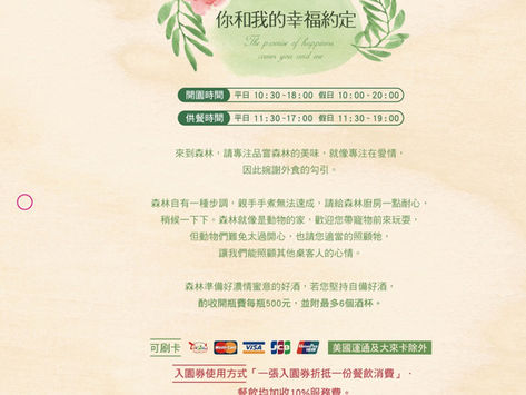
Ark Green Leaves Estate|Watercolour Hand-Drawn Menu Design
Bringing a forest kitchen's atmosphere into the menu through illustration
Ark Green Leaves Restaurant centres on a 'magical five-star kitchen in a beautiful forest' concept, with ingredients sourced from nature. The design challenge was making the ordering experience part of the brand itself. Joseph designed the menu in a watercolour hand-drawn style, capturing the living quality of a forest, so each turn of the page extends the estate's atmosphere rather than just listing items. Delivered with complete print-ready specs to ensure the illustration quality is faithfully reproduced.
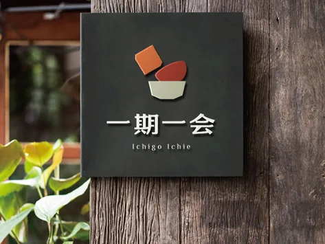
Ichigo Ichie Japanese|Menu & Full Identity Design
The philosophy of 'a once-in-a-lifetime moment' on every menu page
Ichigo Ichie centres on the Japanese philosophy of 'a once-in-a-lifetime moment,' celebrating seasonal ingredients. The full identity extends from the logo to the menu, business cards, interior, and signage — each touchpoint speaking the same refined Japanese sensibility. Menu design emphasises the seasonal nature of the offering through clean layouts with deliberate white space, aligned with the CIS to keep brand tone consistent across applications.
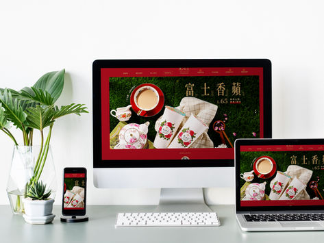
Classical Rose Garden Xianhedao|Beverage Brand Visual System
Classic elegance carried through every brand touchpoint
Classical Rose Garden Xianhedao's brand design centres on classic elegance, echoing the natural beauty and historical atmosphere of a rose garden. The visual system extends from logo to website and brand collateral, building a premium yet approachable image in the beverage market. The palette draws on rose, green, and earth tones, with typography and image language maintaining a classical art style for consistency and recognition across every touchpoint.
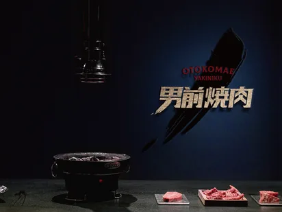
Nan Qian Yakiniku|F&B Brand Design for a 70-Year Group's New Venture
Carrying group heritage while giving the new format its own contemporary identity
Nan Qian Yakiniku is under Kaohsiung's Quan Cheng F&B group, which has run Shantou hotpot in Kaohsiung for 70 years. The design challenge for this new yakiniku concept: carry the group's trusted heritage while establishing a contemporary feel for a younger crowd. Joseph set the 'Nan Qian' brand character, translating the group's F&B depth into a distinctive visual language for the yakiniku format — extended to a full CIS so the brand conveys quality the moment it hits the table.
Cross-Region & Overseas F&B Brands|Remote Design Collaboration Cases
Standardised process enabling efficient collaboration from Taipei to overseas
Joseph's F&B design service is not bound by geography. Through standardised intake processes and project management systems, we have successfully completed branding projects with clients across Taipei, Taichung, regional Taiwan, and overseas. Whether menus, brand identity, or collateral, remote collaboration delivers the same quality as in-person. The work speaks clearly: design quality doesn't depend on proximity.
Our team brings 30 years of industry experience · Trusted by 1,000+ brands · Handled by a senior designer, start to finish
Book a Menu Design Consultation
Tell us your restaurant type, brand situation, and needs — we understand first, then quote, respecting both our time.