Withthoughtfulcalendardesignkeep your brand present on every client's desk every day
Desk calendars, annual planners, and tri-fold designs — with print coordination, putting your brand in front of the right people every day.
A wrong corporate gift burns budget and leaves no impression. A desk calendar is one of the few brand touchpoints that sits on a client's desk for an entire year — designed well, they see you every day; designed poorly, it goes in the recycling bin after the holiday. With 30+ years and 1,000+ companies, Joseph handles everything from calendar layouts and tri-fold desk calendars to full annual planners, with end-to-end print coordination — so your gift earns its place on the desk.
🔴 Year-end calendar production requires early planning — capacity fills up from Q3, book your slot early
A Brand That Sits on the Client's Desk All Year Deserves to Be Designed from Three Angles
A Calendar Is a Brand Ad That Never Goes Offline
An ad disappears when the campaign ends; a desk calendar is present from New Year to year-end, reminding the client of you every time they flip a page. The catch is that a mediocre calendar stays in the drawer — one designed with care, with a visual highlight each month and comfortable layout, earns a place on the desk surface. We start from brand identity so every month carries your tone, not a generic template with a logo slapped on.
Corporate Gifts Are Competitive — Only What Stays Counts
A client's desk might hold three or four calendars at once — only the best-looking, most practical one stays. Corporate gift competition is no longer about whether you sent something; it's whether your calendar stands out from the pile. With our team members' 30+ years across five industry sectors, we know the aesthetic preferences of different industries and anticipate at proposal time which style is most likely to earn a permanent spot.
Designed Right Once, Refreshed Year After Year
A calendar is an annual design need. Get the visual language, format guidelines, and monthly-theme structure right in year one — and each subsequent year only needs a theme and photo refresh to stay fresh while maintaining brand consistency. We build a complete design spec so the calendar becomes a fixed annual asset, not a from-scratch project every time.
Hire a print shop and you get a template-filled calendar. Work with Joseph and you get an annual gift designed from three angles — brand, market competition, and future extensibility — putting your brand on the right desks every day.










Three Things Most Print Shops Skip — But You Should Ask For
Brand First, Not Template First
Most calendar design means "putting a logo into a standard format" — no brand personality in the whole book. We start from your brand identity — colour, type, tone — so every month's layout and visuals carry your brand language. The client knows at a glance who sent it.
Design Through Print, End to End — No Vendor Chasing
Many design firms hand over the artwork and stop; you figure out printing. We coordinate with trusted print partners — from design and artwork to print-spec confirmation and proof review — end to end. What you see on screen is what comes off the press, with no cross-company coordination burden on your side.
Tri-Fold and Multi-Format Design Experience
Most vendors only offer the standard desk-calendar format. We have design experience across tri-fold desk calendars, calendar bases, wall annual planners, monthly posters, and DM-style folded calendars. We recommend the right format for your budget and purpose — not a standard answer that doesn't fit.
Our Team's 30 Years of Work, Results You Can See
From manufacturing to F&B, medical, and global brands — 1,000+ companies trust our design capabilities

普利司通

日月香肉鬆
View case →
多納烘焙
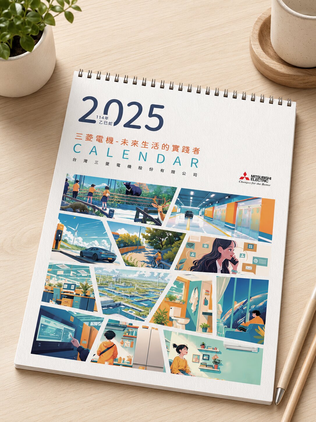
三菱電機

AURZ
View case →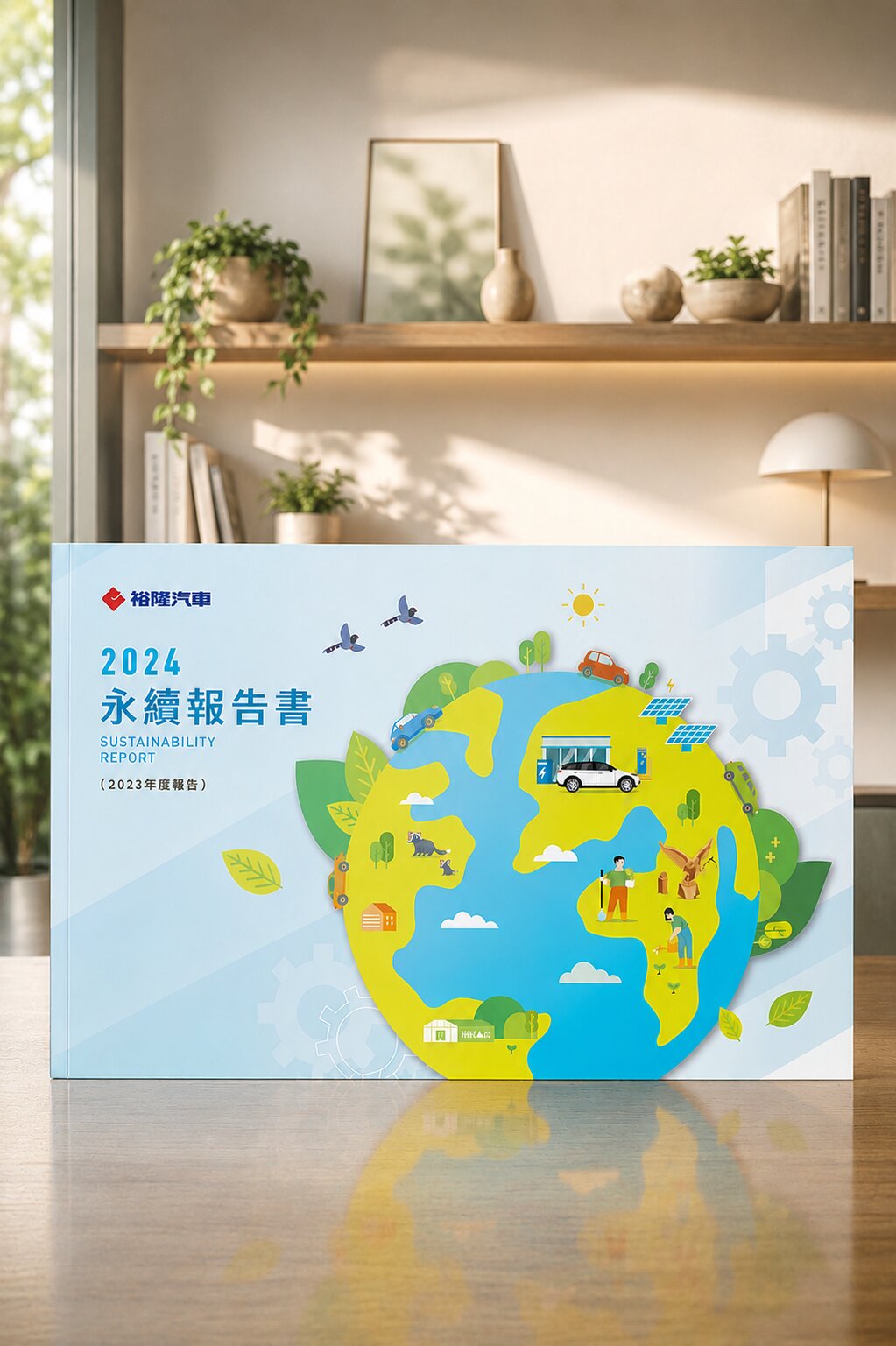
裕隆汽車

普利司通

禾善堂
The Right Calendar Format for Your Need
Different purposes need different design strategies. Find your scenario below, and we'll confirm the right format and spec during consultation.
Scenario A: Annual Corporate Gift
- Year-end calendar gift for clients — you want it on their desk all year
- Need: brand-consistent design, quantity 50–2,000 copies
- Recommended: hardcover desk calendar, tri-fold, or wall planner depending on budget
Scenario B: Trade Show or New-Client Acquisition
- Brand collateral for trade shows or sales visits — lightweight, eye-catching
- Need: tri-fold desk calendar or folded calendar, easy to carry
- Recommended: tri-fold desk calendar or DM-style folded calendar, small-run flexible
Scenario C: Group or Annual Series Publication
- Group-wide annual calendar publication with consistent design across departments
- Need: design spec to support multiple sub-brands or department versions
- Recommended: a full system with design spec, built for year-on-year refresh
From Brief to Delivery — Every Step Has a Deliverable
Needs Interview (Purpose, Quantity, Timeline, Budget)
Confirm calendar format, brand asset status, print quantity, and delivery timeline — setting a clear baseline for design
Brand Asset Review & Annual Theme Planning
Review existing brand assets and plan the visual theme direction for all twelve months, including seasonal and holiday logic
Layout Design Proposal
Present 2-3 layout directions including cover, monthly page, and annual-planner page samples for selection
Full Calendar Design & Revisions
Execute the full 12-month design including covers, with revision rounds until sign-off
Print Spec Confirmation & Vendor Coordination
Confirm paper spec, binding method, and colour proofing; coordinate with print partners to match artwork and final product
Delivery & Annual Design Spec
Deliver the printed product and compile an annual design spec for future-year refresh
What Our Clients Say
We used to get template calendars from a print shop every year. This year was the first time it felt on-brand, and clients proactively told us the design was solid — now we know the difference.
Manufacturing Client
Desk Calendar · Annual GiftThe most valuable part was getting a proper design spec — next year we just need to swap the theme photos for a fresh edition, saving the time of starting from scratch every year.
Retail Chain Client
Annual Design System · CalendarThe tri-fold desk calendar was more eye-catching than we expected. Many people at the trade show asked where it was designed — it became a conversation starter.
Tech Trade Show Exhibitor
Tri-Fold Calendar · Trade Show30+ Years · 1,000+ Companies of Print Design Work

Herbalife Quarterly|Periodic Publication Design for a Health Brand
Fresh palette and multi-page layout extending the brand consistently
The core task for Herbalife Taiwan's quarterly was conveying health and vitality through layout. We ran a fresh teal palette through the cover and each section, paired with a clearly structured chapter design, so the quarterly maintains brand recognition in gym-channel readerships. Each issue's cover is led by the relevant theme visual, with an overall layout spec ensuring consistency across editions.
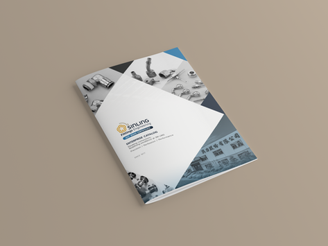
SIN LING|Professional Catalog for a Connector Manufacturer
Clear information architecture making technical specs easy to read and look up
SIN LING focuses on connector manufacturing; the catalog has high functional demands — engineers and buyers need to locate specs, confirm part numbers, and compare parameters quickly. We designed the layout with a clear information hierarchy so technical specs layer naturally through the typography; the cover builds brand recognition, and the design works for both print catalog and digital e-book, conveying SIN LING's manufacturing expertise.
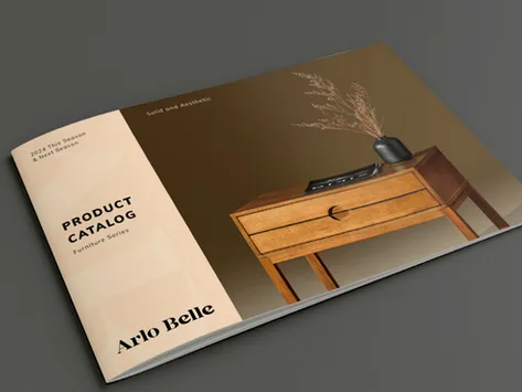
Arlo Belle|A Quality Catalog for a Furniture Brand
Wood-texture cover conveying natural materials and a premium feel
Arlo Belle's catalog uses a wood-texture cover as the design anchor, conveying the furniture brand's natural material quality and warm premium impression. The minimal layout lets product photography lead, with copy supporting rather than competing. The consistent tone extends through each product page, making the catalog an effective carrier of brand image.

National Pingtung University of Science and Technology|ESG Sustainability Report
Design language carrying the university's sustainability commitment
The design challenge for a university ESG report is making data-dense content readable while maintaining institutional credibility. We used a structured layout to separate each ESG pillar, with a design tone aligned to environmental principles, so NPUST's annual sustainability achievements communicate clearly to stakeholders.

National Taipei University|ESG Sustainability Report Design
A design standard for academic institution ESG publications
National Taipei University's ESG sustainability report was designed with rigorous layout standards appropriate to an academic institution, while giving each of the E, S, and G pillars a clear visual identity — so readers can navigate information layers intuitively, balancing readability with professional credibility.
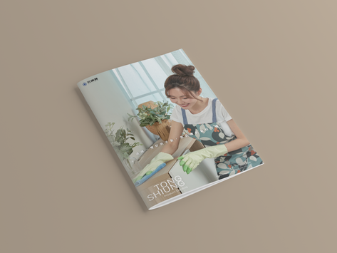
Dongsheng Gloves|Multi-Purpose Industrial Glove Catalog
Scene-based imagery presenting products clearly across multiple use cases
Dongsheng Gloves' catalog strategy used vivid scene imagery to show the gloves' versatility across different environments, helping buyers grasp application scope at a glance. Precise spec descriptions and clear layout support the purchasing decision, balancing intuitive reading with information completeness.
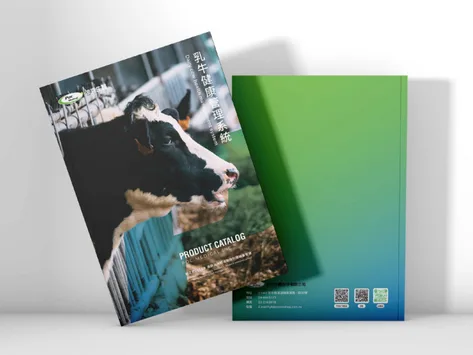
Bok Biomedical|Biomedical Brand Catalog for the Dairy Sector
Consistent brand colour and trustworthy feel throughout the catalog
Bok Biomedical operates in the dairy sector; the catalog needed to convey both the scientific rigour of biomedical and the natural approachability of agriculture. Brand identity colours unify the visual through the catalog, with signature imagery reinforcing image — building brand trust while communicating product information.
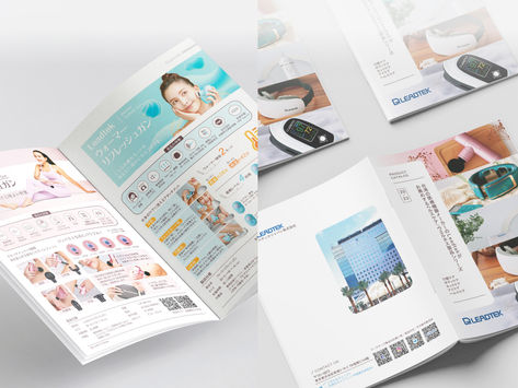
Leadtek|Tech Industry Catalog Design
Crisp layout and tech-toned colour palette building professional recall
Leadtek's catalog uses a modern, crisp layout and tech-toned colour palette as the foundation, aligning corporate image with industry positioning. Brand identity runs throughout so every touchpoint delivers the same professional and reliable feel, helping tech products build brand recall in distribution channels.
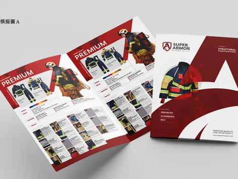
SUPER ARMOR (Kai Guang)|Fire Safety Equipment Catalog
Clear structure making professional equipment specs easy to find and understand
Fire safety equipment catalogs are used on construction sites, in fire departments, and for government procurement — readers need to locate specs and certifications fast. The design centres on a clear structure so information layers are distinct; an engaging cover builds professional and reliable brand feel, reflecting the industry's high demands for accuracy and safety.

Greenfield Biotech (Kampson)|ESG Sustainability Report Design
A biotech brand's sustainability commitment expressed through design
A biotech company's ESG report addresses investors, regulators, and consumers simultaneously — credibility and readability are both essential. We helped Greenfield Biotech present E, S, and G outcomes in clearly structured layouts, with design tone aligned to the brand's sustainability positioning, so the report itself extends the brand's trustworthy image.
Our team brings 30 years of industry experience · Trusted by 1,000+ brands · Handled by a senior designer, start to finish
Book a Calendar Design Consultation
Tell us your purpose, quantity, and preferred format. We'll give you a clear quote after understanding your needs.