Kaohsiungtrademarkdesign—from legal protection to a cohesive brand identity system
Trademark design, CIS, brand advisory — from identity core to cross-channel execution.
Locally rooted in Kaohsiung, Joseph has served 1,000+ companies, with team members bringing up to 30+ years of experience. Many owners find, after a logo is done, that the brand still doesn't communicate consistently — because there's no CIS to unify cards, signage, packaging, and website into one visual language. Joseph starts with brand advisory, then handles trademark design, CIS planning, and print production end to end.
🔴 Brand identity advisory slots are limited — only a few new cases per quarter

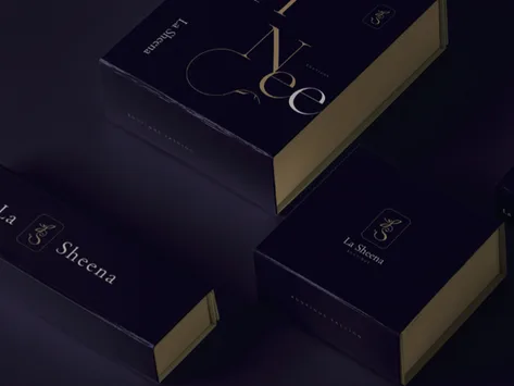

A Trademark That Makes Brand Image Land —Starts From Answering Three Fundamental Questions
A Trademark Is Not a Picture — It Is the Core Identity Claim
Many owners get a nice-looking logo and then find it can't unify cards, signage, and packaging — because the design had no concept of an identity core, only a handsome shape. Joseph starts trademark design with a brand diagnosis, clarifying brand character, audience, and the key claim, so the mark carries extensible identity genes, not just a good-looking graphic.
Recognition in the Kaohsiung Market Comes From Differentiation, Not Imitation
In Kaohsiung, logo homogeneity is the norm across manufacturing, F&B, medical, and services — many marks look like siblings in the same sector. With team members bringing up to 30+ years of local work and five-sector competitor observation, we map the competitive landscape before designing, finding a differentiated identity angle so the trademark is the one that holds its own position in the market.
A CIS Makes Your Trademark Consistent Across Every Future Context
The finished trademark is not the endpoint — it is the start of the CIS. Cards, envelopes, signage, packaging, website, vehicle — every application must grow from one visual language, or the image drifts across channels. Joseph integrates trademark, CIS planning, application design, and print in one team, so the identity system actually lands instead of living in a guidelines document.
Hire a designer and you get a graphic. Work with Joseph and you get a CIS — clarified from the brand, market, and future perspectives — so your identity lands consistently at every touchpoint.










Three Things Most Design Firms Skip — But You Should Demand
Brand Advisory Before Design — Not Decoration
Most design firms ask "what style do you like?" and start drawing, skipping brand diagnosis. We clarify brand character, target audience, and market position first — so the trademark has an identity core to anchor from, not just personal preference. A solid diagnosis gives design direction and revisions a real foundation.
Trademark Through CIS, One Team End to End
Many owners finish a trademark and then find they need someone else for application design — information gaps make the identity drift across contexts. Joseph integrates trademark, CIS guidelines, application design (cards, envelopes, signage, packaging), and print in one team that knows your brand, so the identity system speaks consistently in every context.
Team's 30+ Years Local, Five Sectors — Competitive Landscape in Sight
Locally rooted in Kaohsiung, Joseph has served 1,000+ companies, with team members bringing up to 30+ years of experience, across manufacturing, F&B, medical, overseas, and succession — we have direct observation of the competitive landscape in five sectors. Competitor mapping before design ensures your trademark has recognition and doesn't blend in, grounding every design decision in market reality, not just aesthetics.
Our Team's 30 Years of Work, Results You Can See
From manufacturing to F&B, medical, and global brands — 1,000+ companies trust our design capabilities

普利司通
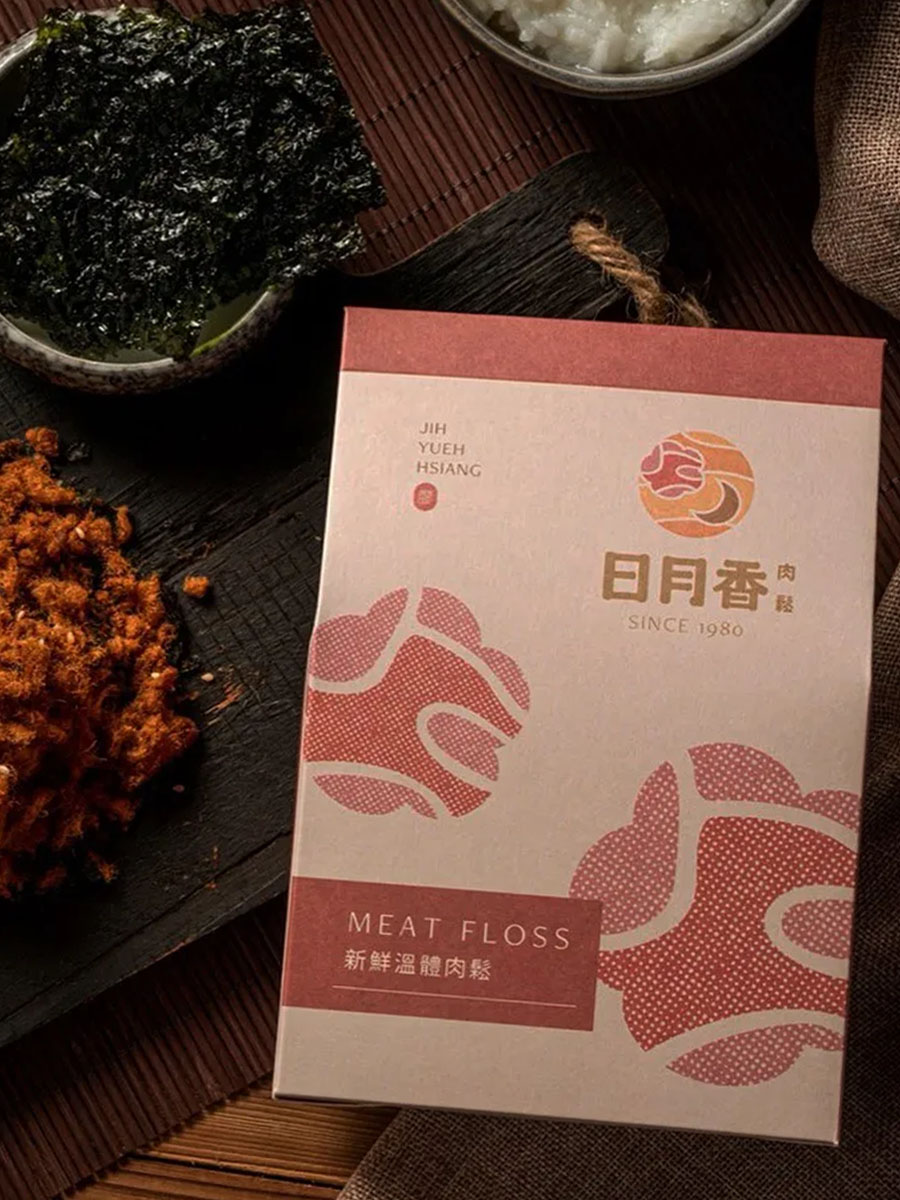
日月香肉鬆
View case →
多納烘焙
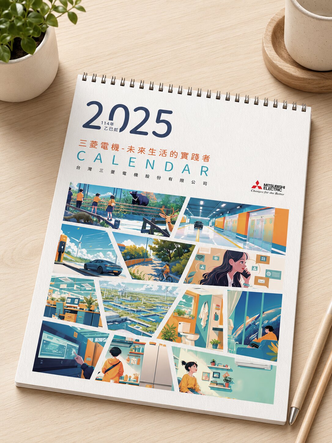
三菱電機

AURZ
View case →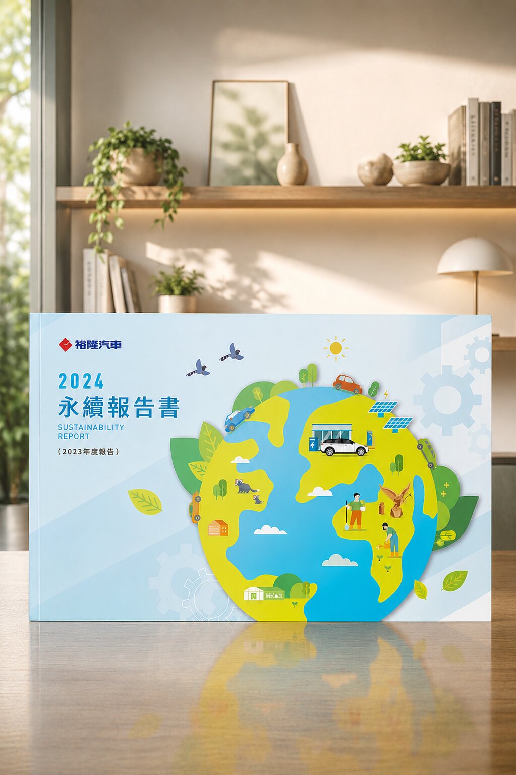
裕隆汽車

普利司通
禾善堂
Match Your Situation — Find the Right Identity Service
Different starting points call for different identity service scopes. See which one fits, and we'll confirm the right combination during consultation.
Scenario A: Build Identity for a New Brand
- Building from zero — you need a trademark and an extensible identity system
- For: startups, new restaurants, new clinics, new product lines, sub-brand spin-offs
- Recommended: brand diagnosis + trademark design + CIS planning + applications
Scenario B: Evolve an Existing Logo Into a Full CIS
- You have a logo but cards, signage, and packaging go their own way — inconsistent image
- For: SMEs wanting visual unity, chain stores, traditional-industry transformation
- Recommended: existing identity audit + CIS guidelines + application design end to end
Scenario C: Identity Refresh for Brand Aging or Succession
- Brand aging or new leadership — refresh the image while preserving the trust built up
- For: traditional-industry transformation, second-generation succession, renaming
- Recommended: repositioning + trademark refresh + full CIS update
From Brand Diagnosis to Identity in Market — Every Step Has a Deliverable
Brand Diagnosis & Needs Interview
A deep dive into your brand character, audience, competitors, and the identity outcome you need
Competitor Identity Mapping
Map the identity landscape in your sector to find a differentiated visual angle
Trademark Concept Proposal
Propose trademark directions informed by the diagnosis, explaining the identity logic and extensibility
Trademark Design Finalisation
Revise based on feedback, finalise, and deliver all format source files (AI/EPS/PNG)
CIS Corporate Identity Guidelines
Establish color system, typeface, proportion, and prohibition rules for consistent use across all applications
Application Design & Print Production
Extend CIS into cards, envelopes, signage, packaging and other applications, with print production support
What Our Clients Say
We used to just find someone to draw a logo — had no idea what CIS was. After we finished, cards, signage, and packaging finally said the same thing. The brand actually felt complete.
Kaohsiung Manufacturing Client
Trademark · CIS PlanningAfter succession we wanted a more contemporary image without alarming old customers. Joseph refreshed the identity while keeping the trust we'd built — both old and new clients accepted it.
Second-Generation Succession Client
Identity Refresh · Brand ContinuityAfter the trademark was done, they extended the full CIS to our cards and signage in one go — saved a lot of time coordinating with multiple vendors, and everything is coherent.
Kaohsiung F&B Brand Client
Trademark to Application End to EndTeam's 30+ Years · 1,000+ Identity Projects —Kaohsiung Trademark & CIS Work
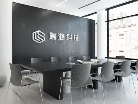
Li Hong Technology|An Identity System for an Industrial Reputation
Not a mark, but a corporate identity strategy
Li Hong didn't need a single mark — they needed a corporate identity to carry a tech-industrial reputation. Starting from industry positioning, thick letterforms convey an industrial feel and abstract geometry signals technical integration, with the strategy applied to logo, cards, and signage as one coherent CIS.

Gong Yi Construction|Turning Values Into a Recognisable Trademark & CIS
An identity grown from one belief — justice
Gong Yi was founded to be a sustainable enterprise upholding justice and fairness. From that belief, we unified name, ideals, and image in an elegant yet tenacious design — the trademark carries the core value, extended to a full CIS so the steadiness, reliability, and professional trust construction demands come through at every application.
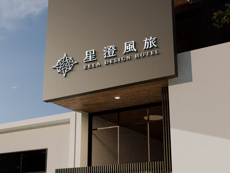
Zela Design Hotel|Positioning a Boutique Hotel Through Identity
Not lodging, but a destination for experiences
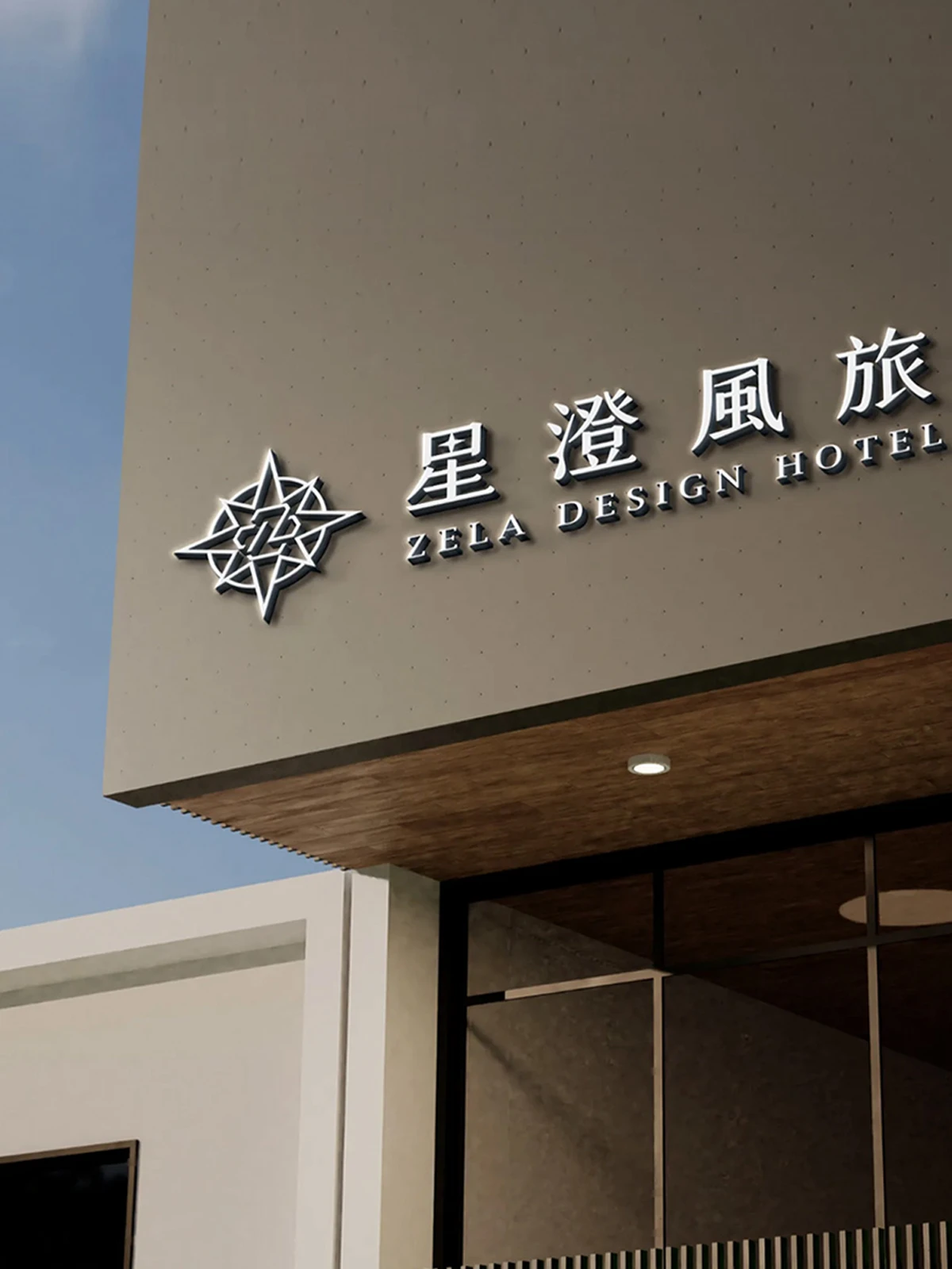
Boutique hotels compete on experience and memory, not just rooms. We positioned Zela as "a destination for beautiful memories and experiences" and expressed that position through careful identity design — so the trademark and visual language reinforce the "more than lodging" claim at every touchpoint.
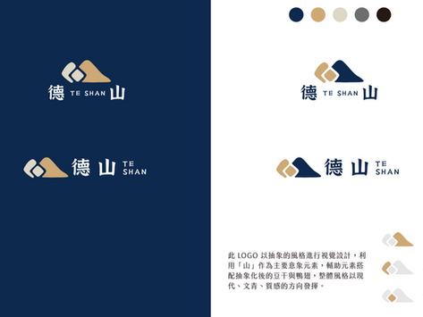
De Shan|A Steady Corporate Identity Anchored on the Mountain
One core image unifying the brand message
De Shan's identity strategy centres on the mountain — solidity, stability, and deep roots. We set that image as the trademark's identity core and extended it from logo to signage and CIS applications, so a steady brand character speaks with one voice across physical and digital touchpoints.
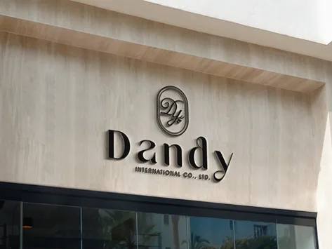
Dandy|A Contemporary Trademark Design & CIS
A clean identity carrying the brand's essential character
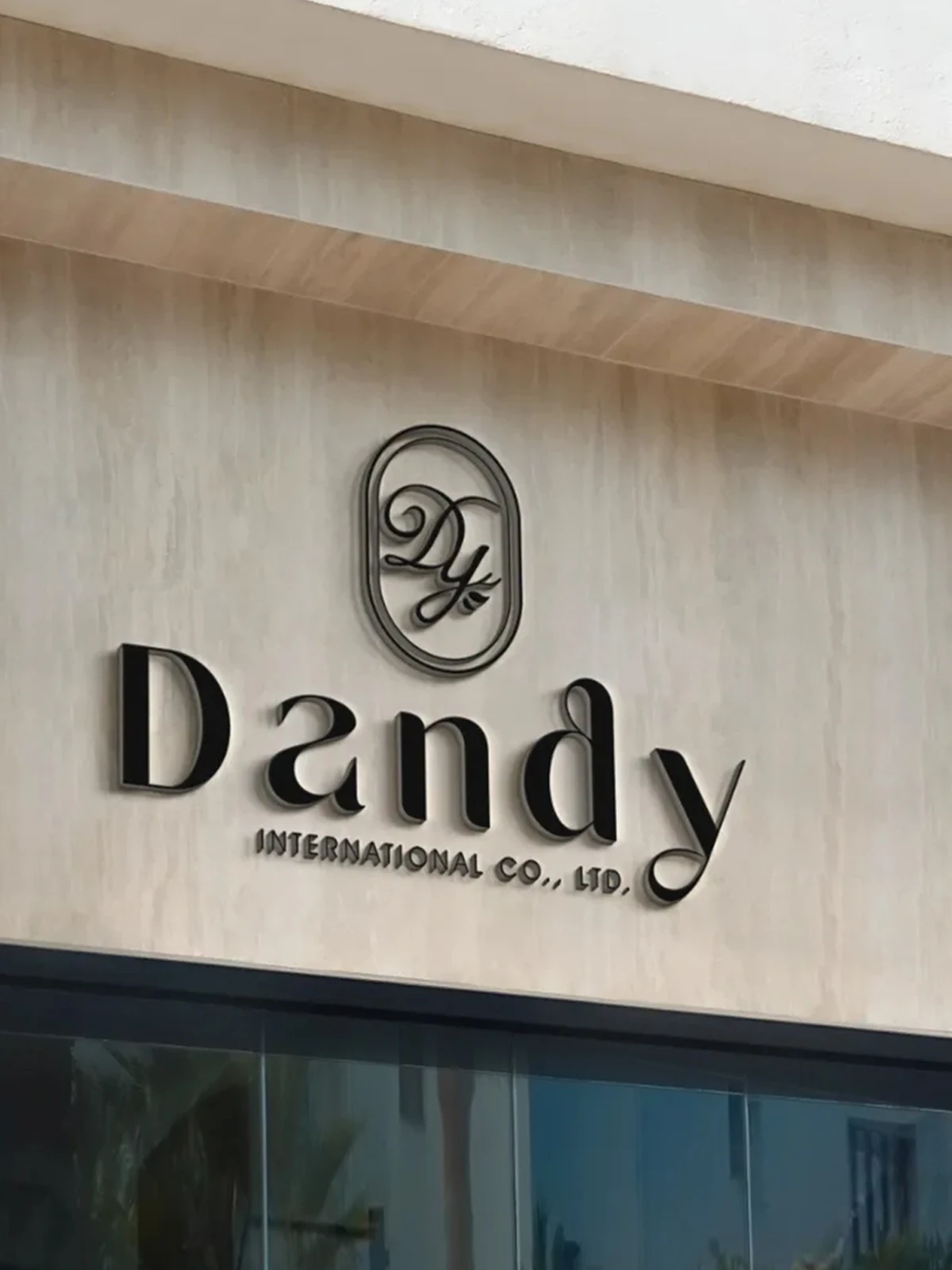
The identity challenge for Dandy was achieving both contemporary feel and brand character visually. We translated the brand's essential quality into a trademark, extending to CIS and store signage so the identity is clear and recognisable in physical contexts, with a consistent brand tone in every application.

AURZ|A Pet Brand Identity Positioned on Emotional Connection
Differentiation = the bond between people and pets
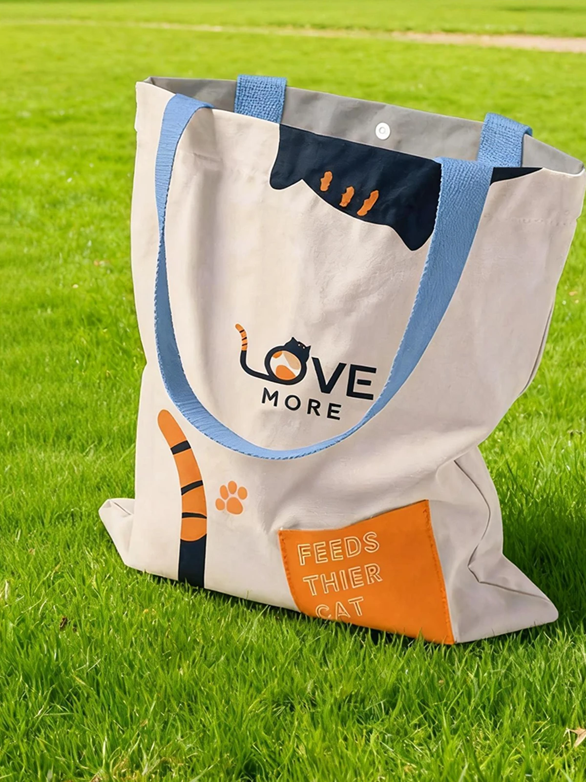
The pet market is crowded; AURZ's differentiation lives in emotional connection, not features. We anchored the identity on the bond between people and pets, then turned it into logo and CIS with a friendly visual language and a soft tone — a consistent, warm yet professional overall image.
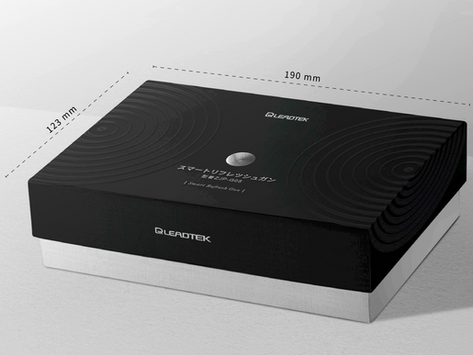
Leadtek|Consistent Extension From Identity to Packaging for a Tech Brand
Consistent from product positioning to packaging
Tech products earn professional recall on the shelf through a consistent image. Starting from brand identity, we extended Leadtek's visual language to packaging and image design for products including massage guns — so the high-tech promise lands consistently rather than piecemeal.

Li Jia Biomed|A Biomedical Brand Identity Built on Trust
A colour language that builds health trust
A biomedical brand lives on a first impression of professionalism and reliability. We built Li Jia Biomed's identity around a clean mark and grounded colour language — blue for credibility, green for health — extended from CIS to packaging, keeping recognition while conveying trust at a consistent tone across all applications.

Rui Han Technology|A Skincare Brand Identity Driven by a Mermaid Concept
A central image uniting logo, packaging, and brand feel
Rui Han's brand identity centres on the mermaid — symbolising beauty, care, and a mysterious connection to nature, resonant with the core skincare promise. We set that image at the identity's centre, letting logo design, mask packaging, and overall image grow from the same concept — a consistent, memorable brand feel.
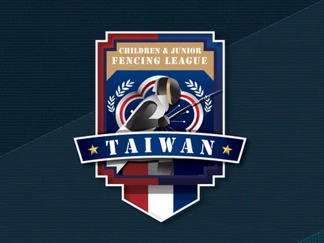
Fencing Association|Translating Athletic Spirit and Elegance Into Identity
Translating fencing speed and elegance into visual language
The identity challenge for the Fencing Association was translating fencing's spirit, elegance, and speed into a recognisable visual language. We built the logo from representative and distinctive design elements, then extended it to cards and image design, so the identity consistently communicates athletic spirit and professionalism across every application.
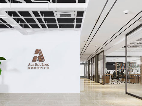
Asia Education Platform|A Brand Identity Architecture Built on "ACE"
Condensing a vast service into one identity core
Asia Education Platform aims to lead Taiwan's education market; the identity challenge was condensing a vast service system into one clear core. We used "ACE" as the strategic pivot, building brand architecture and a full VI — from naming logic to image applications — conveying the platform's EdTech professionalism and scale consistently.
Our team brings 30 years of industry experience · Trusted by 1,000+ brands · Handled by a senior designer, start to finish
Book a Brand Diagnosis
We'll understand your brand character, audience, and identity needs before giving clear service recommendations and a quote.