ESGDashboard&DataVisualizationDesignthat turns complex sustainability metrics into clear decision-making tools
Dashboard design, multi-source integration, auto-update — carbon, energy, and KPI readable at a glance.
The carbon inventory is done. The ESG report is out. But the board can't read it, investors can't find the point, and CDP filing is still a row-by-row Excel affair. The data isn't the problem — the visual communication is. With 30+ years of brand-visual experience across 1,000+ companies, we turn ESG data from a back-end spreadsheet into a dashboard that stakeholders can read and act on — strengthening the credibility of your sustainability disclosure.
🔴 ESG disclosure timelines are tight; dashboard design slots are limited — only a few remain







A Dashboard That Makes ESG Data Legible Requires Three Design Heights
A Dashboard Is the Credibility Interface for ESG Disclosure
CDP submissions, GRI reports, investor ESG questionnaires — every disclosure occasion needs numbers communicated clearly, not just listed. A well-designed ESG Dashboard lets stakeholders grasp key indicators, spot trends, and confirm target progress in 30 seconds, while letting internal auditors verify data sources quickly — strengthening the credibility of every disclosure.
Data Integration Is a Communication Design Problem, Not Just an IT Problem
Carbon emissions, energy, water, and KPI progress scatter across different departments' Excel files, ERPs, and carbon-inventory systems, making consolidation laborious and executive readouts hard to grasp. Pulling that into a one-page dashboard takes not only technical integration but design judgment: which indicators go first, which trends need visualization, which details belong in a second layer — the core capability of visual communication design.
ESG Communication Is an Extension of Your Brand Image
Sustainability disclosure is not just regulatory compliance — it is also a window into corporate image. The ESG Dashboard on your IR page, the visual charts embedded in the report, the indicator slides for the board — all tell the outside world "we take sustainability seriously." A poorly designed dashboard undermines your sustainability image; a well-crafted one makes every disclosure an accumulation of brand trust.
Hire a BI vendor and you get a back-end system. Work with Joseph and you get an ESG dashboard designed from the compliance, decision, and brand heights — so every disclosure is clear, compelling, and credible.










Three Things Digital Tools Can't Do — But You Need
Visual Design First, Not Just Technical Integration
Most BI tools provide the ability to plug data in, but which indicators to show, how to make a non-specialist audience read it at a glance, and how to design the visual hierarchy — these are design decisions that tools cannot automate. Our team applies 30+ years of visual design experience to get those decisions right, so your dashboard actually communicates.
Cross-Department Communication Design, Not Just a Chart Page
ESG data usually needs to speak to three audiences: executives (overview and trends), operational teams (segmented KPI detail), and external stakeholders (transparent, verifiable disclosure). We design a multi-layer communication structure from the same data so each audience finds what they need.
Built for Disclosure Occasions, Not Just an Internal Tool
The ESG dashboards we design can be embedded in ESG websites, IR pages, sustainability reports, and board presentations, supporting CDP submissions, GRI disclosures, and ESG rating applications. Designed with disclosure occasions in mind from the start — so your dashboard isn't just a pretty chart but a communication tool that actually gets used.
Our Team's 30 Years of Work, Results You Can See
From manufacturing to F&B, medical, and global brands — 1,000+ companies trust our design capabilities

普利司通

日月香肉鬆
View case →
多納烘焙

三菱電機

AURZ
View case →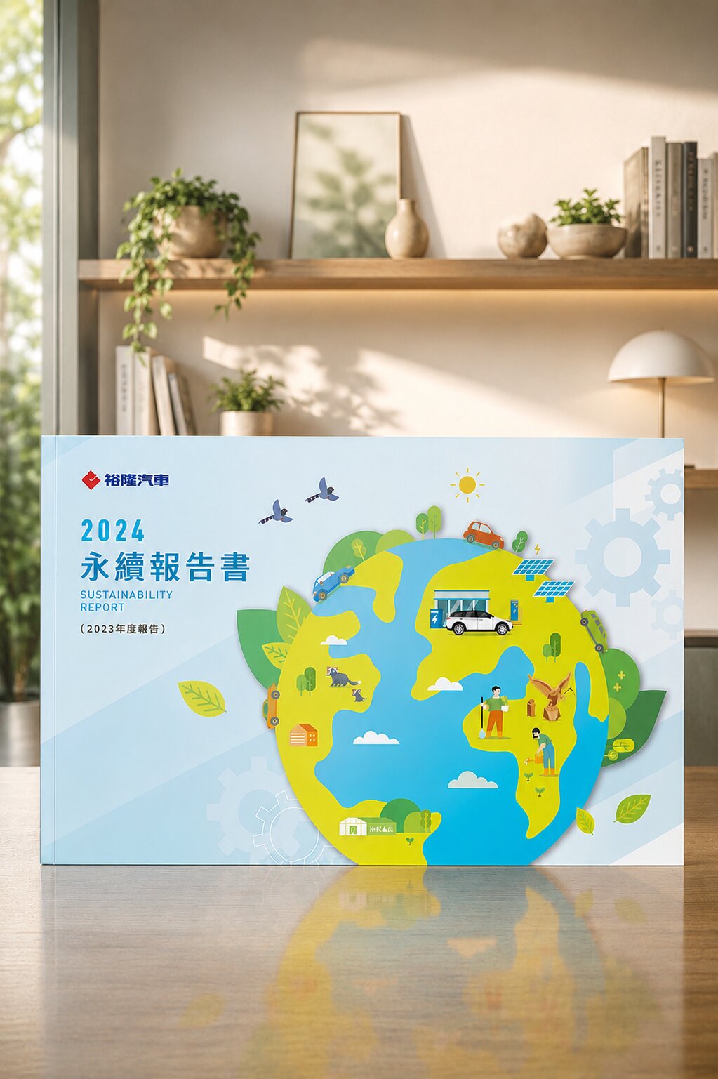
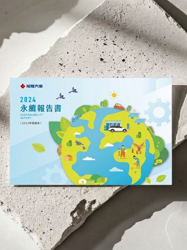
裕隆汽車

普利司通

禾善堂
The Right ESG Visualization for Your Disclosure Stage
Every company's ESG disclosure maturity is different, and so is the depth of dashboard needed. See which scenario fits, and we'll confirm the right scope during consultation.
Scenario A: First ESG Disclosure — Need a One-Page Overview
- Starting ESG disclosure for the first time — need to turn existing data into a clear visual overview
- For: first ESG report, first CDP filing, investor ESG questionnaire
- Recommended: ESG indicator visualization + one-page dashboard + disclosure format guidance
Scenario B: Data Exists — Need a Dynamically Updated Dashboard
- Carbon, energy, and water data are already tracked, but still consolidated manually — need automated update
- For: listed companies, companies building ESG data governance
- Recommended: multi-source integration framework + interactive dashboard + auto-update setup
Scenario C: Need a Full Disclosure Solution Across Website, Report, and Board
- ESG communication needs to appear consistently across multiple occasions: website, sustainability report, IR, board report
- For: companies with mature ESG disclosure, CDP/GRI reporting needs, sustainability brand image
- Recommended: multi-occasion dashboard design + visual guidelines + embeddable disclosure modules
From Data Inventory to Disclosure Launch — Every Step Has a Deliverable
ESG Data Inventory Meeting (90 min)
Clarify existing data sources, disclosure goals, audiences, and occasions — confirm the dashboard's design scope
Indicator Architecture Design
Decide which ESG indicators appear at which layer — build visual hierarchy and information architecture
Dashboard Visual Design
Design the single-page or multi-page dashboard visuals — aligned with brand tone and disclosure occasions
Multi-Source Integration & Auto-Update Setup
Connect Excel, ERP, carbon inventory systems, or IoT data and configure auto-update
Disclosure Occasion Embedding & Testing
Embed the dashboard in the ESG website, IR page, or report — verify the display in each occasion
Delivery & Maintenance Guidance
Full delivery of design files and technical documentation, with guidance on future updates and ESG disclosure planning
What Our Clients Say
Once the carbon inventory was done and Joseph designed the visuals, the board understood our ESG progress in under 10 minutes for the first time. "Design makes data speak" finally has a concrete shape.
Listed Manufacturing Company
ESG Dashboard · Board PresentationBefore, every CDP filing took three weeks of manual consolidation. After the dashboard, data pulls directly and filing time was cut by more than half. More importantly, our score improved because the disclosure was clearer.
ESG Manager, Technology Sector
Multi-Source Integration · CDP DisclosureAfter embedding the ESG dashboard into our IR page, institutional investors proactively said our disclosure quality was among the more thorough in the sector. The visual design detail genuinely influenced how outsiders judge our sustainability commitment.
Listed Biotech Company
ESG Web Embed · IR CommunicationSelected ESG Sustainability Visual Work

National Pingtung University of Science and Technology|University ESG Report Visual Design
Translating academic research outcomes into a sustainability communication medium for disclosure
A university ESG sustainability report must address multiple audiences simultaneously: the Ministry of Education, corporate partners, faculty, students, and the public. The design approach was to distill complex campus data — carbon inventory, energy management, staff and student ESG activities — into a clear visual narrative where each chapter stands alone yet the whole maintains a coherent disclosure logic. Deliverables covered report visual design, infographics, and print output specifications.

National Taipei University|Visual Design for Campus Sustainability Disclosure
Making staff-and-student sustainability stories coexist with quantitative data in one report
National Taipei University's ESG report spans environment, social, and governance with a large volume of dispersed data. The design approach established a clear chapter visual hierarchy, finding visual balance between quantitative indicators (carbon emissions, energy use, waste-recycling ratios) and qualitative narratives (faculty-student sustainability stories, community partnership cases), so the report doesn't become a stack of data tables.

Green Yin Biotech (Campton Biotech)|Biotech Industry ESG Sustainability Report
Turning a biotech company's environmental commitment into credible visual disclosure
A biotech company's ESG report must speak simultaneously to regulators, healthcare-channel partners, and investors — different appeals but the same underlying data. The design direction used a clean, professional visual language for environmental management indicators and designed appropriate information depth per chapter audience, so the disclosure meets regulatory requirements and functions as an external brand asset.
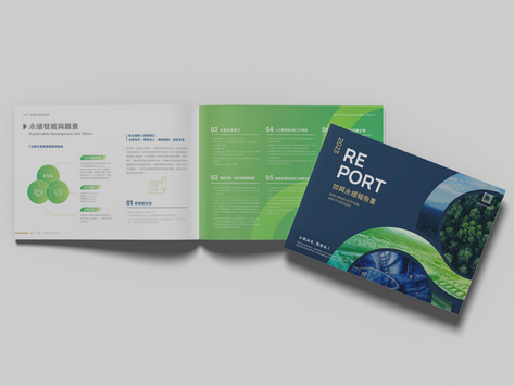
Ju Xing Co.|Textile Industry ESG Sustainability Report Design
Visual narrative for supply chain transparency and labour rights
The textile industry's ESG disclosure focuses heavily on supply-chain management and labour rights. Ju Xing's report design needed to make these issues visually clear and traceable. We used infographics to present the supply-chain structure, labour indicators, and environmental data, while maintaining overall visual consistency — supporting strong disclosure quality in textile ESG ratings and international buyer audits.
Our team brings 30 years of industry experience · Trusted by 1,000+ brands · Handled by a senior designer, start to finish
Book an ESG Visualization Consultation
Through an ESG data inventory meeting, we'll understand your data sources, disclosure goals, and audiences before confirming the dashboard design scope.