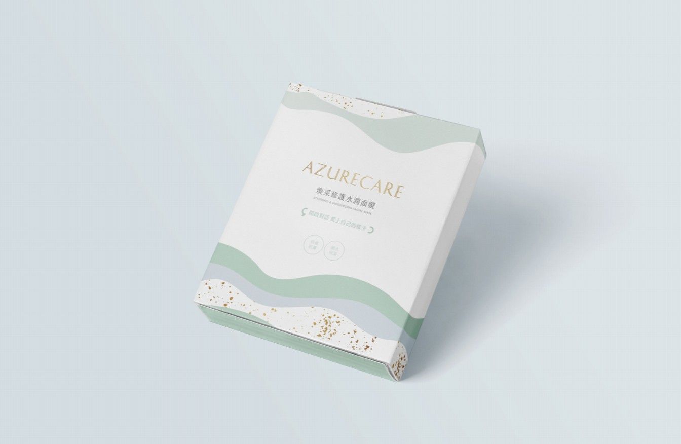
Joseph Studio was commissioned by Alcon Mask| to create product packaging design. Starting from brand positioning, we combined market insights with consumer psychology to craft packaging that stands out on shelves and effectively represents the brand.
【Introduction to Alcon】
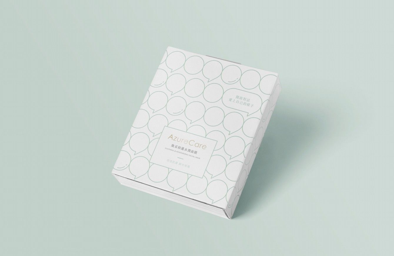
The reason for the name of Alcon is that there is the English name AzureCare before the Chinese translation of Alcon.
Azure means azure blue, which gives people an image of openness and relaxation. Care means care. In daily life, we often fall into poison without knowing it. Alcon hopes to provide the most natural, environmentally friendly and healthy products , that is, the best skin care products for everyone.
【Joseph Design Concept】
In the design demand interview, the founder mentioned that Alcon hopes to open up a dialogue between people. If we don’t advocate fast food culture, if we can have more dialogues and open up more sincere interactions and connections, Perhaps we also have more possibilities.
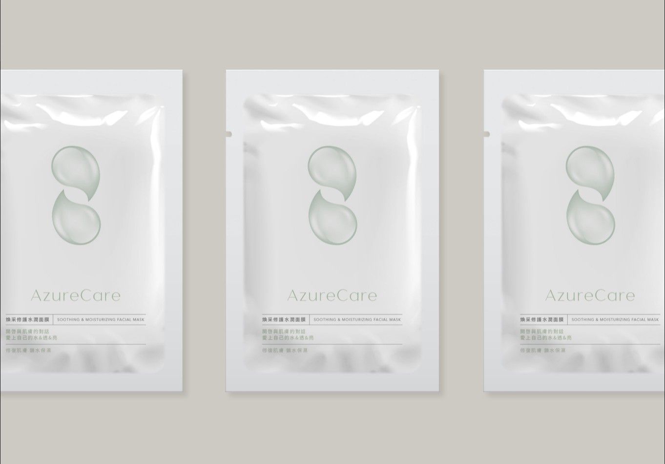
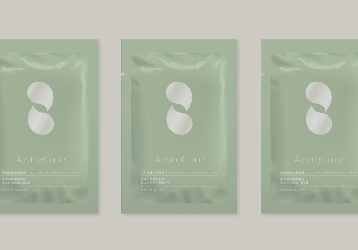
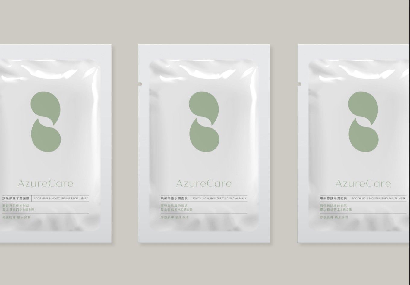
In terms of design, Joseph returned to the image of water. The skin must be nourished by water to avoid various skin problems. Women are made of water. We use water to express the function of moisturizing and locking water. The dialog box echoes the brand dialogue concept. The overall graphic Combined with a sense of repair, the overall simple brand tone is expressed with the combination of pink green, white, and champagne gold.
#packagingdesign #productdesign
#Bread #breadpackagingdesign
Design Gallery