BrandDesign,Integrated:One Team for Identity and Every Application.
Logo, CIS system, and application design — one stop. One senior designer, start to finish.
For most companies, the identity problem isn't a lack of design — it's a lack of a shared standard. The logo goes to one studio, the business cards are handled in-house, and a signage vendor picks the storefront colors independently. Once each is finalized, the brand looks like three different things at three different touchpoints. Brand design's value lies in treating the identity core and its applications as a single project — one senior designer responsible throughout, from brand diagnosis and trademark search to CIS guidelines and application design. Our team's 30 years and 1,000+ brands later, a project with full CIS planning typically delivers in 4-6 weeks.
🔴 This quarter's integrated-design slots are nearly full
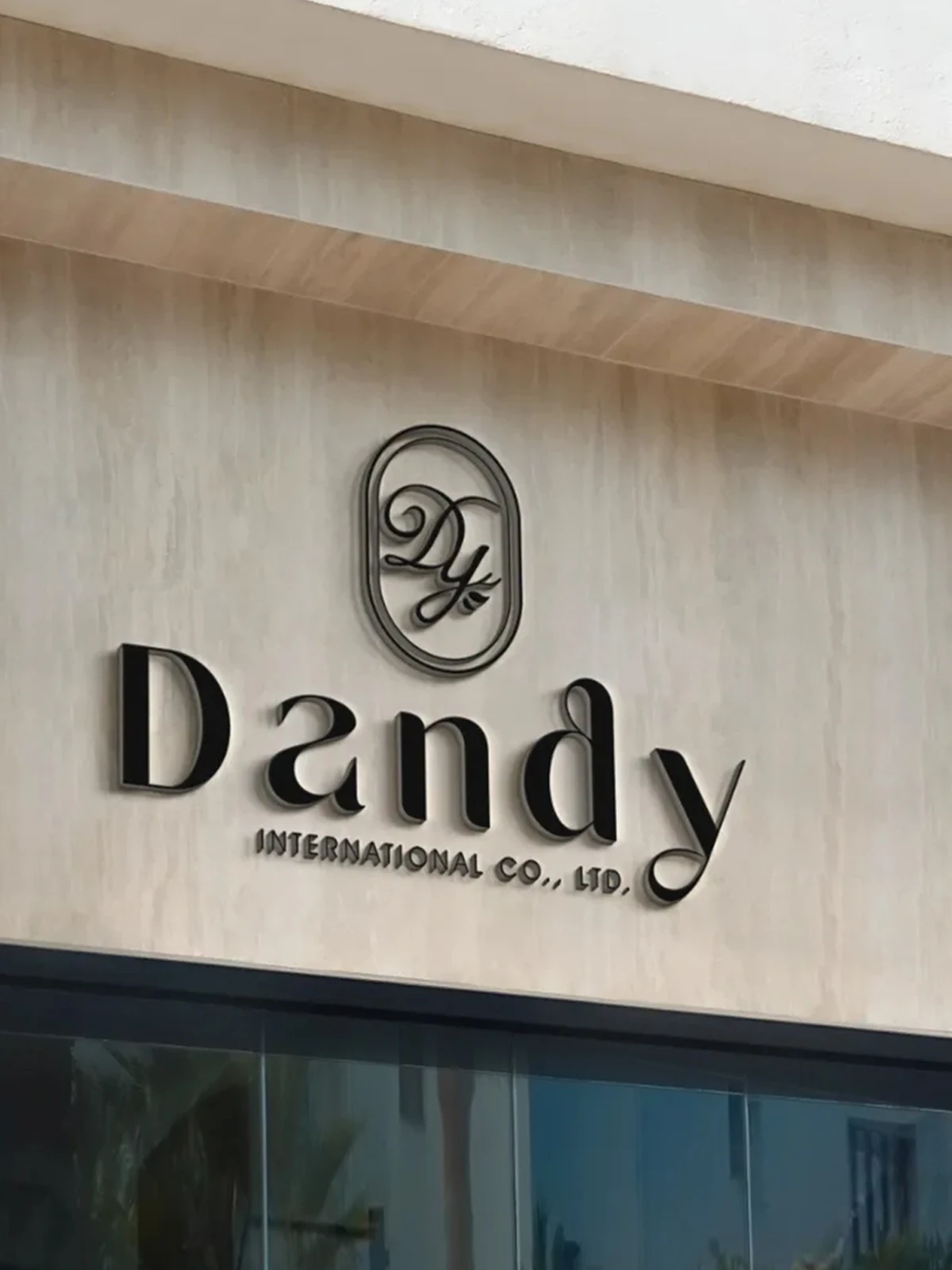
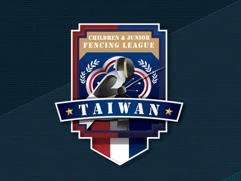
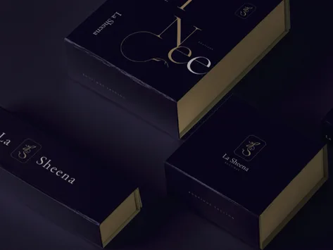

Brand Design Requires More Than a Single Mark
Establish What the Brand Communicates, Before Designing
A project doesn't begin with a logo sketch. It begins with three questions answered clearly: who the target audience is, how the brand differs from its peers, and what it should look like in five years. Once those answers are set, the logo's form, color, and type have a logic to follow — and every later application can trace back to the same positioning, rather than a designer's judgment on a given day.
An Identity Must Pass the Test of Real-World Application
A mark that reads well in a slide deck faces three different tests when shrunk into a business-card corner, enlarged onto a three-meter sign, or printed on corrugated cardboard. Testing against dark backgrounds, minimum sizes, and single-color printing is a fixed step during design — not an afterthought. Our team's 30 years and 1,000+ brands mean most material and scale risks are ruled out before the proposal stage.
After Handoff, the Brand Must Operate Independently
The day a project closes is the day the brand actually starts being used. Marketing staff will change, print vendors will change, and every new piece of material still needs to match the same visual system. So delivery isn't just design files: a CIS manual specifies exact color codes, type specifications, logo usage and its restrictions, alongside all-format source files and a commercial font-licensing list. Years later, whoever takes over can simply follow the manual.
The practical result of integration: after handoff, the brand presents the same face at every touchpoint.










Before You Brief a Studio, Confirm These Three Points
Are the Applications Handled by One Team
Briefing the logo, business cards, and signage to separate vendors, each finalized independently, commonly results in mismatched styles — and the coordination cost falls on the client. Our approach: one senior designer is responsible for the logo, CIS guidelines, and application design throughout the project. Not subcontracted work, but one person holding the full context.
Has a Trademark Search Been Completed Before Design Begins
Discovering that an identical trademark is already registered after the logo is finalized means the entire budget needs to be spent again. We search the Intellectual Property Office's trademark database before any design work begins, confirming the direction is viable. This step isn't standard practice industry-wide, but it can prevent the cost of redoing an entire project.
Does Delivery Include Guidelines and Font Licensing
Design files are only half of what's delivered. We provide a CIS manual, source files in every format, and a commercial font-licensing list — so future materials have clear rules to follow, and a licensing dispute never becomes the first time the issue surfaces.
Our Team's 30 Years of Work, Results You Can See
From manufacturing to F&B, medical, and global brands — 1,000+ companies trust our design capabilities

普利司通
日月香肉鬆
View case →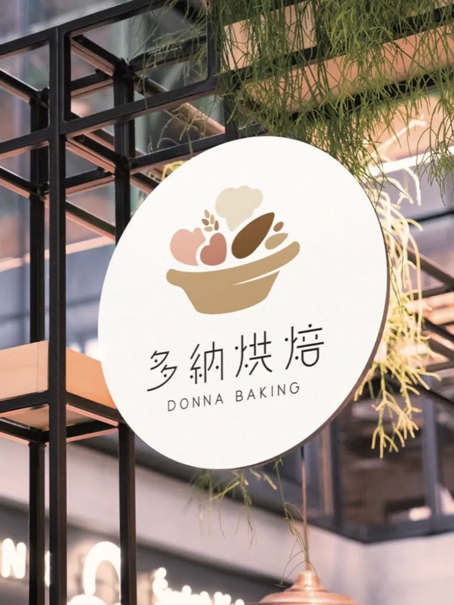
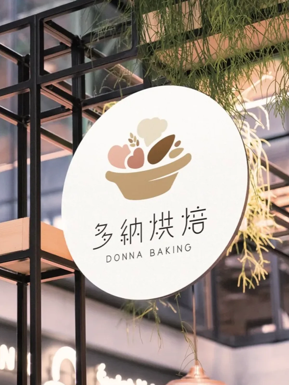
多納烘焙
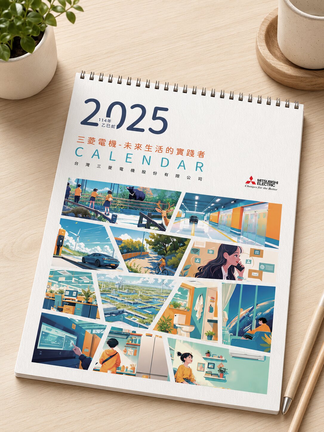
三菱電機
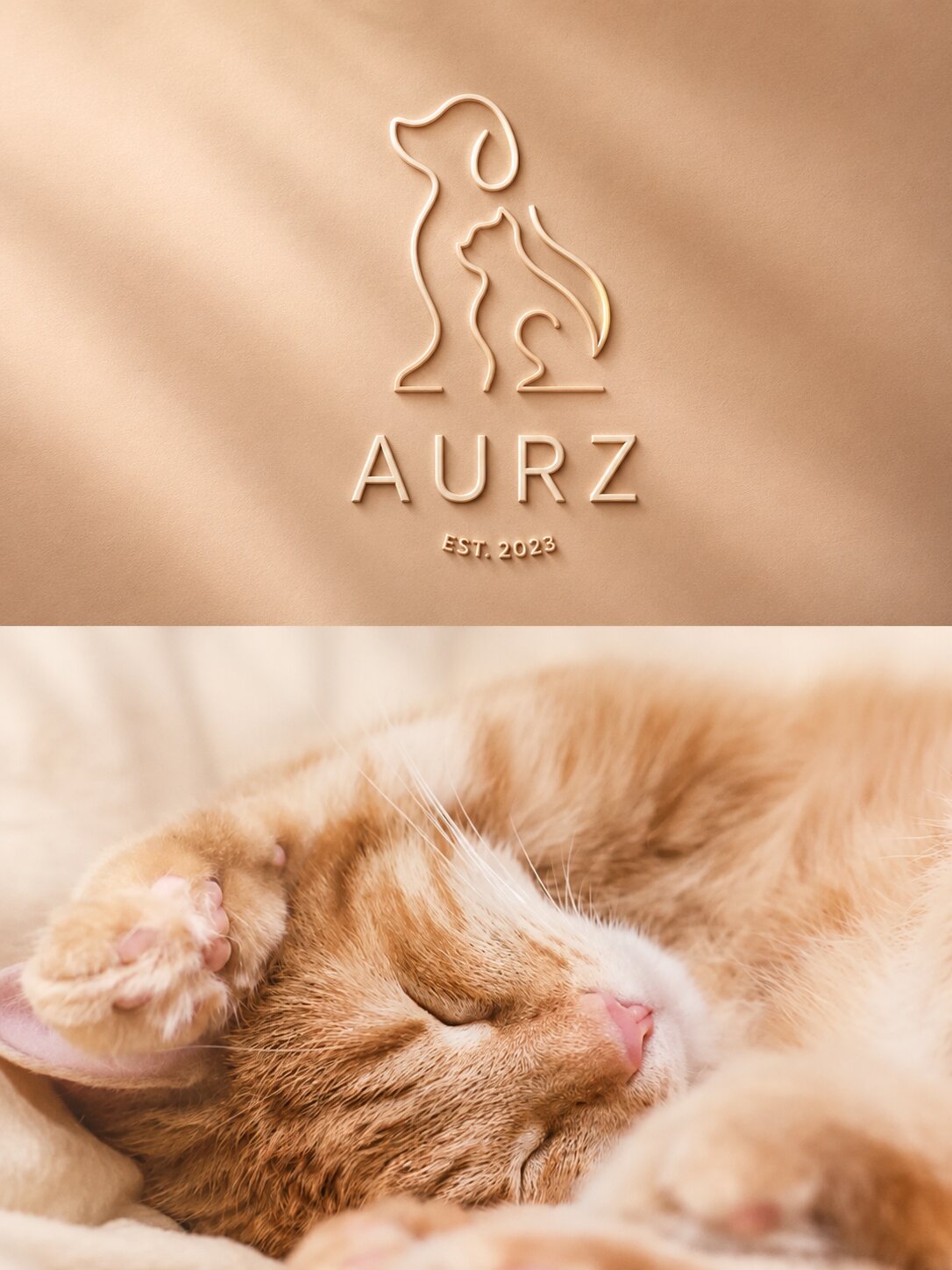
AURZ
View case →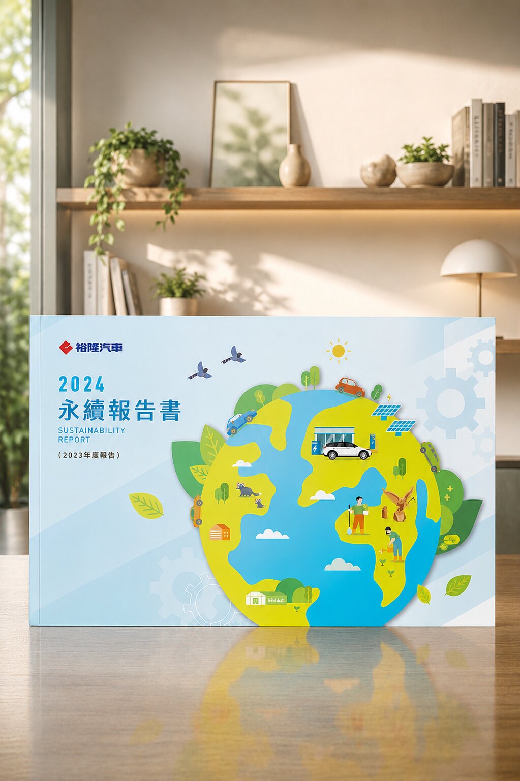
裕隆汽車

普利司通
禾善堂
The Right Scope for Your Stage
Different stages call for different scopes. These three scenarios offer an initial reference — we'll confirm the exact range together in consultation.
Scenario A: Build a New Brand Design
- Starting from zero — you need logo, CIS, and applications delivered together
- For: startups, new business units, spin-off sub-brands, new market entry
- Recommended: logo design + CIS guidelines + core application design
Scenario B: Brand Upgrade & Transition
- Succession, brand aging, or inconsistent materials — a full refresh is needed
- For: traditional-industry transformation, rebranding, new CEO succession
- Recommended: logo redesign + full CIS update + application refresh
Scenario C: Globalization / Multi-Brand Group
- Multi-language markets and sub-brand consolidation — an identity that lands across cultures
- For: brands going overseas, corporate groups, franchise systems
- Recommended: CIS + multilingual application guidelines + channel-consistent design
From Diagnosis to Applications — Every Step Has a Deliverable
Brand Diagnosis (90 min)
Confirm positioning, target market, and the scope of applications needed
Trademark Search (IPO database)
Rule out trademark conflicts before designing — no post-approval surprises
2-3 Logo Concept Proposals
Distinct directions, each with the reasoning behind it
CIS Guidelines (Color, Type, Usage Rules)
From the finalized logo, standard colors, type, and usage rules are compiled into a manual
Application Design (Cards, Packaging, Signage, etc.)
Design core applications within scope, consistent with the CIS guidelines
Source Files + Brand Guidelines
All-format source files, font-licensing list, and brand guidelines, delivered together
Our Team's 30 Years · 1,000+ Brands of Brand Design Work

Gong Yi Construction|An Identity to Match a Name Built on a Principle
Trademark search, logo, and CIS guidelines in one project
Gong Yi Construction placed its core operating principle directly into the company name — leaving almost no margin for error in the identity design, since any gap between name and image would be immediately visible. Construction's required sense of professionalism rests on stability and reliability, so the process began with a trademark search, confirming the registration was clear before the logo and standard colors were designed in an elegant, resilient tone, with usage rules compiled into CIS guidelines. Name, principle, and visual image correspond to one another in this project.

Li Hong Technology|An Identity System Extended to Cards and Signage
Industrial identity, cards, and signage delivered in one project
Li Hong's identity system needed to convey tech-industry professionalism and manufacturing solidity at the same time. The design used thick, solid letterforms for an industrial texture, paired with an abstract geometric figure symbolizing technical integration, to form the identity core. That core's real effectiveness depended on its performance on physical objects — business cards and storefront signage. Within the same project, the identity rules were extended to both applications, staying legible at small scale and proportionate at large scale.
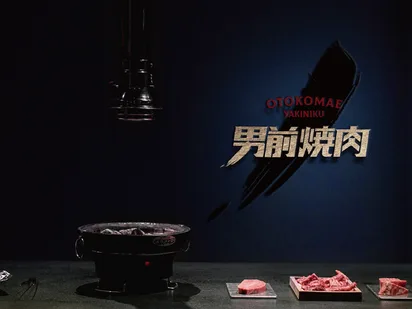
Nan Qian Yakiniku|A 70-Year Group's Identity Challenge in a New Category
Carrying group heritage while establishing an independent brand character
Kaohsiung's Quan Cheng F&B group has run its Shantou-style hotpot for over seventy years. Entering the yakiniku category raised two seemingly conflicting goals: the new brand needed to carry the group's accumulated credibility while establishing an independent character for a younger audience — not read merely as an extension of the parent group. "Nan Qian" established its character through clean type and grounded tones, with the identity core and full CIS completed in the same phase; by opening day, every piece of material already presented a consistent look.
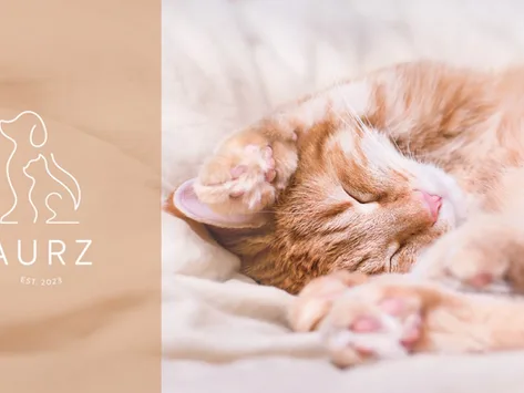
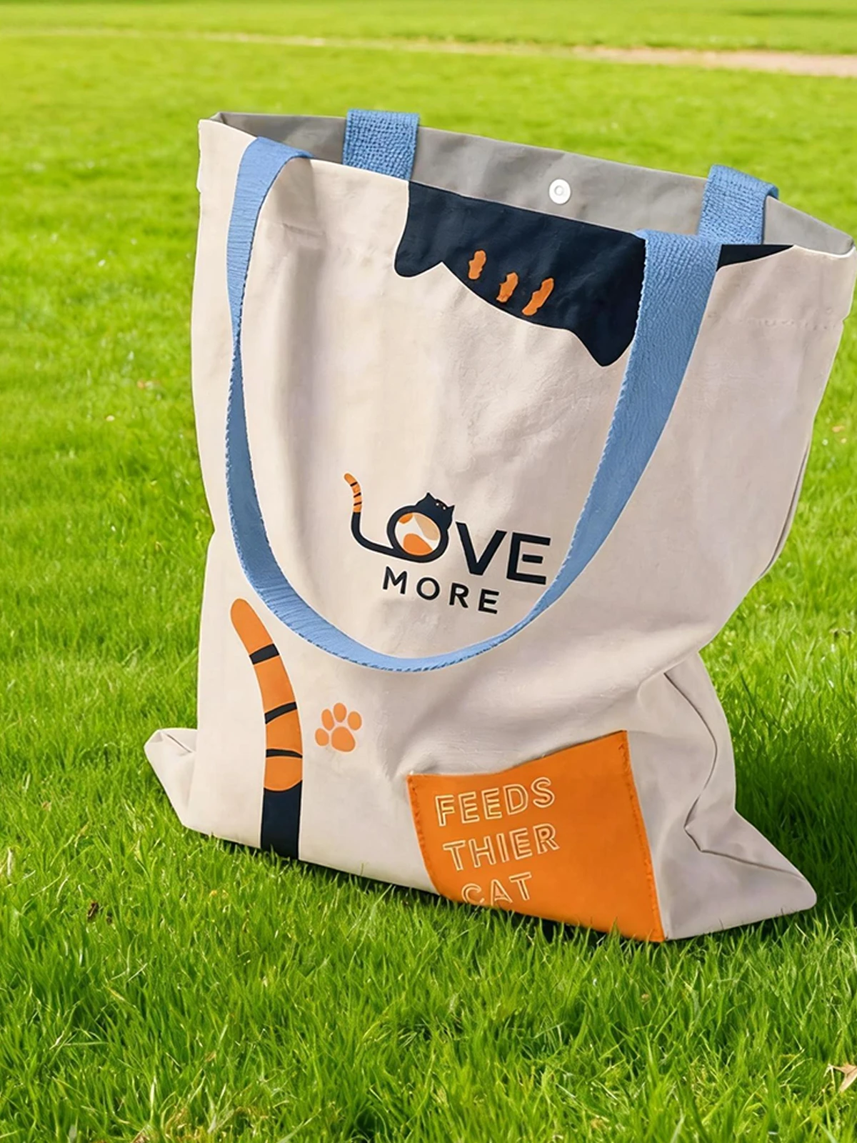
AURZ|The Judgment Standard for a Pet Brand Identity
Logo, CIS, and applications planned as one project
Pet owners tend to judge a brand fairly instinctively — whether the first look conveys warmth often decides whether they look further. AURZ's identity was therefore built on a friendly visual language and soft color palette as its core setting, with CIS and brand applications planned in the same project so the warm tone wouldn't read as careless once extended across different materials. Maintaining a defined level of professionalism was an explicit design requirement.
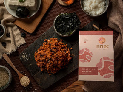
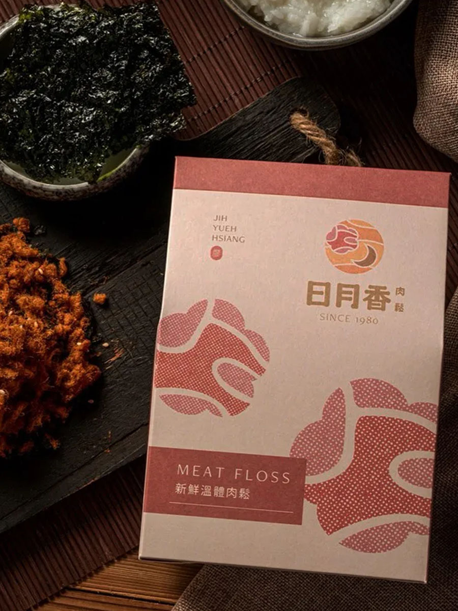
Ri Yue Xiang|Extending From a Market Stall to Gift-Box Retail
Logo, brand type, packaging, and gift boxes planned as a set
Ri Yue Xiang has operated in a Taoyuan traditional market for over forty years; after the second generation took over, it kept using local warm pork, preparing everything before dawn, with no added coloring or preservatives. That operating principle is itself the brand's most important asset — the identity design's task was to translate it into a visual language, not to replace it with a new image. The design centered on warm letterforms and earthy tones, extended from the logo through packaging and gift boxes, so the trust built at the stall could carry through to a new retail channel.

Li Jia Biomed|Building Product Trust Through a Color System
One color language across identity and packaging
For biomedical products, a sense of reassurance takes priority over other messaging in consumer judgment. Li Jia Biomed's identity accomplished this with a clean mark paired with two core colors — blue for professional reliability, green for health. This color system wasn't confined to the mark itself; it extended into CIS guidelines and packaging design, ensuring accurate recognition on the shelf.
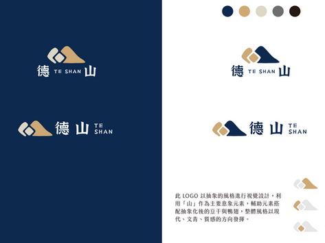
De Shan|A Single Image Across Two Scales, Mark and Signage
Logo, signage, and CIS completed in one project
De Shan's identity centers on the image of a mountain — corresponding, in visual vocabulary, to solidity, stability, and deep roots, the operating qualities the brand wanted to convey. The design challenge was making that image work across two very different scales: a printed mark, and a physical storefront sign. The CIS rules explicitly document the presentation standards for both contexts, keeping the image consistent whether enlarged or reduced.
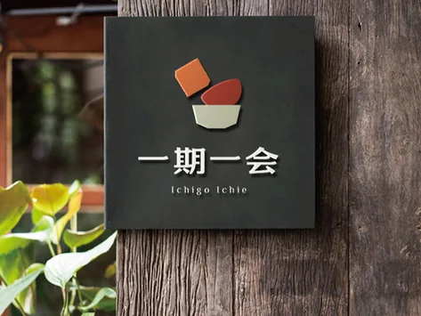
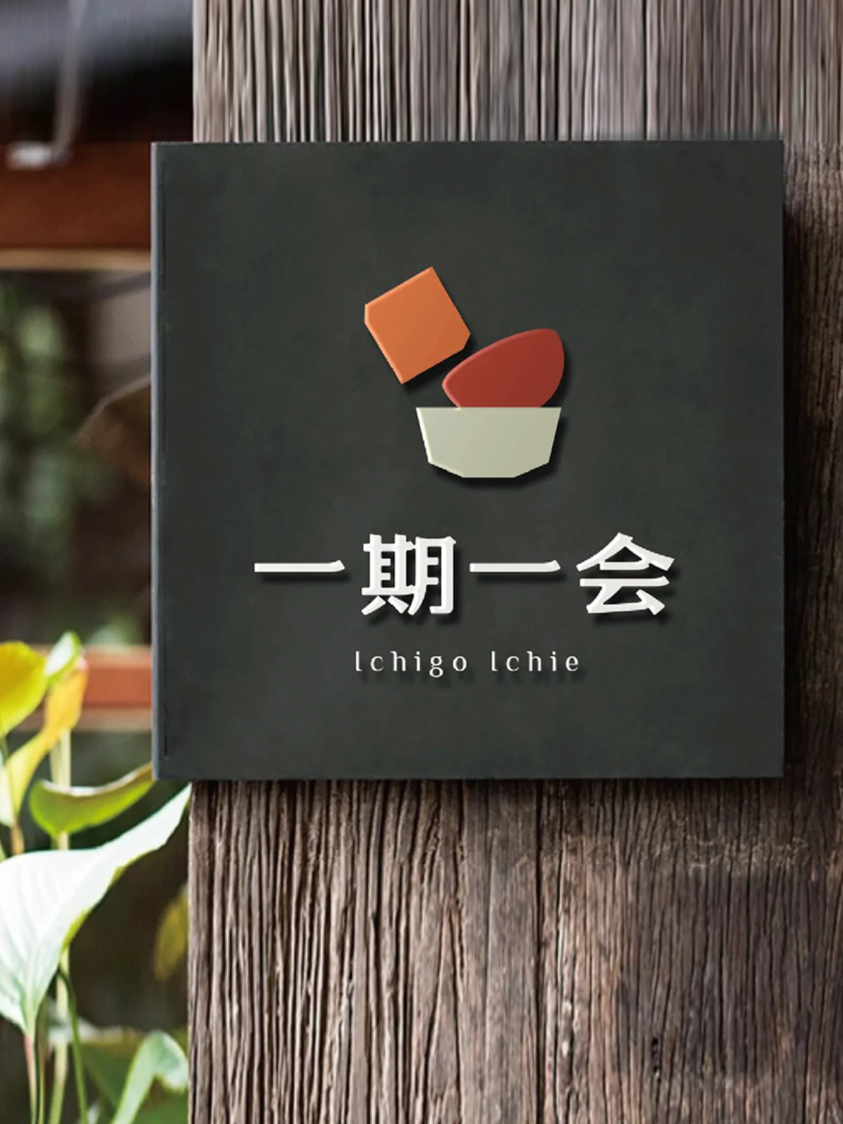
Ichigo Ichie|The Brand Meaning Must Read at Every Touchpoint
Logo, VI, menus, and light boxes planned together
"Ichigo ichie" is a tea-ceremony term meaning an encounter that happens once in a lifetime and never repeats — this Japanese restaurant honors each gathering with seasonal ingredients, so the operating philosophy and the brand name itself are tightly linked. The design task was ensuring that meaning didn't stop at the mark, but stayed perceptible as guests moved from entrance to table: the identity plan covered logo and VI through menus, storefront signage, and light boxes, so the same phrase was reaffirmed across different objects.
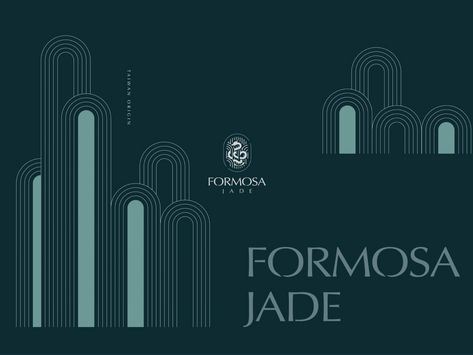
Formosa Jade|A Brand Claim Rooted in the Founder's Own Experience
Identity, packaging, and gift boxes designed in step
The founder of Formosa Jade's mother had long collected jade, only to buy a counterfeit on her very first purchase — an experience that led her to spend decades studying the subject and become a recognized gemology scholar. The brand's claim to "speak for real jade" derives its credibility directly from that background, so the identity design needed to convey a corresponding sense of expertise: built on a refined Eastern visual vocabulary, with packaging and gift boxes designed in step, so the first impression on opening the box matches the brand's professional positioning.

Guo Rui|Two Locations, One Shared Identity System
Logo and CIS planned together, shared across both cities
Guo Rui Consulting provides Hong Kong finance and banking-related services from offices on Canton Road, Tsim Sha Tsui, and in Shenzhen's Futian core. With two teams each producing their own materials, an identity system without explicit rules would gradually drift apart. The design centered on a steady, international logo paired with clearly documented CIS guidelines, ensuring that whichever team produces the material, the result reads as the same institution.
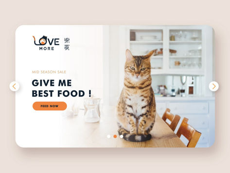
Le Mo Cat Food|Label Transparency as the Design Premise
Identity and packaging built to AAFCO standards
Le Mo's two founders have kept cats for years themselves, giving them firsthand experience with unclear labeling on imported cat food — the starting point for entering the market. The brand benchmarks against AAFCO (Association of American Feed Control Officials) standards, placing label transparency at the core of its claim. The identity design answers that claim with a warm, trustworthy visual language, extended from the logo through packaging, so product information reads clearly on the shelf.
Our team brings 30 years of industry experience · Trusted by 1,000+ brands · Handled by a senior designer, start to finish
Book a Brand Design Consultation
We start with a brand diagnosis — position and scope first, then the quote, then the work.