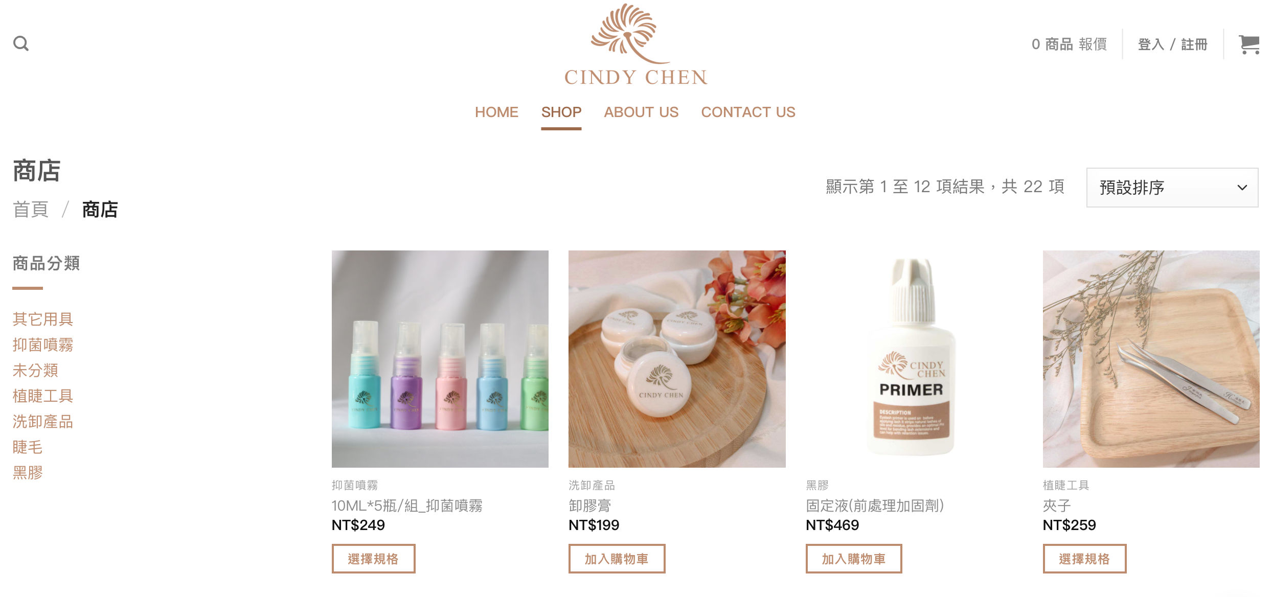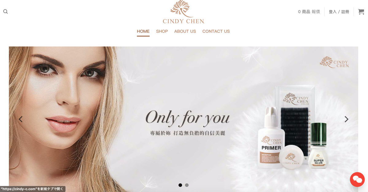
Joseph Studio designed signage and storefront visuals for CINDY CHEN Eyelashes, translating brand identity into physical spaces that attract attention and showcase brand character.
- Gentle and firm, confident and beautiful, full of vitality, moist and kind dandelion
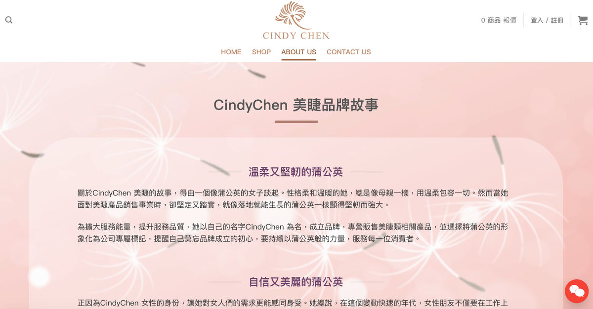
The story of CindyChen's eyelashes has to be told by a woman like a dandelion. With a soft and warm personality, she is always like a mother, tolerant of everything with gentleness. However, when she faced the business of selling eyelashes products, she was firm and steady, just like a dandelion that could grow on the ground.
In order to expand the service capacity and improve the service quality, she established a brand under her own name CindyChen, specializing in the sale of eyelash-related products, and chose to visualize the dandelion as the company's exclusive logo to remind herself not to forget the original intention of the brand's establishment. , to continue to serve every consumer with dandelion-like power.
Joseph Integrated Marketing Design Company It is precisely because of CindyChen's female identity that a shopping cart website with a sense of dandelion series is tailored. , so that all friends who use CindyChen products can show their beauty and confidence to the world like dandelion, and experience the unique enthusiasm and vitality of dandelion!
#official website #website design
#shopping cart website design
Design Gallery